
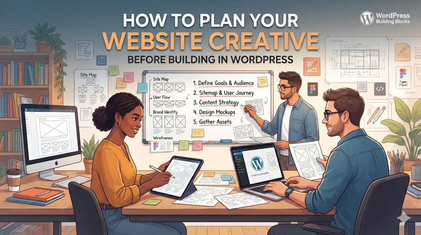
How to Plan Your Website Creative Before Building in WordPress
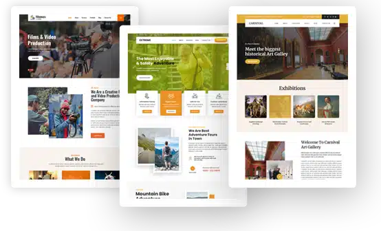
WordPress makes it easy to start designing quickly.
Choose a theme, open a page builder, replace the demo content and a website can begin taking shape within hours. That convenience is one of WordPress’s biggest strengths, but it can also encourage teams to make design decisions too early.
A homepage gets built before the message is clear. A three-column section is added because the template includes one, not because the content naturally belongs in three columns. Stock images are selected to fill empty spaces, and important assets such as diagrams or product demonstrations are only considered after the page is nearly finished.
The result may look polished, but it often feels generic or difficult to follow.
A better process is to plan the website’s content, creative assets and user journey before deciding exactly how everything will be assembled in WordPress.
Start With What the Page Needs to Achieve
Before choosing a layout, define the job of the page.
A homepage needs to help visitors quickly understand the business and find the right next step. A service page may need to explain a complex offer and generate inquiries. A product page needs to answer enough questions for someone to feel comfortable purchasing.
Once the objective is clear, think about what the visitor needs to understand before taking that action.
For example, a service page might follow a structure such as:
Problem → solution → how it works → proof → next step
An e-commerce product page may need:
Product value → images or demonstration → benefits → reviews → specifications → purchase
The exact structure will vary, but it should come from the information customers need rather than the sections available in a template.
Grace Themes’ own guidance on planning a WordPress website similarly recommends identifying the audience and deciding what visitors should learn before focusing heavily on colors and layouts.
Plan the Message Before the Visual Design
Website copy and design work better when they are planned together.
Consider a hero section.
The designer needs to know whether the headline is five words or fifteen. They need to know whether the page should lead with a product screenshot, photograph, illustration or video. The writer needs to know how much information the visual already communicates so the copy does not repeat it.
If those decisions happen independently, the page often goes through unnecessary revisions.
Before designing, establish the basic content hierarchy:
- What is the main message?
- What is the most important supporting point?
- What proof is available?
- What objections might visitors have?
- What should the primary CTA ask them to do?
This gives the visual design something meaningful to organize.
Decide Which Ideas Need Visual Explanation
Not every section needs a custom graphic.
At the same time, relying entirely on text and generic stock photography can make complex products or services harder to understand.
Think about what each visual needs to accomplish.
Photography works well when people need to see a real product, person or environment.
Illustration can simplify an abstract process that is difficult to photograph.
Screenshots are useful when customers need to understand an interface.
Motion can explain a sequence or show how something changes.
Video may be appropriate when demonstrating the product, showing a customer experience or communicating something that would require several static sections to explain.
The decision should come from the information, not from a desire to make the page look busier.
For larger projects that require several types of website creative, teams may also work with an external partner rather than sourcing every skill separately. For example, Superside’s web design services bring together UX, responsive web design, copy, landing pages, motion and reusable design systems, which can help when a website requires more than routine theme customization.
The WordPress team can then focus on turning the approved creative into a site that is easy to manage.
Wireframe Before You Polish
A wireframe is one of the easiest ways to identify structural problems before they become expensive to fix.
It does not need perfect typography, branded colors or final photography. Simple boxes and text labels are enough.
The purpose is to answer questions such as:
Does the visitor understand the offer quickly?
Does the page explain too much before introducing the product?
Does an important customer testimonial appear too late?
Is a long block of text actually trying to explain something that would work better as a diagram?
Does the CTA appear at a logical point?
Wireframing also makes it easier to experiment with different structures because nobody is attached to the finished visual design yet.
Once the hierarchy works, visual styling can be added with much more confidence.
Build an Asset List Before Opening the Page Builder
After the wireframe is approved, list every creative asset the website requires.
This might include:
- Homepage hero image
- Mobile hero variation
- Product photographs
- Team photography
- Icons
- Screenshots
- Illustrations
- Customer logos
- Video
- Video thumbnail
- Social-sharing image
This simple step prevents one of the most common problems in web production: building a layout first and then trying to find an image that happens to fit it.
It also makes production more efficient.
If the website needs six related product illustrations, they can be created as one visual set rather than being requested individually over several weeks.
If photography will appear in horizontal desktop sections and narrow mobile layouts, the photographer or designer can plan compositions that work in both formats.
The website begins to feel more intentional because the assets were created for the experience rather than added afterward.
Think Beyond the Homepage
The homepage often receives most of the design attention, but visitors may enter a website through many different pages.
Someone arriving from Google might first see a blog article.
A paid campaign may send visitors directly to a landing page.
A shopper might arrive on a WooCommerce product page.
An existing customer may return through an email link.
Each of these pages should still feel like part of the same website.
That does not mean every page needs the same layout. It means recurring elements such as typography, buttons, imagery, forms, spacing and calls to action should follow a recognizable system.
Grace Themes has written about customizing WordPress themes, but customization works best when those changes follow an intentional visual system rather than being made independently on each page.
Map the Customer Journey for E-Commerce Sites
For WooCommerce sites, it is particularly useful to plan what happens before and after checkout.
The customer’s experience may include a product page, cart, checkout, confirmation message, follow-up email, review request or referral program.
These elements are often added through different WordPress tools, but customers still experience them as one brand.
For example, a store using ReferralCandy with WooCommerce can run referral campaigns connected to customer purchases and rewards. The integration handles the referral mechanics, but the website owner still needs to decide how the offer is introduced, how the incentive is explained and whether the referral experience feels consistent with the rest of the store.
Thinking about these touchpoints early helps prevent the website from feeling carefully designed until checkout and disconnected immediately afterward.
Turn Repeated Designs Into Reusable Components
After several pages have been designed, look for recurring patterns.
Most websites repeatedly use some version of:
- Hero sections
- Feature blocks
- Testimonials
- Image-and-text sections
- Pricing
- FAQs
- Forms
- Calls to action
These are strong candidates for reusable WordPress blocks or page-builder components.
The purpose is not to make every page identical.
A reusable hero, for example, might support a photograph on one page, a product screenshot on another and illustration on a third. The spacing, typography and responsive behavior remain consistent while the content changes.
This gives editors flexibility without requiring them to redesign basic website elements each time they publish a new page.
It also reduces the gradual inconsistencies that appear when several people maintain the same site.
Plan Mobile While You Are Designing Desktop
Responsive design should not be treated as the final stage of the project.
Creative decisions can change significantly on smaller screens.
A wide illustration may become unreadable.
Text positioned over photography may no longer have enough clear space.
A two-column product demonstration may need to stack in a specific order.
Decorative animation may add little value on a small screen.
Thinking about these situations during design makes the final implementation much easier.
Grace Themes offers responsive WordPress themes and supports popular page builders, so much of the underlying adaptation can be handled by the theme and builder. But the creative assets themselves still need to make sense at different screen sizes.
A page can technically be responsive while the visual storytelling is not.
Use the Page Builder for Implementation, Not Strategy
Once the message, page structure, wireframes, assets and responsive behavior are clear, the WordPress page builder becomes extremely valuable.
Now the team can work quickly because the important decisions have already been made.
Use an existing theme section when it fits the content.
Modify a component when a small change is required.
Create something custom only when the communication problem genuinely needs a different solution.
Grace Themes’ overview of drag-and-drop WordPress page builders shows how these tools make it possible to arrange elements such as text, images, forms, sliders and video without manually coding each page.
That flexibility works best when it is used to implement a clear plan rather than becoming the planning process itself.
Final Thoughts
A WordPress theme can provide a strong starting point, but the theme cannot decide what your customers need to understand.
That work happens before the website is assembled.
Define the audience and objective. Plan the information hierarchy. Decide which ideas need photography, illustration, screenshots, motion or video. Wireframe the page, create the required assets and think through mobile behavior.
Then bring those decisions into WordPress.
This approach does not make the website-building process more complicated. It usually removes unnecessary revisions because design, content and implementation are solving the same problem from the beginning.
The page builder should make a good website plan easier to execute—not become a substitute for having one.
