
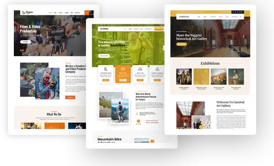
Full Width WordPress Themes


Full Width WordPress Themes for Wide, Edge-to-Edge Website Layouts
First impressions online happen in a split second, and a cramped page rarely wins them. Imagine your best photograph trapped in a narrow column with blank bars on either side, then picture it running from one edge of the browser window to the other with a bold headline floating over it. The second version is the one far more likely to stop a visitor mid-scroll, and full width WordPress themes exist to deliver it. They remove the boxed-in feeling of a fixed container and give images, sliders and sections the whole screen. Our Full Width category at GraceThemes holds two premium designs, Amplitude PRO and Wide Range PRO, and each comes with a free starter version, so photographers, agencies, bloggers and shop owners can launch an immersive layout without writing a line of code.
Here is what you will find as you read. You start with the key takeaways, then compare all four designs in one table and read an honest review of each. Next, you will learn what full width really means, why wide layouts work and where they need care, followed by the layout settings that control width, how to make any page full width and how to fix layout problems. Practical advice on hero sections, sliders, parallax motion, headers and footers and responsive breakpoints follows. A matching table then points you to ten website guides for photography studios, photojournalists, creative agencies, artists and galleries, designer portfolios, landing pages, personal blogs, small businesses, online shops and nonprofits, each ending with a recommended design. From there, we cover the pages a wide site needs, homepage planning, imagery, layout patterns, typography and white space, accessibility, search visibility, speed, measuring results, marketing and content ideas, plus the mistakes worth avoiding. Finally, we compare free and premium versions, explain how to choose and install a theme, set out pricing and close with related categories, answers to common questions and final thoughts.
Key Takeaways
- Full width WordPress themes stretch content across the browser window instead of holding it inside a narrow boxed container.
- Our Full Width category lists Amplitude PRO and Wide Range PRO at $29 each, and both designs also come in free editions.
- Amplitude PRO suits photographers, portfolios, blogs, businesses, landing pages and creative agencies, with a full-screen slider, 600+ Google fonts and 30+ shortcodes.
- Wide Range PRO is built for photographers and photojournalists, with a full-screen homepage slider, 500+ Google fonts and free installation and setup listed on its page.
- Both premium designs name WooCommerce, translation readiness and the Yoast SEO and All in One SEO Pack plugins.
- Wide layouts work best when text stays in a readable column, hero images are optimized and full-width sections are mixed with contained content.
Our Full Width Themes Compared
This table lists every design in the category along with the free starter versions. Each name opens the product page, where you can see the live demo and the full feature list.
| Theme (details and live demo) | Price | Best for | Standout features named on the page | Store and languages |
| Amplitude PRO | $29 | Photography, portfolios, blogs, businesses, landing pages, creative and marketing agencies | Full-screen slider with captions, 600+ Google fonts, 30+ shortcodes, eCommerce section, photo gallery | WooCommerce, multilingual and translation ready |
| Wide Range PRO | $29 | Photographers, photojournalists, portfolios, landing pages, personal blogs | Full-screen homepage slider, 500+ Google fonts, sliding menu bar, portfolio and gallery pages | WooCommerce, translation and multi-language ready |
| Amplitude (free) | Free | Personal sites, blogs, portfolios, photography, corporate pages, nonprofits, small businesses | Full-width page template, custom sidebar and footer widgets | WooCommerce, translation ready |
| Wide Range Lite (free) | Free | Photojournalism, photography, digital marketing, portfolios, personal blogs | Full-width page template, full-width slider, live preview in the Customizer | WooCommerce, translation ready |
Reviews of Our Full Width Designs
Amplitude PRO

Amplitude PRO describes itself as a clean, creative full width design made for full-screen websites across a wide range of businesses. Its homepage opens with a full-screen slider that shows photography or artwork under overlying captions, and the slider has controls and transition options. The feature set lists 600+ Google fonts, unlimited color options, 30+ shortcodes, client portfolios, a photo gallery, testimonials, team members, footer layouts, social media settings, a contact form with an embedded Google map and a full eCommerce section.
Behind the scenes, a Theme Options Framework controls backgrounds, colors, fonts and logos, and custom post types handle portfolio items, gallery entries, testimonials and team members. Different page templates are designed to use the maximum amount of screen space, while blog templates and a contact page template cover the rest of the site. The page states that Amplitude is clean coded to WordPress Codex standards, lightweight, responsive, Retina-ready and cross-browser compatible, and that a drag-and-drop page builder plugin can be used with it.
Wide Range PRO

Wide Range PRO targets photographers and photojournalists and also suits landing pages, portfolios, blogs and personal sites built around imagery. The homepage carries a full-screen Nivo slider, and the page also lists a full-width image slider. Its feature list names 500+ Google fonts, unlimited color options, a sliding menu bar with social media icons, page templates with or without a sidebar, blog layouts and custom footer and sidebar widgets.
Custom post types cover team members, testimonials and photo galleries, with portfolio and gallery pages for showing images. Its shortcodes cover slideshows, columns and buttons along with toggles, tabs and Google Maps embeds, and a built-in contact form sits alongside Contact Form 7 compatibility. The page also lists a theme options panel that needs no coding, an XML file for demo content, documentation, free lifetime support and updates, and free installation and setup.
The Free Starter Versions
Amplitude (free) offers a full-width page template, custom sidebar and footer widgets, optional page sidebars and a responsive, retina-ready layout. Its page names Contact Form 7, WPForms, Yoast SEO and Newsletter among compatible plugins and says the design supports page builder plugins. Wide Range Lite adds a full-width image slider, a sliding menu with social icons and a Customizer with live preview. Both free versions name WooCommerce, and both have a $29 PRO upgrade with more page templates and an extended theme options panel.
What Full Width Means in Web Design
Before you pick a design, it helps to know exactly what the term covers. A full-width layout lets sections stretch to the browser edge, so background colors, photos and video fill 100% of the screen width. A boxed layout places the whole site inside a centered container with visible page margins, and a fixed-width layout keeps content at one maximum width no matter how large the monitor is. Many modern sites blend these approaches: an edge-to-edge design for hero areas and galleries, and a contained content area for body text.
In the block editor, images, Cover blocks and Group blocks can use wide alignment or full alignment when a theme declares support. Wide width pushes a block beyond the normal content width, and full width stretches it across the viewport. The editor alignment toolbar shows these options only when the theme allows them, which is why the same block can look different on two designs.
Classic themes, including our full width designs, usually offer a full-width page template in the Page Attributes panel or the Template dropdown. Selecting it gives you a no-sidebar template that widens the content container for that page alone. This per-page basis is handy, because a portfolio page can run edge to edge while blog posts keep a sidebar.
Why a Wide Layout Works
Full width WordPress themes appeal to visual brands for three clear reasons.
First, full-width photos and video create immediate visual impact, a spacious feeling and an immersive experience. A wide canvas supports enhanced storytelling, because each section can carry its own background, image or color block as the visitor scrolls. That step-by-step visual storytelling, with brand stories told in a narrative style, suits photographers, artists and brands whose work speaks better through pictures than paragraphs.
Second, large screens and ultra-wide monitors leave empty margins on a boxed site. A full-width design uses that screen real estate for galleries, product showcases and a full-screen background, so the page has a modern aesthetic and a sleek look rather than a cramped one.
Third, sidebar removal reduces visual clutter and gives the main message more room. Distraction-free reading and fewer competing elements help visitors notice the primary call to action.
Where Wide Layouts Need Care
Wide designs have weak spots too, and the best full width WordPress themes leave room to manage them.
The first is line length. Text that runs across a whole wide screen hurts text readability, because the eye struggles to find the start of the next line. Keep paragraphs in a contained reading area and let images and backgrounds handle the width. The typography section later in this guide gives the line length, font size and line height to aim for.
The second is balance. The best wide sites mix full-width and contained layouts. A full-width hero, gallery or testimonial band can sit between centered text blocks, which keeps visual balance while protecting reading comfort. Plan the content hierarchy so each wide section has a clear purpose.
Image quality is the third. Edge-to-edge images must look sharp on retina screens and still load fast on phones. Low-resolution photos stretched across a wide monitor look blurry, so optimize images for full width and let responsive image markup serve smaller files to small screens. The imagery and speed sections below cover file sizes and formats.
Finally, remember that full width is not right for every project. Content-heavy websites such as a knowledge base, a product documentation page or a news site with long articles often read better in a boxed or contained layout, because readers come for text rather than imagery. A sidebar with a table of contents or related links also earns its place on those sites. Many owners choose a middle path: full-width sections on landing pages and the homepage, and a contained layout for blog posts.
Layout Settings That Control Width
Every theme decides how wide content may grow, and once you know where those controls live, you can stop guessing.
Most themes wrap page content in a content container, sometimes called the main wrapper or content wrapper, with a max-width property such as a 1200px boxed container or a 960px content width. Inside that wrapper sits the content area with its own wrapper padding and container padding. A full-width section escapes the wrapper and spans 100% width of the browser window, while 100vw width and 100vh height let a hero fill the whole viewport. Centered content inside a white background or a faded background is the classic boxed look; a stretched layout lets the body background and section colors flow to the browser edge.
Boxed and full-width are the two main layout types, and you choose between them at two levels. A global layout setting, often labeled site layout style, layout mode or default layout, chooses between a boxed and a full-width site for every page. A per-page layout, set through the page template or a content width toggle, overrides that default for one page only. Classic themes usually keep these controls in the Customizer or a theme options panel, while block-based themes keep them in theme.json and the Site Editor. Good full width WordPress themes give you both levels, so the layout decision can follow the content rather than the theme.
In block themes, theme.json content size sets the theme content width for normal blocks, and wide size sets how far wide-aligned blocks may extend. Blocks marked with the alignwide class respect the wide size, while blocks with the alignfull class run edge to edge. Classic themes that want these options must add theme support with the align-wide feature in functions.php, which is why the Full alignment option and Wide alignment option are missing in some older designs. When the editor alignment toolbar shows only left, center and right, the theme predefined width is in control.
Making Any Page Full Width in WordPress
To make page full width, the simplest route is the page template. In the page editor, open the Template dropdown under Page Attributes or the page settings, choose the full-width template your theme provides and update the page. In a block theme, select a block and choose full width from the block alignment toolbar, or wrap sections in a Group block or Cover block set to full alignment. In the Site Editor you can also create page template variations for wide pages: add a new template, remove the comments section and page title if you want a blank canvas, and assign it in the post editor. Header and footer removal suits a custom landing page or Coming Soon page, while page header removal keeps the site header but drops the title banner.
For a design without a suitable template, a developer can create one in a child theme. The usual steps are to copy page.php contents into a new file such as full-width.php, add a template name declaration in the template header and remove the get_sidebar call. After that, upload the template file and select it in the editor. Custom CSS can also widen a single element, for example by setting max-width to none on the content container or using a negative margin with calc(50% – 50vw). Always back up before editing theme files, and keep changes in a child theme so a theme update cannot wipe them out.
Fixing Full-Width Layout Problems
If a page refuses to stretch, the theme’s content container probably has a max-width property. Use the browser’s Inspect tool to find the container class, then override it with Additional CSS for that page only. A horizontal scrollbar usually appears when an element uses 100vw and the vertical scrollbar adds extra width; setting overflow-x to hidden on the body element or switching to percentage width fixes it.
When full-width blocks look boxed in the front end but not in the editor, check whether the theme supports wide and full alignment. If a plugin breaks the layout, deactivate plugins one by one, or use the Health Check & Troubleshooting plugin to test safely without affecting visitors. Clear any cache after each change so you see the real result. If a plugin conflict or styling conflicts persist, check the theme framework’s own layout options before writing custom styling, and confirm each fix with browser resizing and device testing.
Theme markup varies, so learn the classes your design uses. Common targets include the site-content class, the content-area class, the entry-content class and the site-main element, which sit between the get_header and get_footer calls in a classic template. A precise CSS selector aimed at one page ID avoids class targeting that spreads to every page. Combine a margin reset and padding removal on the wrapper with a negative margin on the inner block, and check the result at each breakpoint to avoid horizontal overflow. Layout conflicts between a page builder plugin and the theme’s own full-width template can cause trouble, so choose one method for each page and stick with it.
Hero Sections on a Wide Canvas
The hero section is the first viewport a visitor sees without scrolling, so it carries the strongest first impression. On a full-width design it usually combines a hero image or background video, a bold headline, a short subheading and one primary CTA.
Start with the image itself. Prepare a wide desktop crop, often in a 16:9 aspect ratio, and a separate crop for portrait phones, using the file sizes listed later in the imagery section. Keep the focal point inside a central safe zone, because automatic image cropping on different screen sizes can cut off the edges. Export in WebP format where possible and keep the file as small as quality allows.
Next, think about the words on top. White text over a busy photo can vanish. A dark overlay, a transparent gradient or a solid text panel restores color contrast, and WCAG sets a 4.5:1 minimum for normal-size text against its background. Keep the hero copy short so the headline and CTA read at a glance.
Beyond the photo, a strong hero section pairs a benefit-led headline with a subheadline that explains the value proposition in one line. Below the copy, a primary CTA and an optional secondary CTA give visitors a clear next step, while trust signals such as client logos, a review badge or a star rating offer instant social proof. Product mockups, device mockups, a short demo video or an illustration hero can replace photography for agencies and software products. Typography-led design and gradient hero design also work when strong images are not available, as long as headline clarity and text-image balance stay intact.
A video hero section can set the brand mood, but it adds weight. Use a short, compressed video loop in MP4 or WebM, formats whose video codecs modern browsers support widely. Set a video poster image as a static fallback, mute autoplay video and consider showing a static image on mobile to save mobile data usage. Progressive loading and a small file respect user bandwidth, and a visible play icon or pause button gives visitors playback control. Watch for a visible loop jump at the end of the clip, and add captions if the video carries speech.
Sliders and Carousels on Full-Width Pages
Both of our premium designs include a full-screen slider on the homepage, so it pays to use sliders well.
Every slide competes with the others for attention. Use a few slides at most, give each one a single-purpose message and put the most important offer first. Thumbnail navigation, navigation dots, slide indicators and previous and next buttons should stay visible, giving visitors manual navigation and user control.
If you keep auto-forwarding, give each slide enough time to read; roughly five to seven seconds per slide and a limit of three or four slides is a sensible rule of thumb. Independent slide messages that do not depend on each other avoid confusion when visitors land mid-sequence. Different slider types suit different jobs: a hero carousel or full-screen image carousel for mood, a testimonial slider for social proof, a product carousel or card carousel for an online shop and a post carousel for recent articles. Too many rotating messages invite banner blindness and choice overload, so ask whether each carousel truly helps visitors or hides content.
WCAG requires that content which moves automatically for more than five seconds can be paused, stopped or hidden. Add play and pause controls, slow the autoplay speed and transition speed and make every control keyboard-focusable with a clear label for screen reader users.
Sometimes the better answer is no slider at all. When messages compete, a static hero with stacked sections, card layouts or a tabbed interface often works better. A grid of featured content lets visitors scan everything at once instead of waiting for the slide sequence.
Parallax and Motion Effects
You have probably seen pages where the background seems to glide behind the content. The parallax scrolling effect moves background elements more slowly than foreground elements, creating a visual depth effect as visitors scroll. Used with moderation, the effect adds atmosphere to a portfolio or landing page.
Motion has costs. Heavy parallax techniques can stutter on lower-end devices, add processing overhead and trigger discomfort for people with motion sensitivity. Respect the prefers-reduced-motion setting, simplify or disable parallax on mobile, and keep animation speed gentle so content stays the focus.
The simplest technique sets the CSS background-attachment property to fixed, so the background holds still while content scrolls over it. Script-based parallax goes further: the background moves slower while the foreground moves faster, creating a 3D illusion of layers. Horizontal parallax scrolling and scroll-driven animation are more ambitious, but they suit experiential websites more than service pages. A minimal parallax effect on one hero section, a subtle hover effect on cards and a few microinteractions usually give enough visual interest. Treat motion effects with a cautionary approach rather than as decoration everywhere.
Headers, Footers and Navigation on Wide Layouts
A sticky header keeps navigation links and a persistent CTA within reach on long-form pages. Keep it a compact sticky bar, because a full-height header eats screen space on small screens, and consider a slimmer version that appears after the visitor scrolls past the hero. A pinned bar of roughly 60 to 70 pixels keeps it slim. CSS position: sticky is lighter than scroll-based JavaScript and helps layout stability, which protects Cumulative Layout Shift scores. Hiding on downscroll and showing on upscroll is another way to reduce navigation friction without covering content.
If you want the photo to reach the very top, a transparent header placed as a header overlay on top of the hero image lets the image run under the menu. Header transparency works only when the navigation links stay readable, so add a subtle gradient behind the menu or switch the header background to solid once the sticky threshold is passed. Test the header visibility on light and dark images alike. A translucent header that turns to an opaque color as the scroll position changes, combined with a gentle header shrink, keeps the logo and menu clear without abrupt animation.
For one-page landing websites, the usual choice is a local scroll menu, where each menu item links to a section with hash-based navigation. The href value points to a section’s content ID, and the CSS scroll-behavior property makes the jump smooth. Keep section ordering logical, label each anchor clearly and make sure the browser’s back button still behaves as visitors expect.
At the bottom of the page, a wide footer section can hold four to six footer columns for contact details, quick links, social icons, a newsletter form and opening hours. Footer widget areas in Amplitude PRO and Wide Range PRO let you place these blocks without code. Keep footer text readable, group links by topic and avoid stuffing dozens of links into every column. The bottom bar usually carries the copyright notice, privacy policy, terms of service, cookie policy and an accessibility statement, and an outdated copyright year or broken links in the footer navigation quietly hurt trust.
Responsive Breakpoints for Wide Designs
A responsive layout must adapt gracefully to phones, tablets, laptops and large desktops. Common responsive breakpoints sit around 480px for small phones, 768px for tablets, 1024px for small desktops and 1200px or wider for large desktop layouts, though content-based breakpoints are often better than device-based breakpoints.
On a phone in portrait mode, multi-column layouts usually stack vertically, the hamburger menu replaces the navigation bar, the sidebar moves below the article and headlines shrink with responsive typography. Hero images may switch to a vertical crop, and form inputs should run full width for easy typing.
Images need the same care. The srcset and sizes attributes on the img element let the browser choose the right file for each device width and pixel density. That keeps full-width photos sharp on retina displays without forcing phones to download desktop-sized files.
Buttons and links need room for thumbs. WCAG 2.2 sets a minimum target size of 24 by 24 CSS pixels at level AA, and 44 by 44 pixels at the stricter AAA level is a comfortable goal for mobile usability.
Finally, test everything. Responsive preview mode in WordPress and DevTools presets in the browser are quick ways to check layout breakpoints, but browser emulation cannot show real scroll performance or touch behavior. Do breakpoint testing on real devices in phone portrait view and phone landscape view, on a tablet layout, on laptop screens and on a widescreen or ultra-wide monitor. Services such as BrowserStack help with cross-browser sizing, and the WAVE tool flags accessibility problems in the rendered page. Rotate devices to check orientation change, because an orientation breakpoint can reorder sections unexpectedly.
Matching a Full Width Theme to Your Website
Start with this table to pick a design, then read the guides that follow.
| Website type | Main goal | Recommended theme |
| Photography studio | Show portfolios and win bookings | Amplitude PRO or Wide Range PRO |
| Photojournalist or documentary storyteller | Present picture stories | Wide Range PRO |
| Creative or marketing agency | Win clients with case studies | Amplitude PRO |
| Artist, illustrator or gallery | Display artwork beautifully | Amplitude PRO |
| Designer portfolio | Show projects edge to edge | Amplitude PRO or Wide Range PRO |
| Landing page or launch | Convert visitors to leads | Amplitude PRO or Wide Range PRO |
| Personal blog or brand | Publish with visual flair | Wide Range PRO or Wide Range Lite |
| Small business or corporate site | Present services clearly | Amplitude PRO |
| Online shop | Sell products with WooCommerce | Amplitude PRO |
| Nonprofit or community group | Tell stories and gather support | Amplitude (free) or Amplitude PRO |
Website Guides for Wide Layouts
These guides show how full width WordPress themes serve different kinds of projects, each with a recommended design.
Photography Studios
A photography website lives or dies on its images. Lead with a full-screen slider of your strongest work, group galleries by session type, add a short About story and finish with a clear booking or inquiry form. Keep image captions brief and let the photos breathe.
Best theme fit: Amplitude PRO, with its full-screen slider, built-in photo gallery and portfolio post type.
Photojournalists and Documentary Storytellers
Picture stories need room for sequence and context. Use full-width photo essays with short captions, a project index and a contact page for editors and agencies. Credit lines and dates under each image help readers follow the story.
Best theme fit: Wide Range PRO, written for photographers and photojournalists.
Creative and Marketing Agencies
Agencies sell taste and results, so combine wide case-study visuals with measurable outcomes in plain language. Show team members, client logos, testimonials and a contact form with your location.
Best theme fit: Amplitude PRO, which names digital, marketing and creative agencies and includes team and testimonial post types.
Artists, Illustrators and Galleries
Artwork deserves large, uncluttered display. Give each series its own gallery page, add a lightbox gallery for detail views and include an exhibitions or commissions page.
Best theme fit: Amplitude PRO, whose slider is described for photography or artwork images.
Designer Portfolios
A portfolio layout should load fast and let each project open into a case study with problem, process and result. Use a category filter if you work across several disciplines.
Best theme fit: Amplitude PRO for portfolio post types, or Wide Range PRO for portfolio and gallery pages.
Landing Pages and Product Launches
Conversion-focused pages need one value proposition, a headline and CTA above the fold, social proof and a short form. Remove the sidebar and menu clutter so every element guides visitors toward the primary action. The same structure works for a lead generation page, a PPC landing page, an event registration page, a free trial page or a demo page. Keep form fields few, use a multi-step form for longer inquiries and place buttons inside the thumb zone on phones.
Best theme fit: Amplitude PRO or Wide Range PRO, both naming landing pages among their uses.
Personal Blogs and Personal Brands
A personal blog benefits from wide featured images, a readable post column and an author section. Keep the reading area narrow even when headers and photos stretch across the screen.
Best theme fit: Wide Range PRO, or Wide Range Lite to start for free.
Small Business and Corporate Sites
Service businesses need clear service pages, trust signals, team profiles and contact details. A full-width hero and testimonial band add polish without hiding the essentials.
Best theme fit: Amplitude PRO, which its page calls a reliable platform for business sites in many industries.
Online Shops
Product photography shines on a wide canvas. Use a full-width banner image for each seasonal campaign or new collection, then contained product grids for easy comparison.
Best theme fit: Amplitude PRO, which lists a full eCommerce section and WooCommerce compatibility.
Nonprofits and Community Groups
Nonprofits connect through stories and faces. Use full-width photos of your work, impact summaries and a clear donation or volunteer path.
Best theme fit: Amplitude (free), whose page names nonprofits, with Amplitude PRO as the upgrade.
Pages Every Wide Site Should Have
Sites built on full width WordPress themes need more than a dramatic homepage. Plan these core pages before you design:
- About: your story, told with a full-width photo.
- Services or portfolio: galleries that show the work.
- Contact: a form, map and social links, which Amplitude PRO includes as a page template.
- Blog: updates that also support search visibility.
- Testimonials: proof from clients that builds trust.
- Privacy: a simple policy page.
If you sell online, add shop categories, product pages and clear shipping information, and keep the cart icon and search icon visible in the header.
Planning a Full-Width Homepage
The homepage is where full width WordPress themes make their first impression, so plan page structure before choosing images. Start with the hero area and its single primary action, then add an introduction that explains what you offer, a featured work or product showcase, a social proof band with testimonials or client logos, and a closing call to action. Alternate wide image sections with contained text sections, so the page has rhythm and the reading order stays clear. Keep the flow natural, and make sure each section answers one visitor question.
Above-the-fold design deserves extra care. The first viewport at the top of page should deliver a clear value proposition, an outcome-focused headline and one conversion CTA, because competing CTAs can cause a conversion leak and slow the decision cycle. Below the fold, use a scannable layout with bold titles, concise copy and visual cues that guide user attention down the page, and keep a clickable phone number in the header for mobile sites.
Choosing Imagery for Wide Layouts
Full width WordPress themes reward strong pictures and punish weak ones, so imagery deserves its own plan.
Start with what you or your photographer can shoot. Original visuals, such as editorial photography, lifestyle imagery, product photography and product close-ups, build a visual identity that stock photos rarely match. Show the product in context and in real-world scenarios, and use aspirational imagery only when it reflects what customers actually receive. Photographers and artists already own their best asset; businesses should budget for at least one professional shoot before launching a wide design.
Every wide image sets a mood. Clean and minimal photos with a muted palette suit premium and minimal brands, bold and punchy shots suit energetic and athletic brands such as sports clubs, and warm and welcoming scenes suit hospitality and community groups. Calm and focused visuals help wellness studios and consultancies look trustworthy and professional. Pick one mood and keep it consistent across the hero, galleries and section backgrounds.
When you export files, a practical starting point is a desktop hero image around 1920 x 1080 pixels and larger versions near 2560 x 1440 pixels for high-resolution displays, plus a 1080 x 1920 mobile hero in portrait orientation. Keeping each hero file under roughly 500KB is a practical target after compression. Generate several widths, such as 300w, 600w, 900w and 1200w, for srcset so the browser can pick the right size, and check how each crop looks in landscape view and portrait view.
Wide Layout Patterns Worth Borrowing
A few proven page sections make wide designs feel intentional rather than empty. A breakout layout lets wide blocks such as photos or quotes step outside the reading column while text stays narrow. Full-screen sections work as visual breaks between content blocks, and section separators like angled edges or gradient lines mark the change of topic. For galleries, a horizontal-scroll gallery with scrollable cards and partially visible cards invites swipe gesture browsing on touch-enabled devices, while a collection grid or showcase gallery suits larger screens.
Trust-building bands also suit the full width: a logo bar of customer logos, a stat badge row, a customer testimonial strip or pricing tables inside a call-to-action area. Style choices can follow the brand, from oversized typography and oversized photography to dark mode, a gradient background, black-and-white design with one accent color, or a minimalist hero with minimal copy. A cinematic hero, an animated hero or an illustration-based design adds personality when motion is purposeful. A slim sticky CTA bar on long pages and a back-to-top button near the footer round out the experience.
Typography and White Space on Wide Screens
Fluid typography, responsive font sizing and proportional font scaling keep headings bold on desktops without overwhelming phones. Build a clear typographic hierarchy with large display headings, readable subheadings and comfortable body copy. Both premium designs give you hundreds of Google fonts, so choose one display face and one text face rather than many.
Typographers call line length the measure, and a range of about 45 to 75 characters per line is the classic typographic guideline, with around 66 often cited as ideal. WCAG’s Visual Presentation criterion, at level AAA, also caps line width at 80 characters. Leading, or line spacing, matters as much as width: a 1.5 line height gives the eye room to return to the next line without losing its place. A 16px base font size is a sensible minimum for body copy on phones and desktops alike. Too-wide text forces horizontal scanning and can cause eye fatigue, while a balanced text density supports skimming text and steady reading flow, especially in long-form pages.
Macro white space between sections and micro white space between lines create clear visual divisions and digestible chunks. Keeping white space around CTA elements helps them stand out, and balanced spacing between columns keeps a wide grid from feeling empty. Consistent gutters make alignment easier across breakpoints.
A grid keeps a wide page orderly. The twelve-column grid is popular because it divides neatly into halves, thirds and quarters, while an eight-column grid suits simpler layouts. Gutter spacing rules keep the space between columns consistent, and margin edge spacing stops content from touching the browser edge on large monitors. A responsive grid moves from a three-column grid on desktops to a two-column layout on tablets and a single column on phones. Card components, product grids and portfolio tiles all benefit from this responsive column layout, and flex containers with justify-content and align-items handle alignment inside each card. CSS Grid adds two-dimensional layout control for rows and columns together, and rem units or em units scale spacing more gracefully than fixed pixel widths. Setting image max-width to 100% prevents image overflow, and planning for collapsing columns avoids awkward layout reflow at narrow widths.
Accessibility on Image-Heavy Layouts
On full width WordPress themes, accessibility starts with alt text that describes what each image shows and why it matters, and decorative backgrounds should be ignored by screen readers. Keep headings in order, give every slider control and form field a label, check overlay text contrast and keep every link keyboard navigable. Captions for video, no flashing animations and support for reduced motion complete a site that welcomes every visitor.
Search Visibility for Visual Websites
Image-heavy pages built with full width WordPress themes can still rank well. Write a descriptive title and meta description for each page, add real text around galleries and use descriptive file names and alt text. The SEO plugins named on both premium pages handle sitemaps and schema markup, and a clear heading structure helps too. A short paragraph about each project or collection gives search engines context that photos alone cannot.
Speed for Large Images and Video
The hero image is often the Largest Contentful Paint element, so it should load first and fast. Avoid lazy loading the hero image, but lazy load images further down the page. Compress every photo, serve WebP files, size images to the largest width they actually display and use a Content Delivery Network for visitors far from your server.
Test with Google PageSpeed Insights, Lighthouse and GTmetrix, and aim for a Largest Contentful Paint under 2.5 seconds. Remove unused plugins, limit fonts to the weights you use, and replace background video with a still image on slow connections. Amplitude PRO and Wide Range PRO both describe themselves as fast loading, yet real speed depends on your images and hosting. Video compression matters as much as photo compression, because an uncompressed video background causes video buffering, wasted bandwidth and slower load times in mobile performance tests. Choose modern image formats, tune encoding settings and keep the number of slides small to protect page loading speed.
Measuring How Visitors Respond
To judge whether full width WordPress themes are paying off, install analytics and watch bounce rate, scroll depth, click-through rate on CTA buttons and conversion rate for forms. A heatmap review shows drop-off points and whether visitors reach your galleries or stop at the hero. Run A/B testing on headlines, hero images and button text, changing one element at a time so you know what made the difference. For a quick landing page audit, try the 5-second test: show the page to someone for five seconds and ask what it offers. Session times, scroll engagement and visitor retention reveal whether wide galleries hold attention, and an SEO split test can confirm whether a layout change affects search traffic. Paid campaigns add another number to watch, the cost per lead.
Marketing a Wide, Visual Site
Paid traffic tends to convert better when the landing page shows message match, repeating the promise from the ad in the hero headline. Share gallery highlights on social media, link back to full projects, and use email sign-up forms to keep returning visitors informed about new work, a product drop or a seasonal campaign. A visual site can also earn links from blogs and directories when each project page tells a short, useful story. Sales funnel pages work best when the conversion path from ad to hero to form feels like one continuous conversation, and a short announcement bar above the header can promote a new collection without changing the hero.
Content Ideas for Full-Width Pages
Fresh content keeps full width WordPress themes looking alive. Before-and-after visuals suit renovation, design and photography work. Behind-the-scenes photo stories add storytelling elements that show process and build trust, while project case studies with wide images explain results. Seasonal collections, event recaps and portfolio previews keep the homepage fresh. A historical timeline or a step-by-step workflow visualization also suits long scrolling sections, especially on an about page.
Mistakes to Avoid on Wide Layouts
- Stretching body text across the full screen: long lines tire readers, so keep paragraphs in a contained column.
- Using low-resolution images: small photos blur when stretched edge to edge.
- Overloading the slider: too many slides dilute the message and slow the page.
- Ignoring mobile users: a mobile-friendly full-width page needs testing in portrait and landscape views on real devices, not only browser emulators.
- Adding motion everywhere: heavy parallax and autoplay video distract visitors and drain batteries.
- Forgetting contrast: text over images needs an overlay or panel to stay legible.
Even the most polished full width WordPress themes depend on well-prepared images, readable text and regular testing.
Free vs Premium Full Width Themes
| Factor | Free versions | PRO versions |
| Price | $0 | $29 one-time per theme |
| Page templates | One full-width page template | Several page templates, including no-sidebar and blog templates |
| Sliders | Image slider | Full-screen slider with more slider options |
| Fonts and colors | Basic styling options | 500+ or 600+ Google fonts and unlimited colors |
| Custom post types | Not listed | Portfolio, gallery, testimonials and team members |
| Setup help | Do it yourself | Free installation and setup |
The free versions are a sensible way to test a wide layout, while the PRO versions add the galleries, post types and templates that a portfolio or business site usually needs.
How to Choose the Right Full Width Theme
Begin with your content. If your site is built around photo stories and you want a sliding menu bar and gallery pages, Wide Range PRO fits naturally. If you need portfolios, team members, testimonials, a contact page template and a full eCommerce section in one package, Amplitude PRO covers more ground. Open both live demos on a phone and a large monitor, check responsive layout behavior and text readability, and compare the slider with your own photos in mind. If budget is tight, start with the free version of your preferred design and move to PRO when the site grows.
Installing a Full Width Theme
After purchase, download the theme zip from your GraceThemes account, then go to Appearance, choose Themes, click Add New Theme and upload the file. Activate the theme, import the XML demo data if you want the demo layout, and replace sample images with your own. Set the homepage, switch to full-width template on pages that need it, configure the slider and menus, and check every page on mobile before launch. PRO buyers can also ask the support team to handle installation and setup for free.
Pricing for Full Width Designs
| Option | Price | What it includes |
| Amplitude (free) or Wide Range Lite | $0 | Core full-width design and full-width page template |
| Single PRO theme | $29 one-time | Amplitude PRO or Wide Range PRO, lifetime updates and support, free installation |
| Elementor Themes Bundle | $59 one-time | 20+ Elementor-based themes, unlimited domains, free installation |
| All Theme Package | $79 per year | All 100+ premium themes, one year of updates, lifetime support |
| Lifetime Package | $99 one-time | All 100+ premium themes with lifetime updates and support |
Because one PRO license works on unlimited sites, a photographer can run a portfolio and a separate client gallery on the same design. Larger packages make sense only when you want several different designs.
Explore Related Categories
These categories pair naturally with a wide, image-led website.
| Related category | Best for | Link |
| Photography | Photographers and studios | https://gracethemes.com/product-category/photography/ |
| One Page | Single-page sites and landing pages | https://gracethemes.com/product-category/one-page/ |
| Personal | Personal blogs and portfolios | https://gracethemes.com/product-category/personal-wordpress-themes/ |
| Multipurpose | Flexible designs for many industries | https://gracethemes.com/product-category/multipurpose-wordpress-themes/ |
| Wedding | Wedding photographers and planners | https://gracethemes.com/product-category/wedding-wordpress-themes/ |
Frequently Asked Questions
What is a full width WordPress theme?
It is a design whose sections, images and backgrounds can stretch across the whole browser window instead of sitting inside a narrow boxed container.
Which full width themes does GraceThemes offer?
GraceThemes offers Amplitude PRO and Wide Range PRO, each priced at $29, and both come in free starter editions.
Can I sell products with these themes?
Yes. Both premium designs and both free versions name WooCommerce compatibility, and Amplitude PRO lists a full eCommerce section.
Are full-width layouts good for blogs?
Yes, as long as the text column stays narrow. Use wide images and headers, but keep paragraphs to a comfortable line length.
Do these themes support other languages?
Yes. Amplitude PRO is described as multilingual and translation ready, and Wide Range PRO as translation and multi-language ready.
Can I make only some pages full width?
Yes. Select the full-width page template on the pages you want wide and keep the default template elsewhere.
Do full-width sliders slow a site down?
They can if images are large. Compress slides, limit their number and test the homepage speed after setup.
How much do the PRO versions cost?
Each costs $29, paid once, with lifetime updates and support and free installation. The $79 package covers every premium design for a year, and the $99 package covers them for life.
Final Thoughts
A wide layout gives your work room to make an impression, from the first full-screen photo to the final call to action. Our full width WordPress themes, Amplitude PRO and Wide Range PRO, give photographers, agencies, bloggers, shops and nonprofits an edge-to-edge canvas without code, and their free versions let you try the style first.
Pair that canvas with sharp, compressed images, a readable text column and a clear path to contact or purchase, and the design will help visitors understand your work and act on it.
