
5 Common Web Design Traps on Therapy Practice Sites
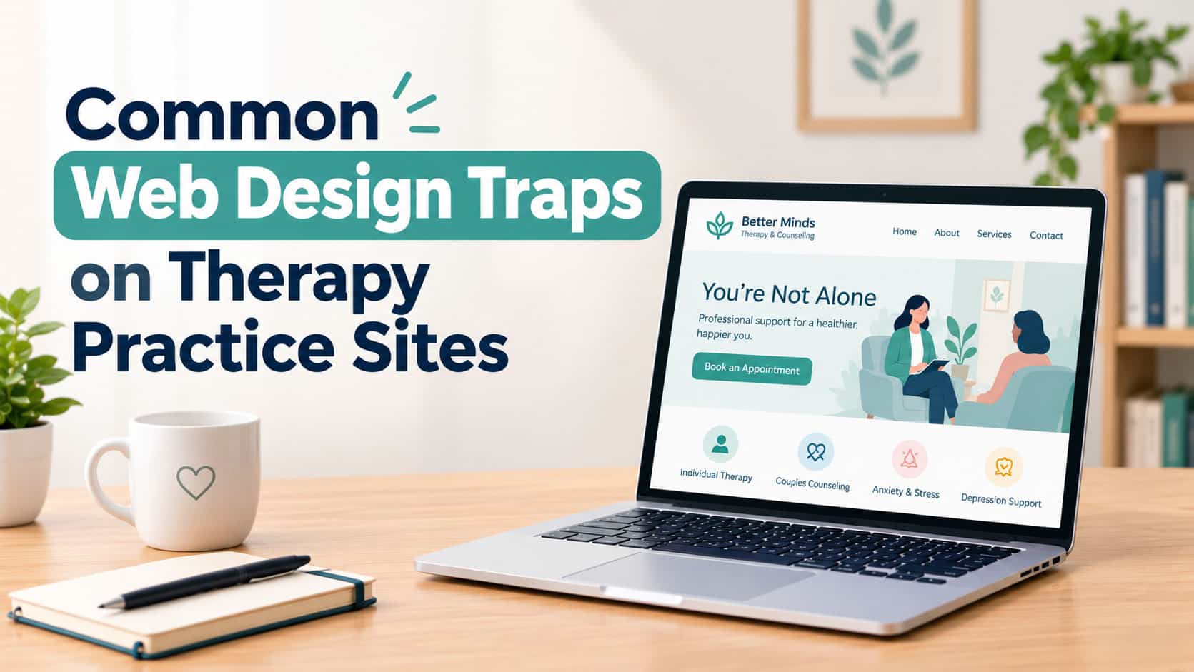
When a prospective client visits a therapy website, they are rarely browsing out of curiosity. More often, they are experiencing anxiety, burnout, relationship strain, or deep personal challenges. In these moments, a practice’s website serves as the first digital touchpoint—a virtual waiting room that sets the tone for the therapeutic relationship.
Unfortunately, many practitioners unknowingly build websites that create emotional distance or technical friction. From cold clinical jargon to hidden contact buttons, subtle design errors cause overwhelmed visitors to leave. Correcting these five common web design traps ensures your online presence radiates warmth, builds trust, and smoothly guides individuals toward care.
1. Overloading Visitors with Clinical Jargon and Cold Layouts
Quick Answer: Using dense academic terminology and sterile clinical layouts creates emotional distance, preventing prospective clients from feeling understood.
Therapists invest years mastering specialized modalities like CBT, EMDR, and psychodynamic processing. While professional expertise is vital, filling your homepage with dense clinical explanations alienates visitors who are simply seeking relief.
A strong therapist website user experience prioritizes empathy over textbook definitions. Instead of opening with clinical terminology, address the visitor’s experience directly:
- Focus on Client Feelings: Use warm, conversational language that validates struggles (e.g., “Feeling overwhelmed by stress?” rather than “We specialize in GAD interventions”).
- Use Authentic Imagery: Replace generic stock photos of smiling models with warm images of your actual office space or approachable headshots.
- Cultivate Calming Visuals: Choose soothing color palettes—such as soft blues, warm earth tones, and muted greens—that evoke safety.
2. Hiding Booking Pathways and Contact Information
Quick Answer: Obscuring contact forms, phone numbers, or consultation links increases user friction, leading anxious visitors to seek help elsewhere.
Deciding to reach out for mental health support requires courage. If a visitor has to search through drop-down menus or hunt for a contact form hidden at the bottom of a page, their motivation rapidly declines.
Executing effective mental health clinic conversion optimization relies on eliminating unnecessary friction in the booking journey:
- Prominent Header Call-to-Action: Place a clear “Schedule a Consultation” button in the top right corner of your navigation menu on every page.
- Transparent Expectations: Outline what happens after they click (e.g., “Step 1: Brief form, Step 2: 15-minute call, Step 3: First session”).
- Multiple Contact Options: Offer a secure contact form, a direct phone line, and an online scheduling portal to suit different preferences.
3. Neglecting Mobile Optimization and Page Speed
Quick Answer: Slow load times and unformatted mobile layouts frustrate visitors accessing your site from smartphones during stressful moments.
More than half of all web traffic originates from mobile devices, and individuals searching for mental health support frequently do so discreetly from their phones during lunch breaks or between daily responsibilities. If your website takes more than three seconds to load or displays overlapping text on mobile screens, prospective clients will leave immediately.
Optimizing for mobile users involves ensuring text remains legible without zooming, touch targets (buttons and links) are easily tappable with a thumb, and images are compressed to load instantly over mobile data networks. A seamless mobile experience reflects professional reliability and care.
4. Failing to Optimize for Local Search and Technical SEO
Quick Answer: Neglecting local search signals and technical SEO makes it difficult for nearby clients actively searching for therapy to discover your practice.
Even the most compassionate website cannot help clients if it remains invisible in search results. Because therapy services are tied to state licensing boundaries and physical office locations, ranking for local search queries is essential for practice growth.
Adhering to private practice web design best practices means building a solid search foundation. Partnering with digital marketing specialists for targeted Utah small business SEO helps mental health clinics establish local relevance, optimize Google Business Profiles, structure local schema, and rank for high-intent queries like “family counselor near me.” Technical optimization connects your site with local individuals actively seeking help.
5. Visual Clutter, Walls of Text, and Poor Layout Hierarchy
Quick Answer: Overcrowded pages and unbroken text blocks induce cognitive overload, making it difficult for stressed visitors to process information.
When people feel anxious or emotionally exhausted, their cognitive processing capacity drops. Presenting visitors with dense text walls, competing pop-up banners, or chaotic menus induces decision paralysis.
To create an inviting layout:
- Embrace White Space: Leave generous blank space around text blocks and images to give visitors’ eyes room to rest.
- Break Up Text: Use short paragraphs, clear section headers, and bulleted lists to make information skimmable.
- Limit Main Menu Items: Restrict your main navigation menu to 4–6 core pages (e.g., Home, About, Services, Specialties, Contact).
6. Comparing Therapy Website Design Strategies
| Design Element | Flawed Practice Website | High-Converting Practice Website |
| Headline Tone | “Evidence-Based Psychotherapeutic Solutions” | “A Safe Space to Heal, Grow, and Thrive” |
| Call to Action | Hidden “Submit Inquiry” text link | Prominent “Book Free 15-Min Call” button |
| Imagery Choice | Stiff, generic stock photo of hand-holding | Warm, authentic photo of welcoming office |
| Mobile Experience | Pinch-and-zoom text, slow loading | Fast, responsive, thumb-friendly tap buttons |
| Navigation | Overcrowded menu with 12 sub-items | Clean 5-item menu with clear user pathways |
7. Myth vs. Fact: Therapy Practice Websites
- Myth: Therapists should list every clinical modality and condition they treat on the homepage.
- Fact: Overloading the homepage causes confusion; focusing on core specialties and client feelings creates a stronger initial emotional connection.
- Myth: An effective therapy website requires expensive custom animations and interactive pop-ups.
- Fact: Intricate animations and aggressive pop-ups can feel overwhelming; simple, fast, and calm designs build greater trust with therapy seekers.
Frequently Asked Questions
How can therapists make their website feel more welcoming?
Therapists can create a welcoming tone by using warm, conversational language, displaying authentic photos of their office environment, including a short introductory video, and keeping the page layout clean and uncluttered.
Should therapists display their pricing and insurance information on their website?
Yes. Transparently listing fees, accepted insurance plans, or out-of-network superbill options removes financial uncertainty and saves time for both the prospective client and the practice during intake calls.
Your therapy practice website is more than a digital business card—it is an extension of your therapeutic environment. By avoiding clinical jargon, streamlining booking pathways, optimizing for mobile devices, strengthening local SEO, and embracing clean visual layouts, you transform your website into a calming, supportive resource. Building an intuitive, empathetic online presence ensures that individuals seeking support feel seen, heard, and empowered to take the first step toward healing.
