
Bingoplus and the Rise of Inclusive Mobile Experience Design
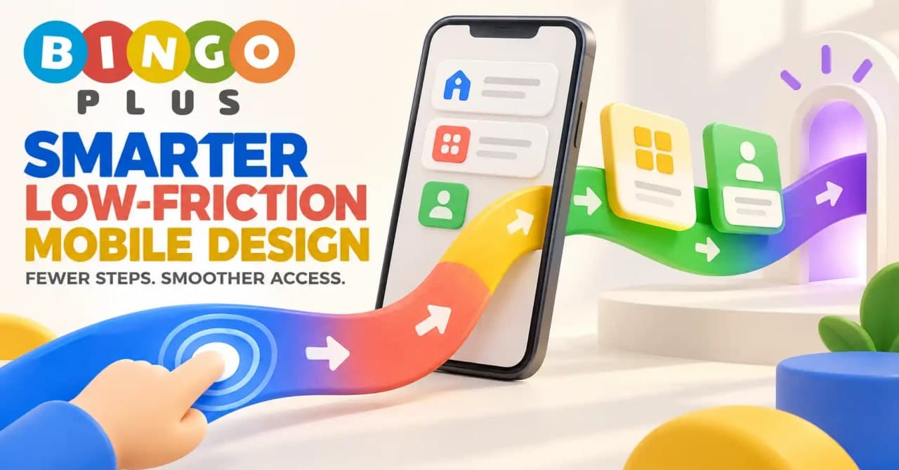
Bingoplus serves a mobile audience with different devices, connection speeds, technical abilities, and accessibility needs. An inclusive digital experience should therefore do more than fit content onto a smaller screen. It should make information understandable, controls recognizable, and important actions manageable for as many eligible users as possible.
For audiences in the Philippines, this approach can improve confidence across Android phones, iPhones, and tablets. Readable typography, clear instructions, adaptable layouts, descriptive feedback, and straightforward support routes help reduce exclusion while creating a mobile environment that feels consistent, respectful, and easier to understand.
Understanding Inclusive Mobile Design
Inclusive mobile design considers how people with different abilities and circumstances interact with an application. It recognizes that users do not have identical eyesight, hearing, movement, language skills, devices, or levels of digital experience.
Accessibility is part of this idea, but inclusion extends further. It also covers older devices, smaller displays, slow connections, temporary injuries, bright outdoor environments, and users who are opening the app for the first time.
Accessibility Is Not a Separate Feature
Accessibility works best when it is included in the main product experience. If readable text, logical headings, and understandable controls are treated as optional additions, users may encounter barriers before they can activate the settings they need.
A more inclusive approach builds clarity into the default journey. Additional preferences can then give users greater control without making the basic interface difficult to use.
Different Users Encounter Different Barriers
A design that works well for one person may create difficulty for another. Small text may be manageable on a large tablet but unreadable on a compact phone, while closely positioned buttons can be challenging for users with limited hand movement.
Common barriers include:
- Low color contrast
- Small touch targets
- Unclear icons
- Rapid animations
- Long blocks of text
- Instructions based only on color
- Forms without descriptive labels
- Error messages that disappear too quickly
Recognizing these barriers helps platform teams improve the entire experience rather than addressing isolated complaints.
Temporary and Situational Needs Matter
A user does not need to have a permanent disability to benefit from accessible design. Someone using a phone under bright sunlight may need stronger contrast, while a person holding a device with one hand may depend on larger controls.
Slow mobile data, a noisy location, or a cracked screen can also change how someone interacts with the Bingoplus app. Inclusive design supports these everyday situations as well as long-term accessibility needs.
Core Elements of an Inclusive Bingoplus Experience
An inclusive mobile journey is created through many small decisions. Typography, navigation, language, feedback, and device compatibility must work together.
Readable Typography
Text needs sufficient size, contrast, and spacing to remain legible on different screens. Users should not have to zoom repeatedly just to understand a menu, account notice, or support instruction.
Readable content typically uses:
- Clear typefaces
- Comfortable line spacing
- Short paragraphs
- Descriptive headings
- Strong text-to-background contrast
- Limited use of all-capital lettering
- Flexible layouts that support text scaling
These practices help users scan information and identify important details more efficiently.
Controls Designed for Touch
Mobile users interact with fingers rather than precise mouse pointers. Buttons and links should therefore provide enough space for accurate selection.
Important controls should not be crowded together. A user attempting to open account help should not accidentally activate an unrelated action because the touch targets are too small or too close.
Icons With Clear Labels
Icons can make an interface more compact, but their meanings are not always universal. A symbol that seems familiar to a designer may be unclear to a new user.
Combining icons with short text labels reduces uncertainty. “Support,” “Account,” “Home,” and “Sign Out” communicate purpose more directly than unexplained symbols alone.
Logical Navigation Order
A predictable navigation structure allows users to understand where they are and how to return to a previous section. This is useful for everyone and especially helpful for people using assistive technologies.
Related functions should be grouped together. Account access, profile settings, transaction information, support resources, and responsible-use controls should not be scattered across unrelated menus.
Plain-Language Instructions
Technical language can create an unnecessary barrier. Instructions should explain what the user needs to do, why an action is required, and what happens next.
For example, an account verification message should identify the required step without exposing sensitive information. It should also remind users that passwords, PINs, and one-time verification codes must remain private.
Feedback That Uses More Than Color
Color can reinforce meaning, but it should not be the only indicator of success or error. A red border without an accompanying message may be difficult for users with color-vision differences to interpret.
A better response combines color with text, symbols, and clear instructions. Users should know whether an action succeeded and how to correct a problem.
Adaptable Motion and Visual Effects
Animation can guide attention, but excessive movement may distract users or cause discomfort. Important information should remain understandable even when motion is reduced.
Animations should not block navigation or make controls difficult to select. Visual effects work best when they support the task rather than competing with it.
How Inclusive Design Differs From General Mobile Optimization
Mobile optimization and inclusive design are connected, but they are not identical. Optimization often focuses on screen size, loading speed, and device compatibility, while inclusion asks whether people with different needs can successfully use the experience.
Responsive Layout Versus Accessible Layout
A responsive page rearranges content to fit a screen. An accessible layout also preserves reading order, text clarity, control labels, and keyboard or assistive-technology compatibility.
Content can fit perfectly on a phone and still be difficult to use. Visual adaptation must be accompanied by understandable structure.
Fast Loading Versus Complete Understanding
Performance matters, especially for users relying on mobile data. However, a rapidly loaded page with unclear instructions does not provide an effective experience.
The goal is to deliver essential information quickly and present it clearly. Decorative assets should not delay account guidance, support information, or required notices.
Personalization Versus User Choice
Personalization may adjust content according to a device, language preference, or previous activity. Inclusive design ensures that users can still understand and control those changes.
Automatic decisions should not hide essential options. People need visible ways to review settings, change preferences, and reach the same important information.
Simplicity Versus Oversimplification
Simple interfaces reduce mental effort, but oversimplification can remove context that users need. Eligibility requirements, privacy information, account warnings, and responsible-use guidance should remain available.
A strong design organizes these details in layers. It presents the central message first while allowing users to open further information when necessary.
Frequent Accessibility Concerns in Mobile Applications
Mobile accessibility problems are not always obvious during ordinary testing. They often become visible when users increase text size, use screen readers, rotate devices, or access the service through older hardware.
Text Becomes Cut Off
Fixed-height containers may hide information when system text is enlarged. Buttons can also become unreadable if labels do not have enough space to wrap.
Flexible components should expand with their content. Essential instructions must remain visible at supported text sizes and screen orientations.
Screen Readers Cannot Interpret Controls
An image or button without a descriptive label may be announced incorrectly or ignored by assistive software. This makes navigation difficult for users who cannot rely on visual cues.
Controls should have meaningful names that describe their purpose. Decorative images can be excluded from the reading sequence so they do not create unnecessary noise.
Forms Are Difficult to Complete
Account forms become frustrating when field labels disappear after typing, errors are not explained, or the keyboard type does not match the requested information.
Persistent labels and specific guidance make forms easier to complete. Sensitive fields should also explain privacy expectations without asking users to reveal credentials through unofficial channels.
Device Instructions Are Too Generic
Android phones, iPhones, and tablets may follow different installation or permission workflows. A single set of vague instructions can create confusion.
When users need platform-specific guidance rather than instructions copied from an unknown third-party source, the Bingoplus app destination offers a more appropriate starting point for identifying supported device routes and understanding the official access process before downloading software, changing security settings, or entering any account information.
Support Is Hard to Find
Accessibility barriers become more serious when users cannot locate assistance. Support routes should be visible from relevant parts of the mobile journey.
Help content should use plain language and explain common issues step by step. Users should not be required to understand technical terminology before they can describe a problem.
Practical Ways Users Can Improve Mobile Accessibility
Platform design carries the main responsibility, but device settings can also make the experience more comfortable.
Review Display Settings
Most modern phones provide controls for text size, display scaling, color adjustment, brightness, and contrast. Users can test these settings to find a combination that suits their needs.
Changes should be checked across important app sections. If enlarged text hides controls or instructions, the issue should be reported through an official support route.
Use Built-In Assistive Features
Android and iOS devices may include screen readers, magnification, voice input, switch controls, caption settings, and reduced-motion preferences. Availability varies according to the device and operating-system version.
Users should activate only features that help their individual workflow. Official device documentation can explain how each accessibility option works.
Maintain a Clear Device Environment
Too many background applications, limited storage, and outdated software can affect mobile performance. Keeping the device organized may improve both speed and stability.
Users should install updates from trusted sources and review requested permissions. An entertainment application should not require unrelated access without a clear explanation.
Protect Account Information
Accessibility assistance should never require a user to disclose a password, PIN, or one-time verification code. Anyone helping another person navigate the app should respect account privacy.
Useful safety habits include:
- Checking the complete domain
- Using a secure screen lock
- Keeping verification codes confidential
- Avoiding unknown download mirrors
- Signing out of shared devices
- Contacting official support for account problems
Establish Responsible Boundaries
Accessible design makes a platform easier to use, but participation should remain intentional. Users can set personal time and spending limits before opening the application.
Bingoplus services are intended for eligible adults aged 21 or older, subject to applicable terms and local requirements. Chance-based entertainment involves financial risk, and no outcome is guaranteed.
Frequently Asked Questions
What is inclusive mobile design?
Inclusive mobile design creates experiences that can be understood and operated by people with different abilities, devices, environments, and levels of technical knowledge.
Is mobile accessibility only for people with permanent disabilities?
No. Accessible features also help people facing temporary injuries, bright lighting, noisy environments, slow connections, small screens, or other situational limitations.
Why should mobile buttons include text labels?
Text labels explain what a control does and reduce dependence on visual interpretation. They can also improve how assistive technologies announce interactive elements.
Can I enlarge text when using the Bingoplus app?
Available text controls depend on the device and application design. Users can review system display settings and confirm that important content remains visible after scaling.
Why should error messages use text as well as color?
Not everyone interprets color in the same way. Written explanations clarify what happened and tell users how to correct the problem.
How can I find the correct Bingoplus app source?
Begin with an official Bingoplus destination and inspect the complete domain before downloading anything. Avoid third-party mirrors with unclear ownership, outdated files, or unusual permission requests.
Do Android and iPhone installation steps differ?
Yes. Android and iOS use different installation, permission, and security processes, so users should follow instructions written for their specific platform.
Can a screen reader work with every mobile application?
Compatibility depends on how the application labels controls and structures content. Unlabeled buttons, incorrect reading order, and image-based text can create barriers.
What should I do if an accessibility feature does not work?
Document the affected screen, device model, operating-system version, and accessibility setting, then report the problem through an official support channel without sharing private credentials.
Does easier access change the financial risks of participation?
No. Accessibility improves usability but does not influence outcomes or remove financial risk. Users should maintain firm limits and participate only with funds they can afford to lose.
Final Thoughts
Inclusive mobile design gives Bingoplus an opportunity to serve a wider range of eligible users without separating accessibility from the main experience. Readable content, descriptive controls, flexible layouts, device-specific guidance, and clear support routes can benefit both experienced users and people encountering the platform for the first time.
Accessibility should work alongside privacy, security, and responsible participation. Bet responsibly, live a wonderful life: use digital entertainment in moderation, protect essential funds, and remember that every chance-based activity carries risk.
