5 Web Design Mistakes That Will Lead Your Biz To a Disaster

The online world is like a living shapeshifting organism that will never stop evolving. User behavior and popular trends don’t last forever and in this process of evolution, the right approach can quickly turn into a wrong one.
Just take a look at how many websites have received a facelift over the past years due to great new design options like parallax scrolling and mobile browsing surge.
But this also influenced many poor web design choices that have prevented the customers from fully connecting with brands. We all know the attractive website is important, but you can’t let it be an excuse for countless errors, weak content, or poor navigation.
Your website is the foundation stone of your reputation among readers, customers, and investors, so it needs to be neat and functional.
This is what makes the impression about your products and services, but that doesn’t mean you shouldn’t pay attention to the design of your products, too.
Your goal is to show your readers and customers that you care about them so the most important goal of your design should be to meet their expectations and satisfy their needs, no matter what structure you use.
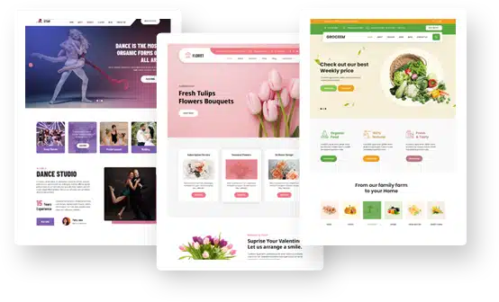
WordPress users might think that they can have everything on autopilot, but the choice of the theme is crucial.
If you want to create a perfect marketing strategy your focus must be on your audience. Since the human eye distinguishes shapes and images before words and their meaning, colors, pictures, and fonts are the primary tools for your storytelling.
There are many pieces of advice online on how to make your design beautiful and user-friendly, but not many people are talking about the traps along the way. We’re here to give you the heads up.
-
No response
The rhythm of our modern lives is rapidly growing. Caught in a turmoil of numerous daily obligations people perform their searches whenever and wherever they can. As a result, more than 50% of your potential customers are browsing on their tablets and smartphones.
This means that you can’t focus just on your desktop layouts – if users are required to swipe or zoom so they can view the entire content they’ll leave your site without thinking for a one that has implemented the responsive web design.
Your website must perform equally well on desktop and mobile. Despite the fact that Google has started to penalize non-responsive sites in mobile searches still more than 80% of the world’s websites haven’t implemented this design. If you’re among them it’s time to correct this mistake.
-
No communication

The design is not only about pretty pictures. Searchers are here primarily for information, and your visuals should turn that information into an engaging story.The biggest mistake you can make is to use confusing metaphors, especially on your home page. Users should understand what your business is about and who you are the moment they enter your website.
If you’re selling umbrellas they need to be implemented into the design. You can’t use artistic images of rainy weather with people who are miserable and wet.
You’re not in the movie industry and in the business world customers are not ready for guessing games – they’re here to find and buy.
Although metaphors seem like a cool and fresh idea you need to be aware that they’re in fact like codes which customers are asked to decipher.
We’ve already talked about the rapidly-growing rhythm of life so you’ll have to find another creative way to present your products in a straightforward way.
-
No story
Although we are more visual beings, this doesn’t mean that written content is not important. Words and visuals need to go hand in hand, especially since the high-quality content is a determining factor when it comes to the ranking criteria of search engines.
All the money you spend on making your website beautiful and sleek will go to waste if the actual writing is treated only as an afterthought.
Disregarding the significance of the written content is the common web design mistake and you can push its value even further by establishing a separate blog using WordPress.
We’ve already mentioned in the introduction that the design of the actual product is equally important – here you can’t express with words so your imagery needs to be top-notch.
Before you establish your open source marketplace make sure that all of your products are telling an engaging and comprehensible story.
Avoid too many features because they’re not a synonym for value. Too many unnecessary features will create the distraction from a primary purpose of the product.
Never skip the prototyping phase because you’ll end up changing design elements after the market release, but also don’t think of a design as a linear process – sometimes you’ll have to retrace your steps so don’t get too attached.
And stay away from the assumptions – conduct a proper research, establish the collaborative environment and involve users in the process.
-
Don’t create the maze of creativity

It’s important to be creative, but we’ve already seen in the case of the metaphors how creativity can backfire at us. The thing that can suffer the most is your navigation.Hidden contacts, hidden menus, and hidden buttons might seem very original, but they’re definitely not practical nor convenient. Your core information mustn’t be hard to find.
There should be clear links leading from the homepage to FAQs, store hours, shipping details, directions, return policies, etc.
Product descriptions and blogs also need to have their sub-menus in the sidebar and a search bar is mandatory.
You need to employ your creativity in a way that will help your customers navigate around easily and improve customer satisfaction as well. I’m aware this is the third time I’m repeating this, but your design should respect the user’s time.
-
Don’t push them too far
We all know that social media is a very powerful way of promoting your brand in the digital world, but it can easily backfire the same as your creativity.
Think of how many times you’ve been pestered on Facebook – you can create the same feeling among your customers.
While the social media icons are needed on your website, you mustn’t place them in annoying popup dialog boxes or create massive buttons right at the top of the page. They are efficient as long as they’re unobtrusive and subtle.


There is nothing that irritates the users more than an element of surprise. Maybe you think that’s a great idea, but they don’t expect pop-ups and autoplay music and videos.
If they want to see or hear something, they’ll click on it. Adobe Flash is an ultimate jump scare because it’s popular among hackers and nobody wants to be put at risk.
Don’t gaze at the stars and fall into a well like the Astrologer in the fable. With new design opportunities, there are also new mistakes lurking from the beautiful imagery.
You need to be able to respond to the demands of your customers and it’s crucial to keep communication open.
The story of your brand will be complete only if the writing complements the design and the creativity is allowed as long as it doesn’t turn into a metaphorical guessing game. And try not to get on their nerves.