
5 Tips for Designing a Mobile-Friendly Website for Better SEO
When a mobile phone or a smart device is used to look for information on the internet, it’s called mobile search.
People often use their phones to find information about things close to them, like businesses or services in the vicinity.
Mobile searches usually look for quick and simple information, such as an address, or phone number, instead of detailed articles.
Why Do You Need a Mobile-Friendly Site?
According to Statista, about 63% of paid Google search clicks in the US originated from mobile. The same trend would doubtless be replicated elsewhere in the developing world.
In many developing nations such as Mexico and India, users have leapfrogged the desktop environment and begun accessing the internet through mobile.
Your website must be mobile-friendly.
- In this guide, we’ll cover five key aspects of designing mobile-friendly websites for better SEO.
- In each section, we’ll include actionable tips.
- In the end, you’ll find a 25-point checklist, which you can use to ensure your website is optimized for mobile.

5 Tips for Designing a Mobile-Friendly Website
-
Use responsive design
Previously, website developers (HTML 3 era) made sites that were 1024 x 768 alone. Better monitors had large vertical stripes on each side and could only be fully utilized if you watched DVD and HD sports broadcasts.
If your website will have 25+ pages, or varying sizes and styles, then engaging a website design service may be better than navigating the learning curve on your own.
Some best practices are:
- Use SEO-friendly and mobile-responsive themes
- Use frontend libraries such as React.js and JSON
- Perform simulated tests for multiple resolutions
Responsive design adjusts the layout and content to fit the screen size and aspect ratio of the device.
The site appears tailor-made for desktop computers, tablets, or smartphones.
-
Optimize for speed
What happens when a site takes too long to load? Users hit the back button and move down the search rankings.
The answer is to generate pages that load fast.
Your approach must include:
- Optimize images: Reduce image file sizes without sacrificing quality.
- Minimize HTTP requests: Combine files to reduce the number of HTTP server requests
- Enable compression: Use GZIP compression to reduce the size of text-based files
- Minimize CSS and JavaScript files: Defer the loading of non-critical files.
- Use a content delivery network (CDN): Serve static resources from a CDN
- Avoid landing page redirects: Redirects can cause an additional HTTP request.
- Optimize the code: Remove any unnecessary elements.
- Use browser caching: Store resources locally in the browser cache.
- Serve resources from a cookie-free domain: Serve static resources, such as images and stylesheets, from a domain that doesn’t set cookies.
- Monitor and test regularly: Continuously monitor and test the page loading speed.
Plugins can often throttle performance. A site with 5 will do better than a site with 15 because additional scripts don’t need to load.
Caching relieves stress on servers and augments website load speed.
You could also ask the website design company to incorporate new design features such as lazy loading.
-
Focus on content
A mobile device is small. Even the largest ones have teeny-weeny screens.
It makes sense if the content is mobile-friendly.
- Break content into paragraphs
- Provide a summary at the top
- Write succinctly and without elaboration
- Industry keyword research is a must.
Most of the advice is self-explanatory for anyone who has spent some time browsing through the web on a mobile.
Long-form content is not suitable for a mobile-friendly website.
The writing has to be brief and preceded by an intro or summary that lays out what the article offers.
Excessive elaboration, subtle arguments, long-winded speeches, and opinions would ensure that visitors bounce back in half a minute. The content written has to be pithy, concise, and direct. There is a big importance to consider future SEO link building strategies in the content creation part, as you may be approached by potential business partners to start an ongoing link building campaign.
Note: Content isn’t limited to the text on your pages. Everything is content. In this light, consider 5 actions:
- Use a clean and minimalistic design
- Make buttons and links large and easy to tap
- Optimize for touch screens
- Avoid pop-ups and interstitials
- Test the website on multiple devices

-
Use mobile-friendly navigation
On a desktop site, the entire space under the address bar is available for navigation. On modern monitors, there is so much space that e-commerce sites tend to use one navigation panel at the top and another to the left.
What to do for a mobile-friendly site?
- Auto-hide navigation bars
- Use hamburger menu
- Make the site at most three levels deep
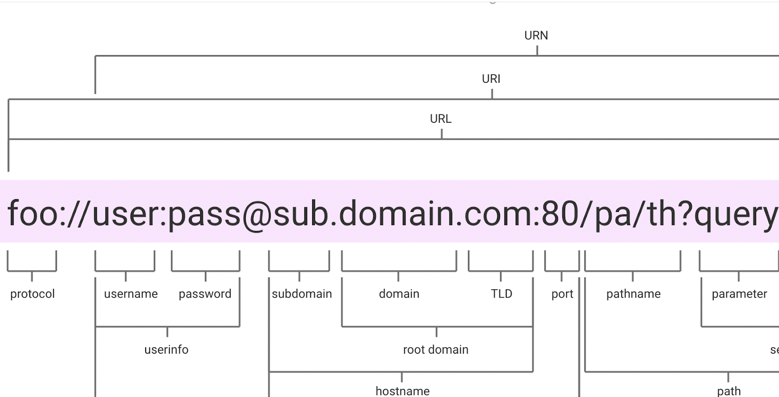
While auto hide and hamburger menus depend on front-end developers and UI/UX consultants, making the site entirely navigable in three clicks requires planning the URL structure carefully.
Use a URL structure that is easy to read and understand, both for users and search engines.
It adds to your SEO efforts when you pay careful attention to URL structure.

-
Declutter the pages
When you design a website, it’s essential to remember that less is more. Adding too many calls to action or navigation options can be overwhelming and lead to a poor user experience. To avoid this, limit the number of actions users can take on a single page.
The best way to do this is by focusing on critical functions that users actively seek, such as contact forms, easily findable. By doing so, you’ll ensure that users can quickly find what they’re looking for and avoid confusion.
Keeping the design simple and using white space is crucial.
A cluttered design can make it challenging to navigate on smaller screens, causing users to lose interest quickly. By removing irrelevant content, you can also save space and create a more organized and streamlined experience.
When it comes to menus, try to avoid long lists of options and features. While an extensive menu might seem like a good idea, it can take up valuable screen space, especially on smaller screens.

25-Point Checklist
Here is a 25-point SEO checklist for mobile websites.
Responsiveness:
1. The website adjusts to different screen sizes and resolutions.
2. Images and videos are optimized for mobile.
3. Text and fonts are easily readable on mobile screens.
4. Forms and buttons are easy to interact with.
5. Test on a variety of devices for ease of use.
Speed:
6. Minimum viable size of media files.
7. Minimum HTTP requests.
8. Compressed text-based files such as HTML, CSS, and JavaScript.
9. Use of content delivery network (CDN).
10. No landing page redirects.
Content quality:
11. All content is relevant to the target audience.
12. Uses clear and simple language.
13. Buttons are easy to tap.
14. Easily shareable on social media. (allowing readers to leave Instagram comments, for example).
15. Regularly updated.
Ease of Navigation:
16. Clean and minimalistic design.
17. As few options per screen as practical.
18. Design elements optimized for touch screens.
19. Search bar.
20. One-tap option to navigate back to the main page.
AMP:
21. All AMP pages are properly structured and validated.
22. Schema markup.
23. Monitor performance.
24. Use the Google Search Console for insights.
25. Compliant with accessibility guidelines.
Last Words
When you set up a mobile-friendly site keep in mind that mobile search is different.
The user is not going to read a lengthy article about economics on a mobile.
They will look for specific data such as an affordable hotel in Dublin or the best barbershop near me.
The site design, menu, navigation, and content must closely relate to that fact.
By following these steps, you can easily build a mobile-friendly website that is highly optimized.