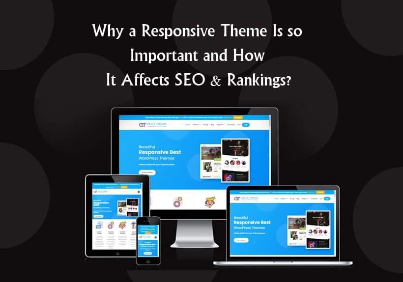
Why a Responsive Theme Is so Important and How It Affects SEO & Rankings?
You’ve probably heard about responsive themes, but do you know what they are or why they’re so important? In this post, we’ll talk about the benefits of having a responsive theme and how it affects SEO and rankings.
What is a responsive theme?
You know what it’s like to go to a website on your phone and see the content all bunched up? Or even worse, you’re forced to zoom in and out every few seconds just to read it properly? That’s because some websites are not responsive; they don’t change with the devices they are viewed on.
A responsive theme changes automatically depending on the device being used. If you view it on a desktop computer, it will look different than if your screen size is smaller (more narrow). The content will adjust so that everything fits perfectly into whatever space is available for viewing.
Responsive themes are also important because they give users a better experience when navigating your site by providing visual cues about where different sections begin/end and how links work — all stuff that makes for more intuitive user interaction with websites!
How does a responsive theme work?
A responsive theme is a WordPress theme that adapts to different screen sizes. Themes are coded using CSS and JavaScript, but some themes are built to be responsive by default, while others can be made responsive through plugins.
The main purpose of a true responsive design is to optimize the user experience for all the devices people use to access your site. A user’s engagement with a site on their desktop computer is likely very different than it would be on their smartphone’s smaller browser window or tablet device’s larger screen. A good example of this can be seen in how people hold up mobile phones while they read an article—they tend not to hold them horizontally like they would do with a tablet or laptop (or even e-reader), but rather vertically so they can see more content at once (similarly, if you look at someone reading something on their phone while sitting down). To take advantage of these different viewing behaviors across various devices requires coding techniques that let the layout adapt accordingly so users don’t have trouble reading text or seeing images clearly anywhere from small smartphone screens all the way up through full HDTVs.
Why is a responsive theme important?
Why is a responsive theme important?
A responsive theme is the best option for creating a mobile site. Mobile websites are more relevant to users and can improve your SEO rankings and overall customer experience, so it’s important to make sure your website has one.
A responsive theme is a one-size-fits-all solution that works across all devices. Responsive themes are designed to adapt and change according to screen size, so they look great on any device.
By having a responsive theme, you don’t have to worry about creating separate mobile websites. You can create one website that works on every device and saves time and money.
What are the benefits of implementing responsive themes?
There are many benefits of implementing a responsive theme, including:
- Your website will be more accessible to users. This will allow them to view your content no matter what device they’re on.
- You can use the same theme across multiple devices, which means you don’t have to create different versions of your website for each device type (iPad, iPhone and desktop). Instead, you can just use one responsive theme that works well on both small screens and large screens.
- You can test different layouts without having to create multiple websites for each layout option you want to test out. For example, if you want to try out three different designs for your homepage, creating three separate versions of it isn’t ideal because it’s time consuming and expensive. With a responsive design though, all three versions would be built into the same site so there won’t be any extra costs once they’ve been created; all you’d need is someone who knows how they work!
How does having a responsive theme affect SEO and rankings?
Having a responsive theme is crucial for SEO and rankings for multiple reasons. First, the user experience when someone searches your site will be much better if it’s optimized for mobile devices. Second, if you have a responsive design, Google can index your site much faster and more efficiently than with non-responsive sites (due to fewer requests from the crawler). Thirdly and most importantly, having a responsive theme means that Google can see your content in its entirety on all devices — which means better keyword targeting potential (and hopefully higher rankings).
Having a responsive design is also crucial for ensuring that your site works on mobile devices. This means that Google can index your site faster, and it will be more likely to show your content in its entirety on all devices (which means better keyword targeting potential).
Responsive themes also make it easier for your site to rank on mobile devices.
Don’t neglect your mobile site.
Given the growing importance of mobile traffic and devices, it’s important that you don’t neglect your site’s mobile version. From 2010 to 2015, mobile internet usage has increased from 5% to 28%. Furthermore, according to Google’s Mobile Playbook for SEO (2017), over 85% of users who land on a page with a broken url will leave the site—or worse—click away from it entirely.
Not only does this mean that your website may be losing potential customers due to technical issues like broken links and slow load times, but it also means that you risk hurting your rankings in Google SERP listings. In fact, there is evidence indicating that Google penalizes sites with slow load times and other technical problems by removing them from their search results altogether!
Conclusion
As we’ve seen, responsive design is definitely a trend that you want to keep an eye on. It’s becoming more and more important for websites to be mobile-friendly and it doesn’t matter if they are using a CMS like WordPress or an alternative platform – they need to have a responsive website. As a marketer or webmaster, you can use this information to make sure that your website is not just functional but also optimized for mobile devices so that visitors will have the best experience possible!