What are the Tips and Tricks in Web Design Techniques?

Do you have a very high bounce rate? If you find yourself answering ‘Yes’, then it is the time to take a deep look at the way you’ve been designing your website.
Because it affects how your audience values your brand. The influence you make on them can either get them to remain or to leave your site.
According to a recent web development app stats, nearly 48% of people say that the website design is the key factor in determining a company’s credibility.
If a website is not designed effectively so as a consequence, it also influences conversions, bounce rate, and more. The layout of your site can engage your visitors as it takes only fewer seconds to leave an impression on users.
Great website design is the need of an hour, so it is very important to pay attention to the layout and structure of your site.
On this note, here in this write-up, I will mention some website tips to make sure that you are going in the right direction and assure that you are not turning away visitors. So let’s start now!
Best Web Design Tips and Techniques For Your Website
Web design is something that everyone has to deal with in the managerial end of a business. Here you will find some great tips and tricks to improve the design of your website.
1. Keep your Website’s Homepage free of clutter
A cluttered screen is one of the most common mistakes in web design. Many people simply throw what they want on their website on the screen without knowing any better, but using a snipping tool on Mac can help capture and organize content more effectively.
If you include too many distracting elements on your site, your visitors will have difficulty seeing where to look and you will end up losing a consistent experience. Conversely, if you include only the necessary elements, those elements are more powerful as they do not need to share the centre stage.
Did you know that 86% of visitors want information about products or services on the homepage? The homepage of your website should communicate your original message immediately. After all, we rarely read every word on a website. Instead, we quickly scan the page by looking at sentences and pictures.
There should be a clear path for the user to follow in order to make an effective web design. There are many different ways to achieve this, but the first step is to always make room for higher priority elements by removing lower priority ones.
Just follow the simple website design tips given below to make for a presentable homepage design:
- Space out your content
- Add imagery
- Include a call-to-action button
With these known behaviours in mind, it is better to take help from the web development company in Bangladesh. They will help you design websites that maximize conversions with low bounce rates.
2. Design with Visual Hierarchy
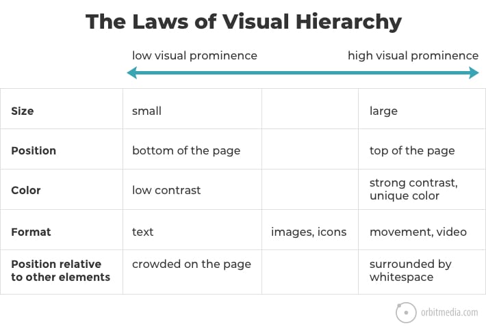
There is a visual hierarchy on every page. The visual hierarchy refers to the arrangement, shape, colour, and contrast of visual elements. This determines their relative prominence and the order in which your user sees.
You can achieve visual hierarchy by presenting a large and bold title at the top of the webpage, and the small legal information below to prioritize certain elements over others.
Web design is not just about adding elements to your website, but also how you add it matters a lot. Web designers use a visual hierarchy, which draws audience attention to key elements. Elements such as position, size, visuals, and contrast can all increase or decrease engagement.
Take a look at this chart that is showing how to attract or deflect attention.

By combining aspects their effect increases manifold. Everyone will see a large video, which is high on the page. Some people will see low contrast text around images.
The visual hierarchy is so that your eyes follow a certain path on every page you visit on the Internet. When used intentionally, it captures the visitor’s attention through a series of messages towards the call to action.
3. Make Easy Navigation

While designing a website, navigation is the key, it is basically a map that displays the main locations that users visit. There is nothing worse than a site with a cluttered or confusing navigation interface. When improving the navigation of your website, it is important to ensure that your visitors can easily find exactly what they are looking for.
Do you know that 50% of website visitors initially use the navigational menu? If users cannot find what they are looking for, then they will not stay for a long time on your site. Instead, they will quickly bounce and look for a site that offers a better customer experience.
Some best web design tips and techniques to improve the navigation of your site are to use the menu bar, include a button that people can click on from any other page to return to their homepage and use an informative footer.
A common website design tip is that your company’s logo should appear in the top left corner of every page. The logo must be clickable and link back to the homepage so that users can easily return to where they end up on your site.
4. Make it mobile-friendly

Did you know that about 94% of people judge a website based on their mobile-friendliness? Yes, you heard that right. Therefore, it is always better to optimize your site for mobile devices
Tailoring your site to meet the needs and desires of your visitors is a necessity. You might be thinking why would anyone access my site on mobile? What will they look for?
The truth is that nowadays people do the most browsing on their mobile phones. Therefore you need to ensure that your mobile site is in peak condition. Not only for your user but also for Google.
You need to make your site “mobile responsive”. It indicates how well your site appears on small screen devices. If your website is not optimized for mobile devices. then your visitors will not have a pleasant experience using your website. Hence, your mobile version should be a top consideration from the beginning.
5. Make Use of Motion UI
Companies are looking for creative ways to stand out from the crowded web. Motion UI is something that provides dynamic graphics and animation for interactive web design.
In short, it can differentiate your web app design even with a minimalistic website by providing an intuitive interface. And if you do proper research and implementation, it can do wonders for your site’s conversion rate.
Motion UI is one of the best web trends, as it gives you a simple solution to attract visitor attention. With the Motion UI Library, you can include animated charts, background animations, hovers, and eye-catching headers.
In the context of web development, the Motion UI is considered as a fast-growing library as it allows developers to quickly animate content even without a solid base in JS or jQuery library.
Using motion UI elements will not only make your website stand out, but it will also increase user engagement by encouraging active user interaction and improving the usability of the site. This is an added benefit for developers as they get many options to design a functional and remarkable website.
6. Use eye-catching images
Each image will not correspond to the type of message you are going to fit in to reflect your message. Luckily, you have a lot to choose from. But still, this is the reason why many of us have decided to demolish our website with very lewd pictures.
Just because a stock website has an image, it does not mean it is genuine and it will build trust in your company. Too many pictures on any website can distract people, you must take some time to upgrade the image quality of your website.
It would be worth it to invest in high-quality product photography. Blurry or low-resolution photos are unprofessional and can ruin your chances of obtaining valuable users.
If actual photos are not an option, don’t worry. Stock photography has come a long way and many free stock pictures are readily available. There are techniques using which you can choose the right type of stock photo.
This will help bring more realism to your brand and ensure who you are and what your content is telling. Designing your website with some high-quality images is a much better method than loading it with plenty of low-quality pictures.
7. Use White Spaces Strategically

Whitespaces, also known as negative space, refers to the blank areas around elements of a web page that are empty and lacking content or visual items. It is an essential design element that helps you break the page and increase readability.
Although the extra space may seem exaggerated, effective use of white space can bring a huge change in the readability and content priority. It also plays an important role in the design process and positioning of website design elements.
If your website is closed with too much multimedia, then it may happen your visitors may get distracted by key conversion points and are more likely to exit your site without action. Embedding your site with white space can really work wonders in improving your bounce rate.
Conclusion
In the above article, I have described some of the best web design tips and techniques to include in your site. It is one thing to read web design techniques, but it is another thing to implement them completely on your site. The tips and tricks mentioned above are all very thorough.
Only professionals can really appreciate the nuances of these areas. So, you can hire web developer in India who understand these web design principles intuitively and guide in creating a great design of your site. I hope the tips and tricks will help you improve your website design.


