WordPress Design Mistakes That Are Killing Your Website Traffic and SEO
Website design can make or break your brand. WordPress and website design have always gone hand in hand ever since the dawn of this CMS cum website builder came into existence.
While a good website design can make the right first impression, the wrong design elements can avert traffic and turn off visitors.
It is no longer enough for companies to design useful products and only invest in offline sales services for brownie points.
After the advent of digital marketing and online services, companies have found it mandatory to pay more attention to their website designs to capture the attention of their audience.
Website design and WordPress: a long-standing relationship
Website design has become incredibly easier with WordPress on our friend list. Nonetheless, the outcome of the design process depends on the prowess of the developer and his understanding of the immediate market.
Designers and marketers no longer work in silos, and it is necessary that the design of your website convey this fact. There are several mistakes even the experienced designers and developers make.
In fact, according to the latest SEO Website Audit of popular sites, you might be making some of them right now!
Here is a list of the mistakes you must always avoid while designing your next website –
Including too much content on one page
Yes, we have all heard it a million times – content is king, but there is something as too much content. About 76% of your users believe that your website needs to look good and feel good, to be good!
They do not like a whole bunch of information cluttering up the homepage. If there is too much content on the home page, your readers will never know which one to focus on first.
You need more focus on visual hierarchy and design to highlight the most critical bits of content. For example – if there is a promotion or discount you want to highlight, you need to feature it on the slider or banner.
You can also use bolder colors and bigger fonts to draw immediate attention to it. Amazon does an excellent job of content distribution and design to attract user attention. The key is to have faith in simplicity and be consistent with your choices of fonts.
White Space to reduce clutter
There is nothing called the “wastage of white space.” You can distinguish between two offers and products with the right use of negative space. Use of white space keeps your website layout neat.
Even when you utilize bright colors and heavier fonts, the use of negative spaces can always help your site look cleaner.
They are instrumental in drawing more attention to call-to-actions. The goal of using white space is to emphasize on what’s more important. Google does a marvelous job of this – think of the main Google search engine page.
The page is nothing but white space, and this allows the user to focus on something that is the most important – Google’s search function!
Don’t run after transient trends
Transient trends are present everywhere, and even WordPress is not devoid of these fads. Parallax design is just one of them. It is excellent for single page websites, and it creates an entirely immersive experience for the users.
However, Google does not take very kindly to parallax design elements and sites using them. No doubt, it looks great, but it can harm your SEO efforts.
Almost all websites get the majority of traffic from mobile devices. Can you think of scrolling a webpage endlessly while looking for a particular feature or information on a mobile? We certainly can’t!
It is challenging to rank for several keywords and topics when you smoosh them into a single endless page. You instead need the more prominent traffic magnets like responsive design and retina displays.
These also contribute to SEO and earn brownie points from the search engine bots. Having a responsive theme allows websites to render on multiple devices of various dimensions and resolutions.
Endnote
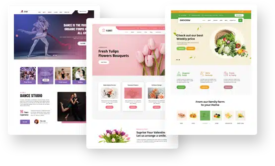
The easiest way to avoid this faux pas is by opting for ready-to-use themes from reliable WordPress theme designers. Always go for the premium themes after a brief trial.
Going premium unlocks several features including site customizations, monetization, customizable URLs, extensible storage, ad-free performance and custom domain.
The most significant advantage of using WordPress is the unabated access to community support.
The community can help all developers find new plug-ins, troubleshoot existing glitches in design and function, and allow the designers to understand how to pick the right themes for their unique needs.