Top 7 AI Tools to Create Stunning Visuals for Your Website in 2026
Great visuals are the difference between a website people skim and a website people stay on. A strong hero image sets the mood. A clear diagram saves readers time. A sharp product shot builds trust. The good news is that AI tools today can help you create all of these without hiring a full creative department.
The trick is choosing the right tool because “AI visuals” is no longer a single category. Some tools specialize in artistic imagery. Some focus on realism. Some help you communicate information clearly. And some are meant for UI and layout ideas, not images.
Below is a carefully researched list of the best AI tools to create visuals for websites.
Top 7 AI Tools to Create Stunning Visuals
Each tool below serves a distinct purpose on a website. Instead of trying to do everything with one AI tool, this list helps you choose the right one based on the kind of visual you need.
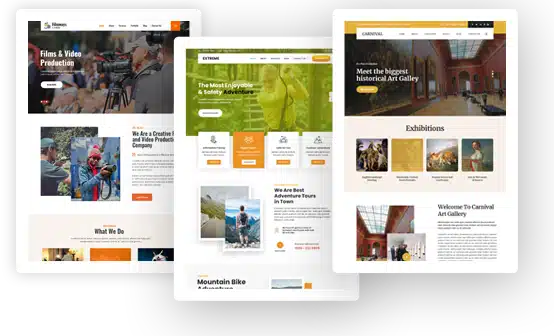
1. Venngage (Best for website diagrams, explainers, comparison visuals, and information-led sections)
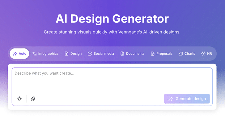
Venngage is an AI-powered graphic design tool for creating website-ready visuals like feature explainers, infographics, process diagrams, step-by-step flows, and comparison graphics. You can add them to landing pages, feature pages, SEO blog posts, and resource hubs when a wall of text is going to lose the reader.
With Venngage’s AI Design Generator, you can turn product messaging into clearer on-page visuals. For example, map a feature into a simple “how it works” flow, replace a long explanation with a clean diagram, or build comparison visuals for alternatives and pricing pages.
Where it shines
Venngage helps maintain brand consistency across website visuals as you publish more pages. You can apply the same fonts, colors, icons, and layout styles across landing pages, feature pages, SEO blog posts, resource hub content, and downloadable assets, so your visuals follow one brand system even when multiple people are creating them.
Where it is less ideal
It is not designed for artistic hero images or atmospheric visuals.
Pricing
Free plan available, with premium plans starting at $19/month.
2. Midjourney (Best for website hero images and high-impact brand imagery)
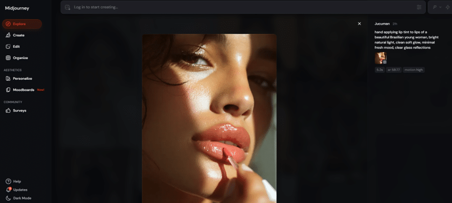
Midjourney is an AI image generator that’s strongest when you need website visuals with style. Think homepage hero images, campaign landing page banners, editorial-style illustrations, and background imagery that sets a clear mood. If your goal is to make a page feel premium, creative, or story-led, Midjourney is one of the best tools for that job.
It is less suited for “exact” visuals. If you need a product to look precisely like the real thing, or you need readable text inside the image for a website header, Midjourney can be hit or miss.
Where it shines
Midjourney produces cinematic lighting, rich textures, and imaginative compositions. It creates artistic visuals that feel handcrafted, making it ideal for concepts, landing pages, or brand narrative scenes.
Where it is less ideal
It struggles with accuracy. Text inside images, specific product details, and brand elements can distort. The Discord-based workflow also takes time to get used to.
Pricing
Paid plans start at $10/month.
3. Gemini (Best for realistic website visuals and clearer text in images)
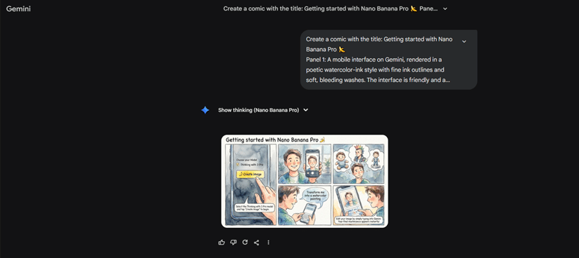
Gemini works best for realistic visuals that need to look “website-ready” without a lot of prompt wrestling. It handles everyday scenes, clean objects, and natural lighting well, and it’s one of the better options when you need readable text inside an image. Use it for product sections, lifestyle imagery, and banners where the visual needs to feel accurate and clear.
Where it shines
Gemini handles realistic scenes, objects, and readable text exceptionally well. It is ideal for product shots, lifestyle imagery, and visuals that need clarity without fanciful interpretation.
Where it is less ideal
It is not meant for cinematic visuals. If you want mood-heavy, dramatic images, Midjourney still does it better.
Pricing
Available through Google AI Premium starting at $19.99/month.
4. Adobe Firefly (Best for commercial-safe, polished brand visuals)
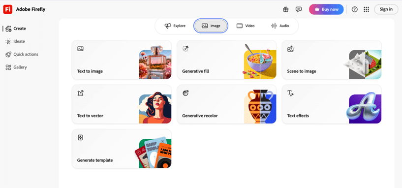
Adobe Firefly is best for teams that need website visuals that look polished and are safe to use commercially. You can generate images and then edit them right inside Photoshop or Illustrator, which makes it easy to clean up details, match your brand, and export final assets without jumping between tools.
It works well for marketing visuals, lifestyle images, and branded graphics where consistency matters more than experimental style.
Where it shines
Strong integration with Photoshop and Illustrator. Great for lifestyle scenes, product shots, branded assets, and anything that requires consistency and polish.
Where it is less ideal
The outputs often look very “clean” and controlled. This is great for professionalism, but less exciting if you want expressive or experimental imagery.
Pricing
Included within Adobe Creative Cloud, starting at $9.99/month
5. DALL·E 3 (via ChatGPT) (Best for quick website illustrations and content visuals)
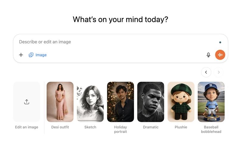
DALL·E 3 is an image generator you can use directly inside ChatGPT to create simple website visuals while you are working on content. It is commonly used for blog header images, section illustrations, background visuals, and lightweight graphics that support written content. Because it follows natural language prompts closely, it works well when you want to describe a visual in plain terms and adjust it quickly.
For website teams, DALL·E 3 is most useful during content creation. You can generate visuals as you write, test different ideas, and then refine or replace them later with more polished assets if needed. It is not a full design system, but it helps you move faster when building SEO pages, blogs, and content-heavy sections.
Where it shines
Best for creating simple website visuals quickly while working on content. DALL·E 3 is useful for blog headers, in-page illustrations, and section visuals where the image supports the text and does not need strict brand or design control.
Where it is less ideal
It is not the most advanced tools for realism or stylistic depth. And it is not built for batch generation.
Pricing
Included with ChatGPT Plus at $20/month.
6. Looka (Best for quick, clean brand identity creation)

Looka is designed for founders, small teams, and early-stage businesses that need a professional-looking brand identity quickly. It helps you generate a logo, colour palette, typography pairings, and a coherent brand kit in minutes.
This is extremely useful when launching a website or updating a brand without the time or budget for a full branding agency. Looka gives you a solid visual foundation that you can use across landing pages, ads, and social channels.
Where it shines
Fast logo creation, clean palettes, and simple typography pairings. It is ideal for early-stage brands that need a cohesive identity quickly.
Where it is less ideal
Looka designs can feel template-driven if you are aiming for a highly distinctive or long-term brand identity.
Pricing
Starts at $192 per year for basic brand kit.
7. Figma (Best for UI layouts, wireframes, and product screens)
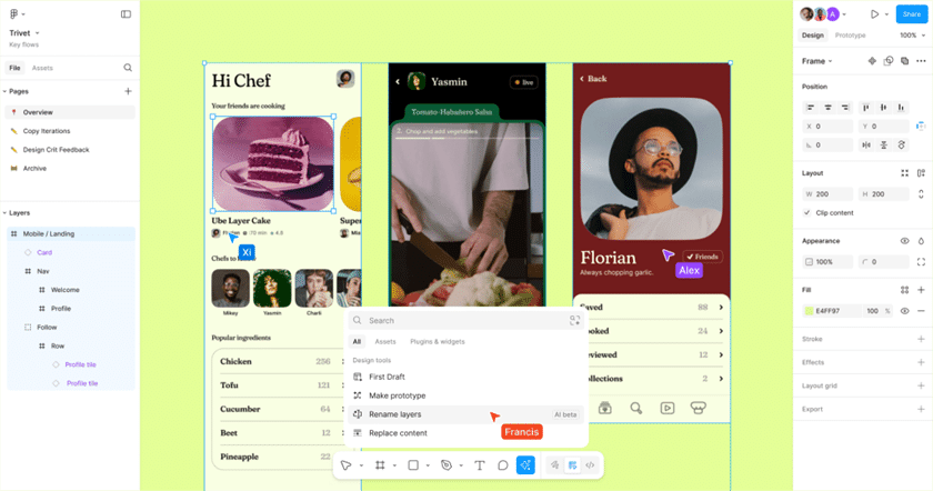
Figma is a collaborative design platform that brings UI/UX visuals to life. With built-in AI features, you can generate layout ideas, refine component libraries, and speed up your design process—all in real time with your team. Whether you’re crafting responsive web layouts or polishing visual details, Figma makes it easy to turn concepts into beautiful, web-ready designs.
Where it shines
It removes the blank-canvas struggle. Figma AI can generate a functional layout instantly, speeding up early design phases.
Where it is less ideal
It will not generate marketing images, artistic scenes, or diagrams. It is purely a layout and UX support tool.
Pricing
Available in paid Figma team plans, starting around $12/month.
How to Choose the Right AI Visual Tool for Your Website
Below is a simple comparison to help you decide which tool fits your goals best.
| Tool | Best For | Pricing |
| Venngage | Website diagrams, explainers, comparison visuals, and information-led sections | Free plan available. Premium plans start at $19/month |
| Midjourney | Website hero images and high-impact brand imagery | Paid plans start at $10/month |
| Gemini | Realistic website visuals and clearer text in images | Google AI Premium starting at $19.99/month |
| Adobe Firefly | Commercial-safe, polished brand visuals | Adobe Creative Cloud starting around $9.99/month |
| DALL·E 3 (via ChatGPT) | Quick website illustrations and content visuals | ChatGPT Plus at $20/month |
| Looka | Quick, clean brand identity creation | Starts at $192/year for basic brand kit |
| Figma | UI layouts, wireframes, and product screens | Paid plans starting around $12/month |
How to Write Better Prompts for AI Visual Tools
Good prompting makes an immediate difference in the quality of your visuals. Most people type a vague instruction and then wonder why the output looks generic. The more intentional you are with your prompt, the more the AI behaves like a designer who knows exactly what you want.
Here are simple ways to get better results.
-
Describe the scene clearly
Be specific about what you want the image to focus on. Instead of saying “person working” say “a person sitting at a wooden desk with a laptop, morning light through a window.” The AI needs context, not abstract ideas.
-
Add style direction
Mention whether you want the look to be realistic, cinematic, minimal, playful, flat, or editorial. This helps the AI understand the visual tone.
-
Include lighting and mood
Lighting changes everything. Bright natural light, soft shadow, cool tone, warm indoor lighting, sunset gradient, or studio clarity will all give you very different results.
-
Use angles and framing
Specify whether you want a close-up, a wide shot, overhead, or eye level. This makes the image feel more intentional.
-
Keep the purpose in mind
Explain where the image will go. A hero banner, a blog graphic, a product section, or a small icon all require different compositions. If the AI knows the placement, the design becomes more functional.
Here are some examples for prompting better
Example 1: Hero Image Prompt (Realistic and Modern)
“A wide hero scene of a bright modern workspace with a laptop open to a website dashboard, soft morning light from a large window on the left, calm neutral tones, gentle shadows, minimal background elements, plenty of empty space on the right for headline text, clear and realistic details suitable for a professional landing page.”
Why this works
- Mentions lighting, style, framing
- Calls out empty space for text
- Sets a clear mood and use case
Example 2: Conceptual Visual Prompt (More Creative)
“A conceptual visual of data turning into a clear path. Abstract flowing shapes on the left represent raw information, transitioning smoothly into a clean, bright path on the right. Soft gradient lighting, modern tech aesthetic, calm colours, balanced composition with space for a small caption.”
Why this works
- Shows controlled creativity
- Clearly communicates an abstract idea
- Still keeps brand friendliness
Example 3: Diagram Prompt for Tools That Can Handle It
“A four-step visual process that explains how a customer moves from sign-up to purchase. Each step is represented by a simple icon, a short label, and a clean shape. Straight reading order from left to right, consistent spacing, modern corporate colour palette, friendly but clear style.”
Why this works
- Helps AI understand structure
- Forces consistency
- Matches real website communication use cases
Common mistakes people make with AI images
AI tools make visual creation easier, but they also create new problems if you are not careful. These are the mistakes that show up most often in websites and brand assets.
-
Using inconsistent styles across the site
Switching between artistic, realistic, and minimal images creates a jarring look. Always decide on a style before generating multiple visuals.
-
Forgetting brand colours and typography
Your brand identity should guide the visuals you create. Without this, images start to feel random and disconnected from your website’s personality.
-
Overdoing artistic effects
Some visuals look impressive in isolation but feel overwhelming on a website. Dramatic images are great for hero sections, but can distract from content in smaller areas.
-
Using images with unreadable text
Many AI models still struggle with text inside images. If the lettering looks distorted, remove it and overlay your real text manually.
-
Generating images that are too busy
Website visuals should guide the eye, not compete with the content. If the viewer does not know where to look, the image is working against you.
-
Adding visuals that do not match your message
Your images should support what you are saying. If your product is clean and simple, avoid overly complex visuals. If your message is bold, avoid flat and lifeless imagery.
-
Ignoring file size and performance
AI images can be huge. Compress your visuals so your website loads quickly and you do not trade aesthetics for speed.
These small mistakes are easy to fix once you become aware of them, and they instantly make your site look more cohesive and intentional.
Create Website Visuals With AI
AI visual tools have changed how websites are built and designed. You no longer need heavy production workflows to create visuals that look polished and thoughtful. What matters now is choosing the right tool for the right moment.
Each tool fills a different role, and the real advantage comes from combining them. Use artistic tools for emotional moments, realistic tools for accuracy, and communication tools like Venngage when your message needs to be understood within seconds.
Pair these tools with intentional prompts, avoid common visual mistakes, and keep your brand style consistent. When you approach AI with purpose instead of novelty, your website becomes clearer, more cohesive, and far more engaging for the people who land on it.