Top 10 Tips to Improve Your Website Right Away to Boost Conversion

The true purpose of a website is to bring in the users and make sure that they stay on the website – either buying your products or consuming your content. This is called conversion.
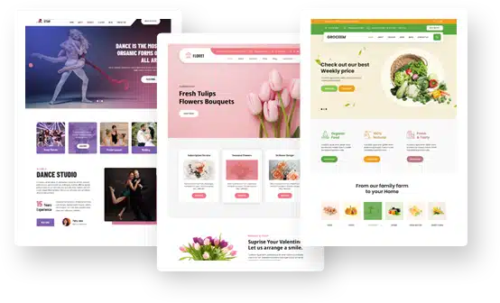
For this, the website should be aesthetically pleasing, informational, engaging, and absolutely functional.
But converting a visitor into a user is not as easy as creating a good-looking website with stellar copy. It takes technical knowledge, time, and the willingness to keep making changes till you hit the spot.
In this article, we’re going to share the most effective ten tips that we have used over and over again to increase website conversions for our clients. And they’ve hit the mark every time.
Optimize the page design based on concrete information
Say you’re in a construction or home improvement business. You have a great website designed but it’s not converting. You may be tweaking the website design for the past couple of months to no avail.
Here’s the secret: Everything on your website must serve a purpose, even if your website boast of a professional construction business logo design. If it doesn’t work, throw it out.
What can be some of the elements that you can discard apart from the logo?
- Pages with negligible amount of traffic
- Old blog posts or news releases
- Articles with no links pointing to it
And so on.
Keeping such content on your website may be hurting your Google rankings.
But instead of just going for an instant clean-up, use some testing tools to figure out exactly which pages or website elements are not working for you. There are dozens of apps and online tools to help you figure this out.
For example, Readability score helps you see how effective your content is so you can make changes accordingly. Similarly, a free tool like Attrock Meta Tag Analyzer can help you pinpoint and resolve meta tag issues that might be hindering your SEO performance. There are mapping apps to show you visually the website areas where your customers are spending most and least of their time.
Sometimes, placement of logos, or even the designs of logos, and other minor details can make all the difference.
So use the testing tools at your disposal, play out with site’s layout and other design details, and create a practical strategy to organize your website on concrete, meaningful data.
Write clear, genuine, and no-hype copy for the site
Website copy that seems sales-y, flashy or hyped-up looks affronting. We need to understand that people on the Internet have seen enough of it to know when they’re being targeted for a sale. And it can be a huge turn-off.
Instead of hyping up your copy, be calm, clear, and cool. Describe your product’s distinctive features, be real about it, and let your customers know that there’s an actual person behind that website.
A strong and clear headline
A strong headline on a landing page can be the difference between a sale and a loss.
To succeed at it, first brainstorm with at least 30-50 different headlines. Shortlist the strongest, and use the test tools to find out which one had the most impact on the visitors. It may take a few tries but eventually you’ll have a headline worth displaying confidently.
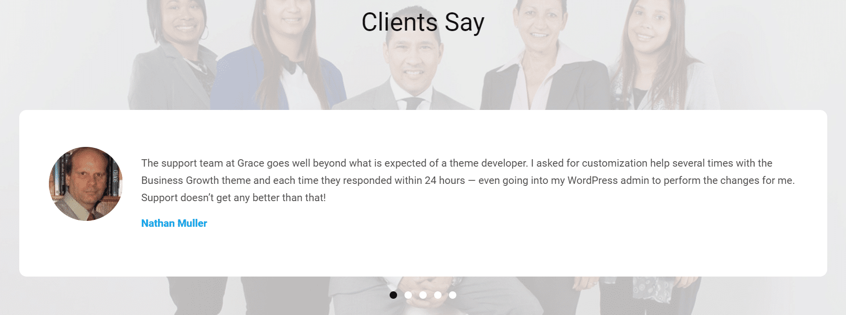
Include reviews, testimonials, and Social Media Follow Count
Presence of reviews and testimonials on the website always improves the trust factor. It provides a sense of security to the potential buyer and makes you look more legitimate.
It also shows off how good you are at your job.
Similarly, displaying your social media count, especially if it’s an impressive figure, also amps up your credibility.
If you have some glowing reviews in your stash, display them proudly on your website, and start seeing the results!
Don’t require registration in order to make a purchase
It can be really off-putting.
Instead of a sign-up form to fill, let your visitor sign in through their social media. Chances are, they are already logged-in on their social media and have come to your website from there. So use that connection and let them make a quick and easy purchase.
Alternatively, you can also offer them ‘express checkout’ option as a welcome offer to build rapport.
You can always ask them to sign up later through an email.
Keep the fields on your forms limited
It’s understandable that you’d like to collect as much information as you can about your customers, to offer them tailor-made solutions–it is not advisable.
Too many fields in a form turn people off. Attention spans are shrinking and nobody wants to spend ten minutes filling out a website’s emailing list, no matter how attractive the products.
So keep it simple and include only the most necessary details. Also try making the call-to-action button playful.
‘Hit me up’ or ‘Yes, I want all the discounts!’, or ‘Here we go!’ instead of the boring ‘Sign-up’.
Use CTA buttons instead of links
The easier and most convenient you’ll make the process for your visitors, the more they’ll come to your website.So instead of sending them on link-after-link chases, give them clean and easy call-to-action buttons right on the ads.
Also, if you’re an entertainment or news website, translate it to mean that your ‘Read more’ button should open into a new tab.
There’s nothing more annoying than losing the page you were on simply because you made the mistake of clicking on an interesting ad.
Offer multiple payment options
This is too obvious but its importance merits its inclusion in this list.
Make the purchase process simple and convenient for users. Offer them multiple payment options to choose from.
In addition to Debit and Credit Cards, also allow payments via:
- PayPal
- Stripe
- E-Wallet
- Amazon Pay
- Google Pay
- American Express Pay
- Square
- Visa Checkout
And many more.
People who bought this, also bought this:
When you recommend related products to the buyers, you are not only showing them the variety you’ve got, you may also be fulfilling some real needs. Based on previous shopping experience, careful algorithm, and keyword preferences, you can show them similar products that they may already be looking for.
In 2015, Amazon reported that 35% of its total revenue came from the effects of its recommendation engine!
So make sure you add this profitable tool to maximize your website’s conversions.
Must include contact info and be quick with answering queries
Have a separate page dedicated to information on how to contact you. Use handles of all the social media accounts you have. Make yourself as accessible to your customers as you can to build trust, reliability and authenticity.
Also make sure that you are responsive to queries. Hire someone to take care of that. If it’s not affordable, tell people in advance the time it’ll take to answer their queries. People will be willing to wait if you are being honest and upfront about it.
One last tip:
You have to use all the tips shared here smartly and wisely. There is no one size that fits all, so you need to be willing to put in the time and effort to learn what will work for your business. How will you learn that?
Testing. Testing. Testing.
Base whole of your website conversion strategy on the test results you derive after implementing the changes we’ve discussed. Don’t accept anything unless you see it working for you in practical, real ways. If it all becomes overwhelming, come to us. We’d be glad to help you.
So, all the best, and happy conversions!