Top 10+ Best Shopify Fonts For Your Store
Shopping online should be exciting! And as an online retailer, it is your aim to facilitate a simple and pleasant shopping experience. Your customers shouldn’t have to sift through your Shopify store pages looking for essential products amid unrelated content.
Customers will simply quit your website in frustration if they can’t locate what they’re looking for right away. Hence, you should try to enhance the user experience.
A great user experience includes typefaces. Therefore, today we’ll share with you the top 10+ best Shopify fonts that assist you in developing the ideal font strategy for your online business. If you’re looking for something unique, using a font generator can also be a valuable resource. Store owners can also use Font Generatorr to create stylish font ideas for Shopify headings, banners, product titles, and branding elements before choosing the final typeface for their store.
Why are fonts important for your Shopify store?
Fonts are essential in any eCommerce business because getting consumers to read your content is difficult. Therefore, every word counts, and attracting users is critical.
Fonts determine how your audience perceives your store since they express specific thoughts, feelings, and behaviors based on their design. Choosing an interesting typeface will keep users on your page longer, bring them into your content, improve their memorability, and hopefully direct them through the purchasing process. If you’re aiming for a retro look, exploring some vintage typography ideas can help evoke a nostalgic and trustworthy feel for your brand. For example, Serif fonts such as Times New Roman and Garamond can also increase reading speed.
When used appropriately, fonts move the eye from one location to the next in the sequence that you intend. Furthermore, employing eye-catching fonts in headlines and promotional banners helps draw attention to what you want to promote.
All in all, when Shopify store owners as well as other business owners utilized fonts properly, they can help online shoppers remember your brand more easily and positively affect your sales and revenue.
What to keep in mind when choosing fonts for your Shopify store?
When you choose the best Shopify fonts for your online store, you should consider the aspects mentioned below.
-
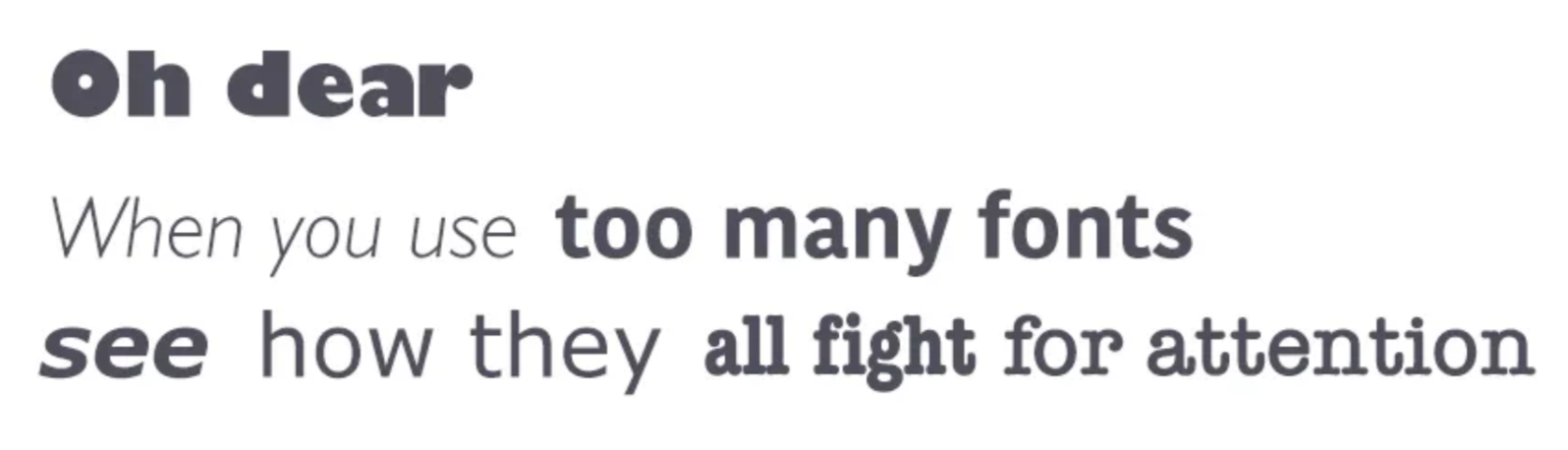
Use no more than 3 fonts on your Shopify website
The most important thing for business owners to keep in mind is that there should only be three main fonts on a website: one for headlines, one for body text, and one for accents.
Use the primary font, which is the one that is the most noticeable, for all titles, banners, and headers (large text).
used as a supplementary font for smaller body text. This should be the font that is the most readable.This font is used on the website as an accent for particular elements like buttons. The brand logo could be in this font.

-
Try to use standard fonts
Font embedding sites (such as Google Web Fonts or Typekit) have a variety of creative fonts that can add something new, fresh, and surprising to your projects. So, what could possibly go wrong? Actually, this method has one major flaw: attractive fonts can distract consumers from reading. People can spend time considering the fonts used by designers rather than reading the text.
Unless you have a compelling need for a custom font, such as branding or creating an immersive experience, it’s usually advisable to stick with the system fonts. Remember that good typography directs the reader’s attention to the text rather than the font itself.
-
Choose a font that works well at different sizes
Your site will be accessed by users using devices with varying screen sizes and resolutions. The majority of user interfaces necessitate text elements of varied sizes (button copy, field labels, section headers, etc.). To preserve readability and usability at all sizes, choose a typeface that performs well in multiple sizes and weights.

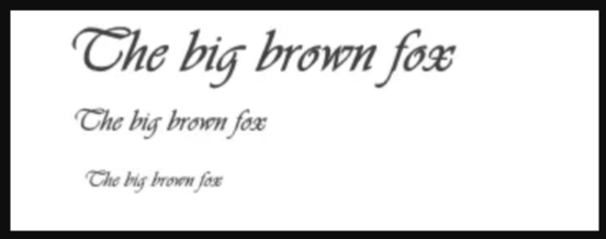
Check that the typeface you select is legible on tiny screens! Avoid typefaces with cursive writing, such as Vivaldi (in the sample below): they are attractive but difficult to read.
-
Utilize fonts that have distinguishable letters
Several fonts, especially those featuring “i”s and “L”s, make it too simple to misunderstand similar letterforms. Hence, while selecting your font, be sure to test it out in various scenarios to ensure that it won’t present a problem for your consumers.

Fonts categories
The font you pick for your Shopify site forms the basis for clear communication of your web content. Basically, there are 3 main types of fonts, namely Serif, Sans-serif.
- Serif fonts: This font has tiny feet or tails at the ends of letterform strokes. Times New Roman or Georgia are two common examples of this typeface.
- Sans-serif fonts: There are no serifs, additional tails, or feet at the end of each letterform in this font. Sans serif fonts are frequently employed for casual text writing. Sans Serif fonts include Arial, Futura, and Helvetica.
How to choose the best Shopify fonts for your store?
You might be experimenting with several Shopify fonts to see which ones suit the web pages of your company the best.
It’s an important question, and the factors listed below will help you choose the ideal typeface for Shopify stores:
- The primary idea and spirit of your company
- The impression you’re attempting to project in order to impress potential consumers
- Your brand is driven by values
- Desired emotions for your client
- These kinds of questions can help and direct you in the right direction.
In addition to the primary questions above, you also need to consider the following elements while selecting the best Shopify fonts.
-
Font sizes
Varying weights may indicate different brand personalities. Fonts that are thinner and more stylised are generally linked with modernism, minimalism, and elegance. Yet, when your typefaces become thicker, they begin to appear more casual, boisterous, and even extroverted.
-
Fonts that complement or contrast
Complementary fonts compliment one another without causing too much conflict or contrast.
As an example, you may pair a heading typeface in bold with the same font in ordinary font-weight. This indicates harmony and balance.
Contrasting font combinations, on the other hand, are something to consider. In terms of shape, thickness, style, and alignment, these two typefaces are diametrically opposed.
A common technique to combine contrasting typefaces is to use a sans serif font as your primary typeface and a serif font as your supporting font.
Top 5+ best Shopify fonts for your online store
Let’s have a look at the fonts available for your Shopify store. Keep in mind that you can use any other fonts that are not on this list, or even add custom fonts to Shopify store; these are simply the most popular and reader-friendly fonts available.
-
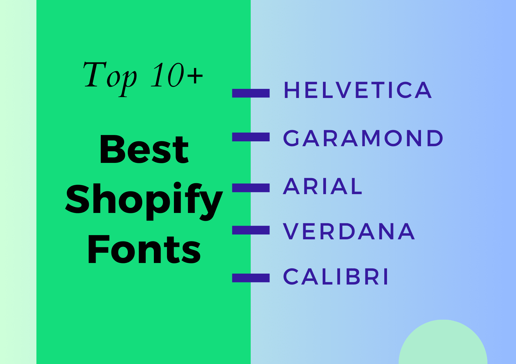
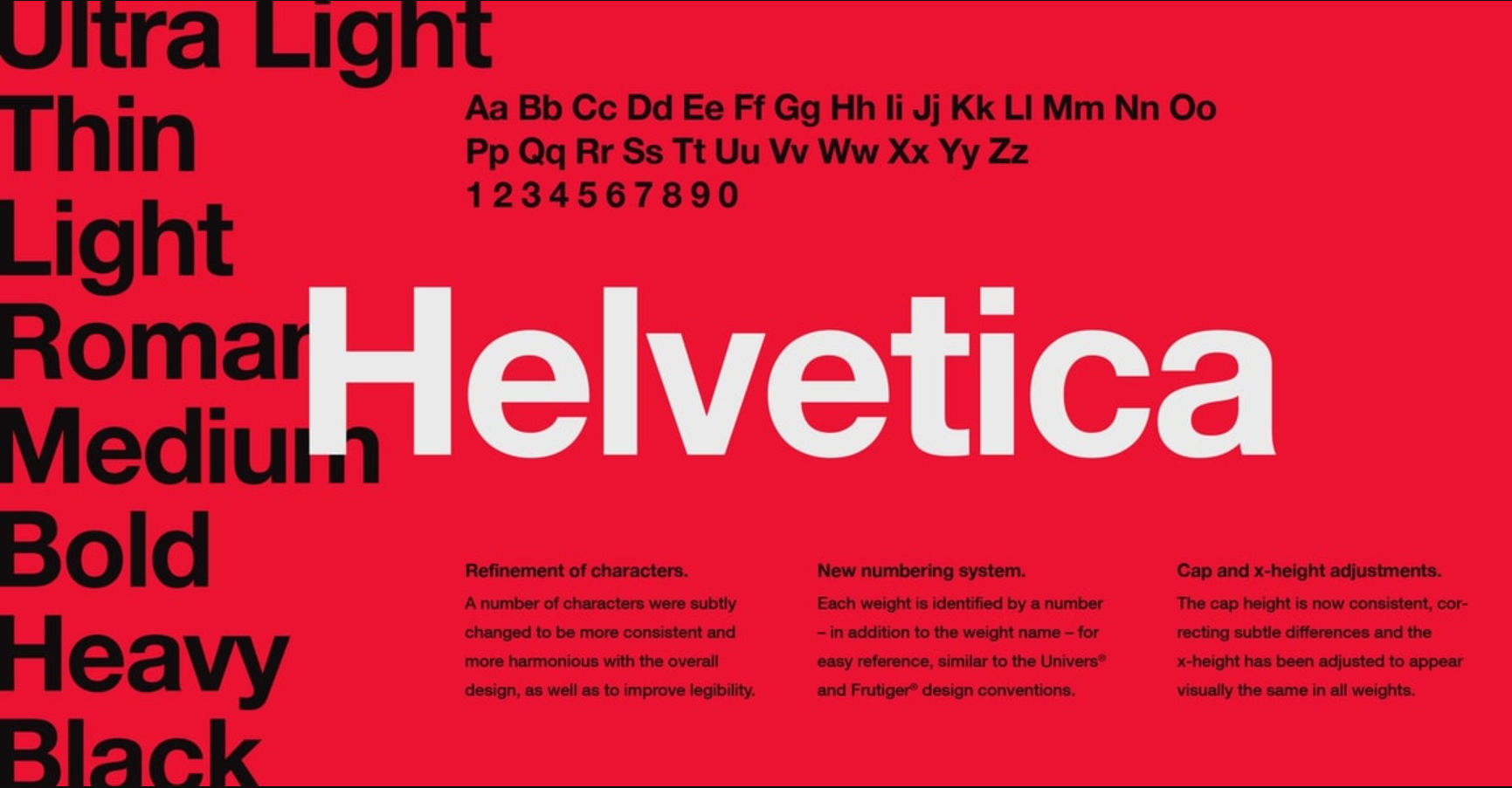
Helvetica

Helvetica has been in existence since 1957. Because it belongs to the sans-serif family, the letters lack curves at the ends of each stroke. It’s a classic font that’s now available in a variety of styles, including Helvetica lite, rounded, and more.Helvetica is a basic font that is often employed by big corporations for logos and marketing materials. Moreover, Helvetica is a straightforward, attractive font that works with any design. Any calligraphy, ornamental, or handwriting font goes well with it.
-
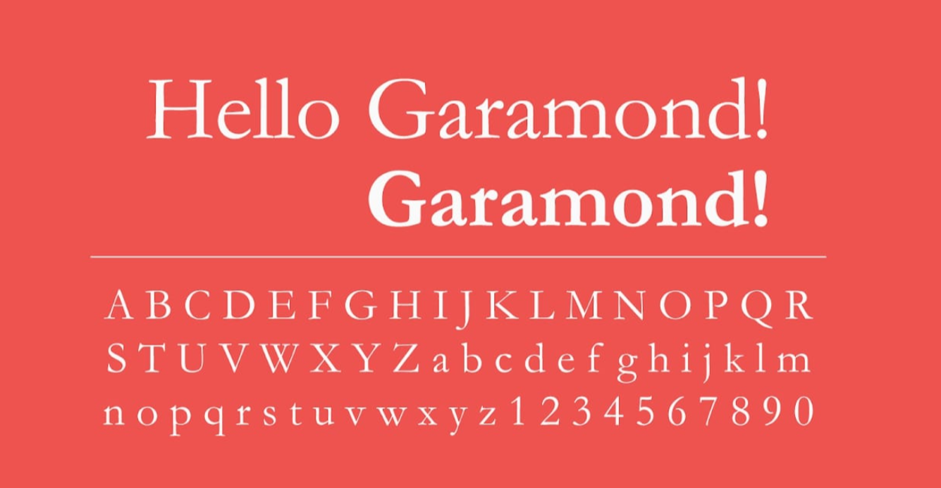
Garamond

Garamond is another ancient font with a retro vibe. It’s ideal for body text in printed publications, and it’s also easy to read. Your website will have a timeless feel with this typeface, and each letter may appear to some as an engraving. -
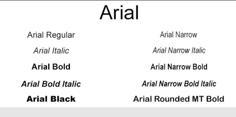
Arial

Arial is arguably the safest font to choose, and it’s pretty much the industry standard in the typography field. Arial is known as Arial MT in some devices or word processors. They are identical with no discernible differences.This font has several variants, but they are all easy to read. It belongs to the sans-serif font family. Sans serif indicates that there are no lines at the end of each letter. This font is well-known, and it is included in the operating system of all Microsoft devices. This font is also recognized by iOS and Android.
-
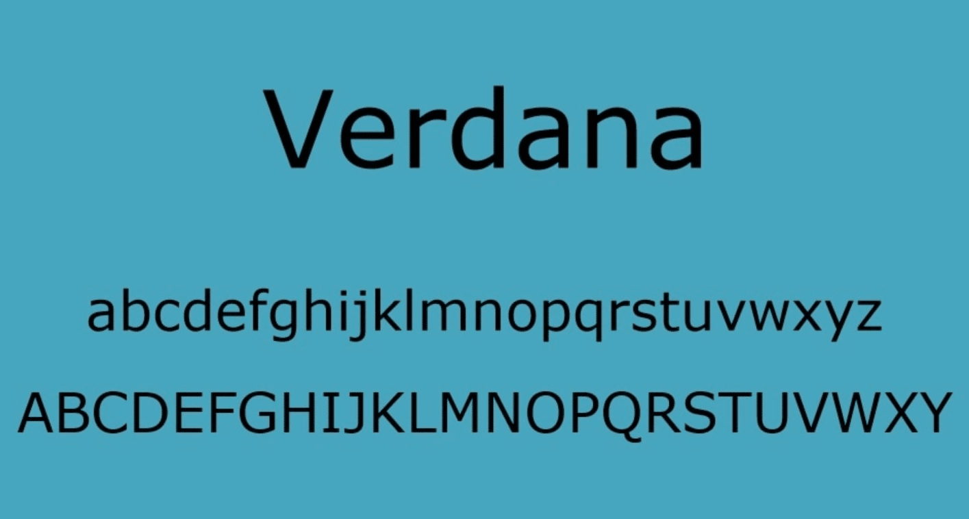
Verdana

Several font specialists believe Verdana to be a true web typeface. It’s a simple sans serif font that’s large enough for easy reading. If you look closely, you’ll notice that the letters are somewhat extended, making them easier to read on laptops, tablets, and smartphones. Verdana is now concentrating on mobile devices and PCs. And appropriately so, given that it was created for and by Microsoft. -
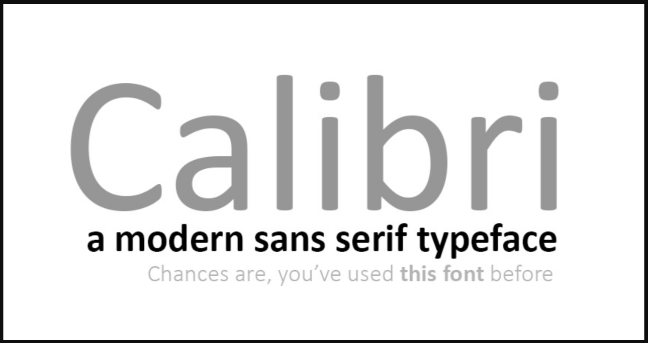
Calibri

This one is very new, having been released in 2004 and made available to the public in 2007. Microsoft introduced it to the world and made it the default typeface for Microsoft Word and other MS Office products. It’s rounded, so it’s easy on the eyes. While it is circular, it does not resemble a cartoon. It has a formal appearance and is regarded as a simple style of typeface. -
Roboto Regular

Roboto (Regular) is a multi-purpose font. It is a simple geometric font that would work well in practically any design. It also has excellent curves and is widely regarded as being very easy to read. Since 2014, it has served as the typeface for Google’s Android operating system. It works well with ornate script fonts as well as standard serif type. -
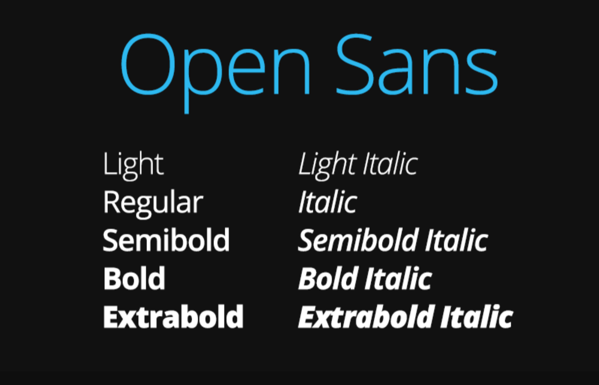
Open Sans

Open Sans is a minimalist font that will complement any ornamental or script font. Any calligraphy font combined with Open Sans is a winning combo for jewelry or handmade items. It’s one of the best Shopify store fonts. -
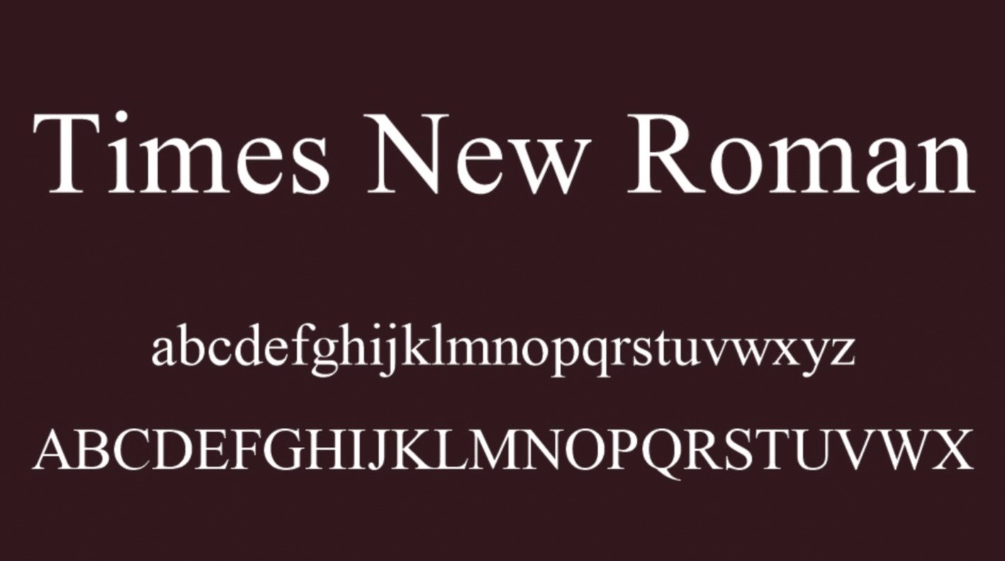
Times New Roman

This font is a modest modification of the Times font (one of the oldest fonts). It is frequently used and easily recognized in newspapers and periodicals all over the world. Several novels are also written in this typeface, and people from all over the world will have no trouble reading them.The name Times was given to the font because it was designed for Time Magazine in 1931. While the magazine no longer uses it, it is still regularly utilized as a body text in newspaper ad-book productions.
-
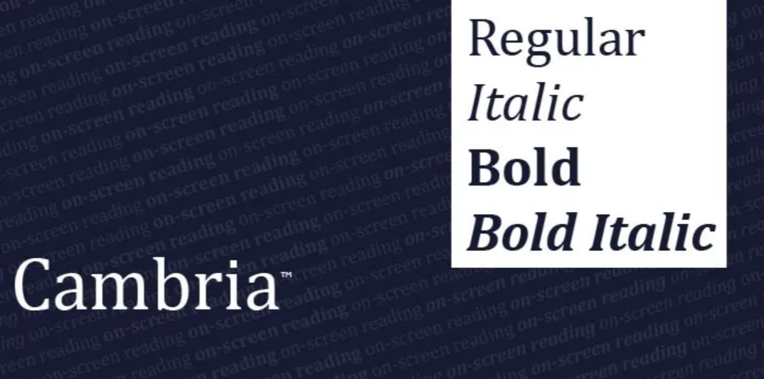
Cambria

Cambria looks great and is preferable if you don’t want to use Calibri. It belongs to the serif family, which implies that the letters have a few lines at the tips. It is, nonetheless, acknowledged to be a simple form of font. Cambria is best used as a body document because it is extremely readable even at small sizes. -
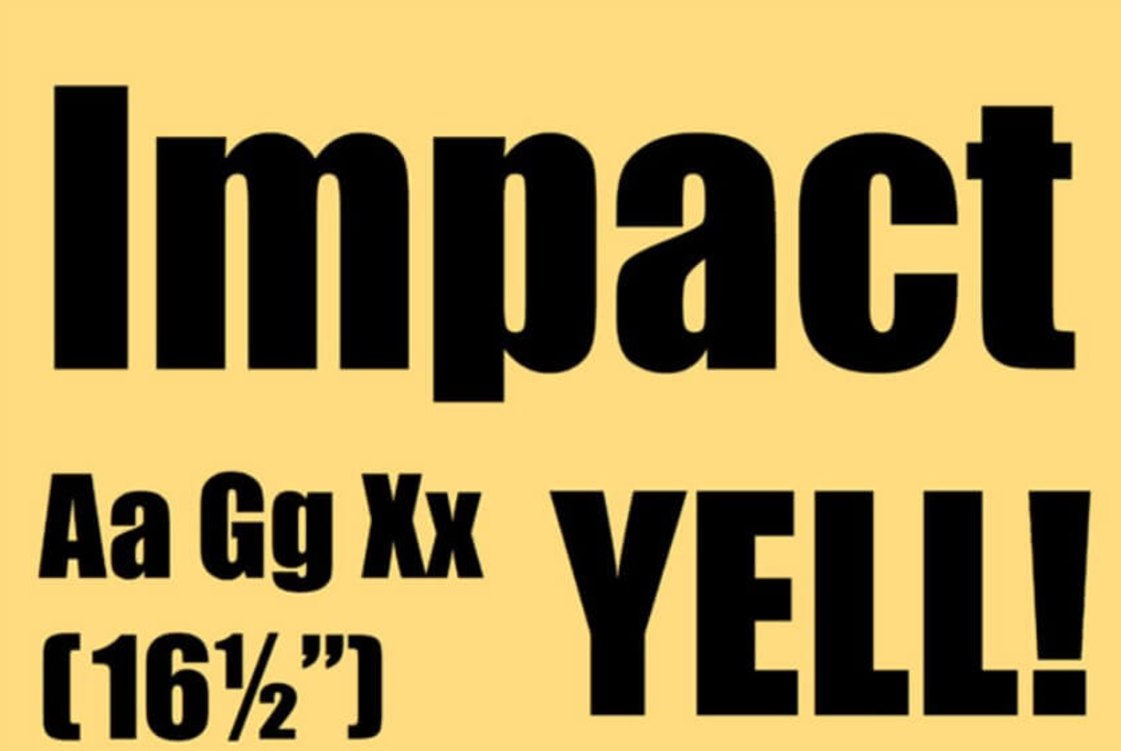
Impact

This is a popular font for headers. It’s dense, bold, and easy to read, with a big headline. The typeface works best for titles and subtitles, but not for text. When used excessively, the font’s width might make it difficult to read. It’s best to use it to announce an offer or to catch the attention of visitors in your adverts.

What are the best Shopify fonts for your store?
The best Shopify fonts stores is one that is both easy to read and professional in appearance. While there are numerous typefaces to pick from, we recommend sticking with sans serif fonts like Roboto, Verdana, Arial, and Calibri are widely used on the Internet.
These typefaces are a great option for titles, headings, and eCommerce websites.
All in all, whichever font you choose for your Shopify store, make sure it is legible and looks good on all devices, so that you can get a good shopping experience and gain more positive reviews for your store.