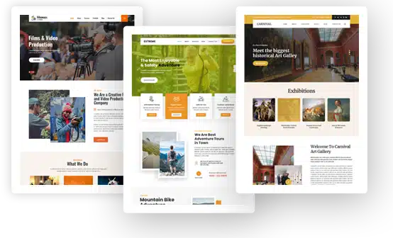
Tips for a More Visually Appealing WordPress Blog
If blogging isn’t just another hobby for you and you’re looking to take your site to the next level, don’t discount making it more visually appealing. A blog that’s beautiful to look at is one of the most effective ways to engage your readers and keep them coming back for more. Plus, it’ll boost your branding, and likely help improve your website’s SEO rankings.
Here are three tips for making your WordPress blog more visually appealing.
Choose a Compelling Color Scheme
Color greatly impacts visuals, as evident in everything from interior design to great art paintings.
Why? Because color can create emotion. The colors you use on your blog should be carefully chosen to create a desired emotion or feeling in your readers. For example, if you want your blog to feel friendly and approachable, consider using warmer colors like oranges and yellows.
On the other hand, if you want your blog to feel more luxurious or high-end, cooler colors like blues and greens might be a better choice.
As long as the colors you choose complement each other and are not dull, readers will be intrigued.
Use Imagery
Images of real people in real settings will give your blog an approachable feel.
For example, adding a personal touch by using images of yourself is a great way to build trust with your audience. Or, if you’re blogging about a product, using lifestyle images that show your reader how they would use it in real life will make your content more relatable.
When selecting imagery, choose photos with minimalistic backgrounds. Also, make sure the photos are high quality and have good lighting. Blurry or dark images can be a turnoff for readers as it makes your blog look unprofessional.
If you’re not a photographer, there are plenty of free stock photo websites you can use. Just don’t neglect to read the terms of use before you download anything.
Plan the Layout Carefully
Think of your blog’s layout as the blog’s design or framework. It’s the first thing visitors see when they land on your site, and you want to make sure it gives off the right impression.
There are many different ways you can go about designing your layout. You can use a pre-made theme, or you can create one yourself using HTML and CSS. If you decide to go with a pre-made theme, make sure it is responsive so it looks good on all devices, including smartphones and tablets.
Next, spacing is key. You want there to be enough white space between each element on the page so that it is easy on the eyes. Cluttered pages are off-putting and can be difficult to navigate.
Think also about scannability. Many readers prefer to scan posts so use headlines, subheadings, font size, bold text, and bullet points to break up text and make things easy to skim.
These are 3 essential things to keep in mind when making your blog nice to look at. By taking the time to plan, you can create a visually appealing site that improves your bounce rate and rate of return.

