
How Responsive Design is Crucial to Target your Web Audience

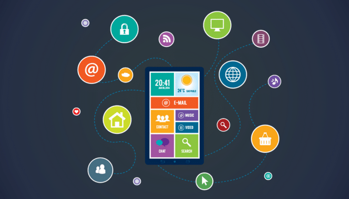
For some time now, the term “responsive” is being used extensively. You may already be aware that the term is actually means “mobile responsive”. Responsive is just an everyday term. With the exponential increase in mobile user base, mobile responsive websites are created with mobile users in mind, although they don’t compromise on any type of computer screen.
The working of a responsive website design is that the elements on the web-page align themselves seamlessly according to a pre-defined configuration based on the size or resolution of the device screen.
Generally, the order in which content try to align is- primary content, secondary and other content in order of priority, followed by the sidebar elements and bottom-page elements.
This means you have to design your page layout to accommodate this hierarchy. Seems like a complicated task? In this article let us see why such an arduous task is going to rate you well among your target audience.
-
Increasing Mobile usage

If recent studies have proved anything, it is that mobile usage has overtaken desktop usage by a long distance and responsive design bridges the gap in screen sizes by allowing the website to work on all devices. Many customers prefer to order food online using their handy mobile phone. With the sudden interest in online ordering for restaurants, foodies would be disappointed to visit your website wanting to place an order, only to see that it doesn’t load properly on mobile. -
Better User experience
Responsive websites give a better experience to all users so that they are happy browsing your site. This increases conversion rate. A well designed website adds to the scope of the content. The positive user signals also helps boost Google search ratings.
In a mobile responsive site, when the user lands on any page, the site renders itself automatically to suit their device. It changes the size and location of each element and reorders it.
This lets your visitor get the best possible visuals experience without any effort. As a bonus, they will see and click on any of the ads, banners, backlinks, images or videos present there.
-
Reduced page load times
Page load time is an important factors when it comes to Search engine ratings. A website which load in a second or less is destined to be rewarded. A good web hosting service can surely provide fast loading speeds.
But the same may not apply for all devices, especially if they have to render in small screens. Responsive design is known to produce fast loading pages and allow Google to discover the content or keywords more effectively and quickly index all the content.
-
Industry focused
Responsive sites are crucial in industries that get most of their traffic from mobile users. Major contributors are restaurants, news, marketing agencies, social media, retail chains like amazon, technology sites and sports. More and more industries are expected to go mobile friendly as their users shift to mobile devices.
-
Makes navigation simple
Users love simple navigation. Some websites have a very complex or their idea of “unique” navigation in an attempt to stand out from the crowd. However, they fail to understand that this only aggravates users.
Because mobile users prefer a simple layout, requiring only a few clicks and visible buttons, you are advised to create as simple of a method possible for navigating your website.
-
Maintenance is Minimum
Before the advent of responsive design, webmasters had only 2 options:- Create a desktop site alone thereby making it small and inconvenient to use on mobile devices.
- Create a dedicated mobile site that would work comfortably on the mobile devices.
This resulted in an increase in cost and more time involved in maintenance as you would need to update both websites simultaneously. If you chose the desktop variant alone, you ran the risk of losing the mobile users which was bad for revenue.
Now, using responsive techniques, webmasters just need to build one website for all three- mobile, tablet and desktop users. This makes updating content easy thereby reducing downtimes. Longer downtimes were a cause for losing good audience. Reduced cost and time also means that you can invest more in design, content and web hosting.
-
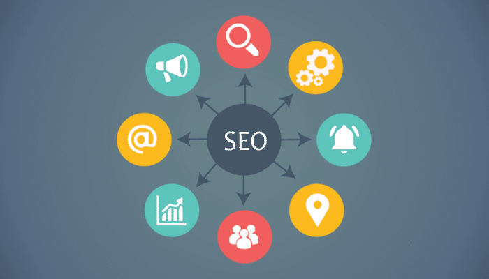
Responsive Design is good for SEO
Every Search Engine prefers a responsive website. Google recommends and encourages responsive web design. Research shows that responsive websites usually perform better and load faster making it the perfect choice for users to share or link your content with a single URL.This is the main reason SEO guys favor a responsive site because they have only one URL and the same HTML, which makes it easy and more efficient for Google to search, index, and organize content.
-
Reduced Bounce Rate
A high bounce rate is usually considered as a negative sign by search engines. There are a number of reasons that result in a high bounce rate, the major reason being non-responsive design.
The solution is simple, make your website responsive. Responsive websites condense the entire website content in a package so that users find it easy to view. This results in audience spending more time on your website thereby lowering bounce rates.
-
Analytics are easier to track
Tracking Google analytics data for 2 different websites would have been a nightmare. Thanks to an unified website through responsive design, you can easily track your website’s performance for the target audience. This gives you the option to fine-tune your responsive web design till it provides the performance and traffic you expect.

To conclude
Responsive web design is the backbone of online marketing and is important for being on the good side of Google as well. Apart from other advantages, it allows your website to provide a superb user experience across platforms which is imperative today to stay ahead of the competition.
With mobile devices being increasingly used for search and online shopping, you need to provide a mobile-friendly site. So making your website responsive plays a big role in your online presence and increasing revenue.
And even though mobile applications are available for every task imaginable, websites are still a sought after source by people and this is why responsive design is important to target your audience.