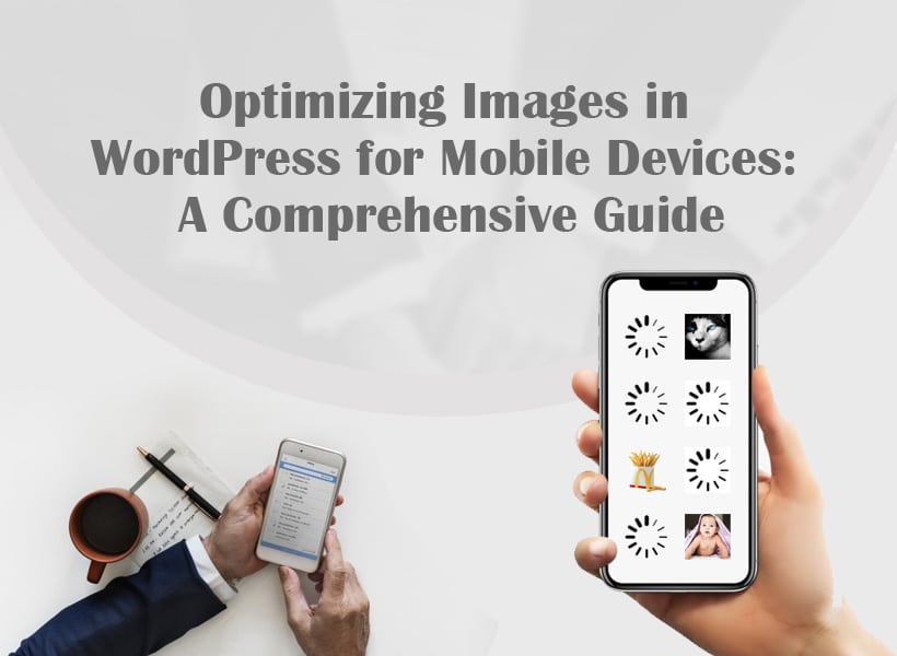
Optimizing Images in WordPress for Mobile Devices: A Comprehensive Guide
Optimizing your WordPress site in today’s “mobile era” is no longer an option, but rather a must. Google has indicated that up to 50% of web traffic can now be attributed to mobile devices, with 63% of customers preferring mobile friendly sites for their purchases, hence ensuring a smooth mobile experience is critical.
The average data transfer for websites on mobile is 2157.7 KB as per HTTP Archive which is why image optimization is essential. This paper will discuss on why and how to optimize WordPress for mobile and a list of nine best practice to boost your mobile performance.
Optimization of WordPress images for mobile devices.
Just a picture showing the same picture on 4k screen and normal smartphone. Resolution differences may be significant, impacting the overall user experience. Consequently, the WordPress images need to be optimized so as to strike the right balance between quality pictures in 4k screens and efficiency in the mobile devices.
Key Reasons to Optimize:
- Faster Loading: More than half of mobile users will leave a page where it takes more than three seconds to load. A fast and mobile-friendly website requires optimizing images.
- Enhanced User Experience (UX): Slow loading images negatively affect user experience, and approximately 70% of shoppers state that website speed influences their purchases.
- Improved SERP Rankings: Mobile-friendly sites load images faster, hence boosting search visibility, organic traffic and overall SERPs performance.
- SEO Benefits: Using mobile-optimized images leads to faster load time for individual pages on a website, less bounce rate, and higher UX, ultimately contributing to better WordPress SEO expert performance.
9 Best Practices to Optimize WordPress Images for Mobile Devices:
-
Right Image Format:
Select the right image format for good mobile optimization (JPEG images for large images, banners and illustrations; PNG images with transparent backgrounds and complex details). A photo editor helps convert images into the correct format and fine-tune quality settings to ensure optimal performance on mobile devices.
-
Compress Your Image:
Reduce image sizes by up to 90% through image compression techniques (Lossy, Lossless, and glossy) and therefore increase page loading speed. For example, there are tools like ShortPixel image compression which might help with the said process.
-
Resize Your Image:
Change image size by adhering to recommended dimensions for various image types (featured image, portrait image, background images, etc.), reducing loading times and resource consumption.
-
Use Faster-loading Image Formats: WebP or GIF:
Use WebP or GIF as faster loading images. For instance, WebP, efficiently compresses images, leading to lower file sizes but maintaining quality.
-
Use a Content Driven Network (CDN):
Use a CDN like Optimole, Bunny, or Cloudflare Images which is able to optimize pictures in realtime through compression, resizing and caching thus enhancing mobile page loading time.
-
Use Lazy Loading Images:
Load only necessary content first, and delay other loads when users start scrolling (lazy load). Use lazy load plugins such as Smush or Optimole for WordPress to optimize mobile speed.
-
Use Caching:
Use image caching plugins such as W3 Total Cache, WP Super Cache, or WP Fastest Cache to make images accessible on a faster location to users to prevent a reload of images thus enhancing your page performance.
-
Store and Use Images From External Servers:
Improve image delivery by caching images from external servers, particularly ones offered by CDNs or image holding services.
-
Use Mobile-Friendly Theme (AMP Enabled):
Select an AMP-enabled mobile-friendly theme from Google. It enables fast loading of images on mobile devices while also gives the option of optimal image sizes for various devices.
Frequently Asked Questions (FAQS):
1. Is it necessary to optimize images for mobile?
Ans: Mobile-optimized images in Wordpress help to boost the speed of loading, better user experience, and higher SEO ranking. Considering that a good number of internet users use the internet through mobile, optimizing the images makes pages loading time faster and helps to meet the expectation levels of various users.
2. What does image compression do for wordpress mobile sites?
Ans: Compression of image drastically reduces the image size thus mobile websites load fast due to this effect. For retention of mobile users, load times for web pages should be shorter and lower bounce rates. Various compression methods include lossy, lossless, and glossy which compromise on different proportions of image quality and file size.
3. Does downscaling images influence mobile device’s loading of a WordPress website?
Ans: Therefore, you should consider image resizing if you want to attain optimal mobile device performance. Besides taking time to load, large images could also result to poor user experience. This resizes the images to recommended dimensions for different categories to enhance the browsing speed and compatibility of mobile screens.
4. Which image formats is WordPress recommended for mobile optimization?
Ans: Two of the most common image formats are JPEG and PNG but for different purposes. JPEG would be better for big pictures, banners and illustrations, while PNG is good for images with transparency or complex details. Mobile optimization depends on the choice of the right format.
5. What is the relationship between lazy loading and faster loading of mobile pages?
Ans: Lazy loading refers to a concept of loading the most significant content of a webpage initially while postponing the loading of other content till the users scroll. In the process, this improves the mobile page loading speed by focusing only on visible and essential elements which in turn, provides a superior user experience for its end-user.
6. How does a Content Delivery Network (CDN) help in optimizing images for mobile in WordPress?
Ans: The mobile page load speed also gets improved if a CDN is used, which utilizes servers spread across the globe. These servers compress, resize, and cache optimized image sizes in real-time. As a result, an optimized image can be delivered to mobile devices quicker by a CDN since it minimizes the physical distance between the server and the user.
7. What does AMP supported mobile-friendly themes do to image optimization with WordPress?
Ans: The mobile-friendly theme with AMP support focuses on speed and performance on mobile devices. It speeds up the process of loading images by defining the best sizes for different devices. Besides, AMP-enabled themes load and cache images automatically, which also adds to faster server responses and mobile device overall performance.
Conclusion:
Optimizing WordPress images for hand-held devices is no longer a “fashion” in the rapidly changing world of Internet exposure; it has rather become a must. Utilizing these best practices, you can greatly boost you mobile site’s performance and keep your audience engaged, and happy.