
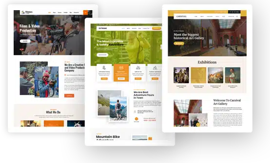
Making Website Photos Feel Designed Without Starting From Scratch

A polished website does not need custom illustration on every page. In fact, too many decorative graphics can make a theme feel cluttered. But there are also times when an ordinary photograph feels a little flat: a blog header, an About page, a featured story, a creative portfolio, or a seasonal campaign.
That is where photo-to-art tools can be useful. Rather than searching for another stock image or commissioning an illustration from scratch, you can work with photography you already have and give it a different visual treatment while keeping the subject recognizable.
When ordinary photos do not quite fit the design
Most website owners already have plenty of usable source material. A café has photos of its interior and dishes. A travel blogger has destination shots. A photographer has portraits. A local business may have pictures of its team, storefront, or workspace.
The difficulty is often not finding images, but making them feel consistent.
A carefully chosen WordPress theme can lose some of its character when every photograph comes from a different source, with different lighting, colors, and overall mood. One practical solution is to stylize only certain images rather than trying to standardize the entire photo library.
For example, you might use painted versions for article covers while leaving product photos and service pages untouched. That gives the site a visual pattern without forcing every image into the same look.
Painting can add more character without replacing the original scene
A painterly treatment works particularly well when a photograph needs to feel more editorial or atmospheric.
Think of a travel story about an old town, a restaurant feature, a wedding portfolio, or a personal essay. A normal photo documents the place or subject. A painted version can soften the literal details and draw more attention to mood, color, and composition.
Pixlio’s picture to painting tool keeps the original subject and composition recognizable while restyling the image with a painted appearance. Available presets include Oil Painting, Watercolor, Impressionist, and Acrylic Canvas, and you can also adjust the aspect ratio or add a custom prompt.
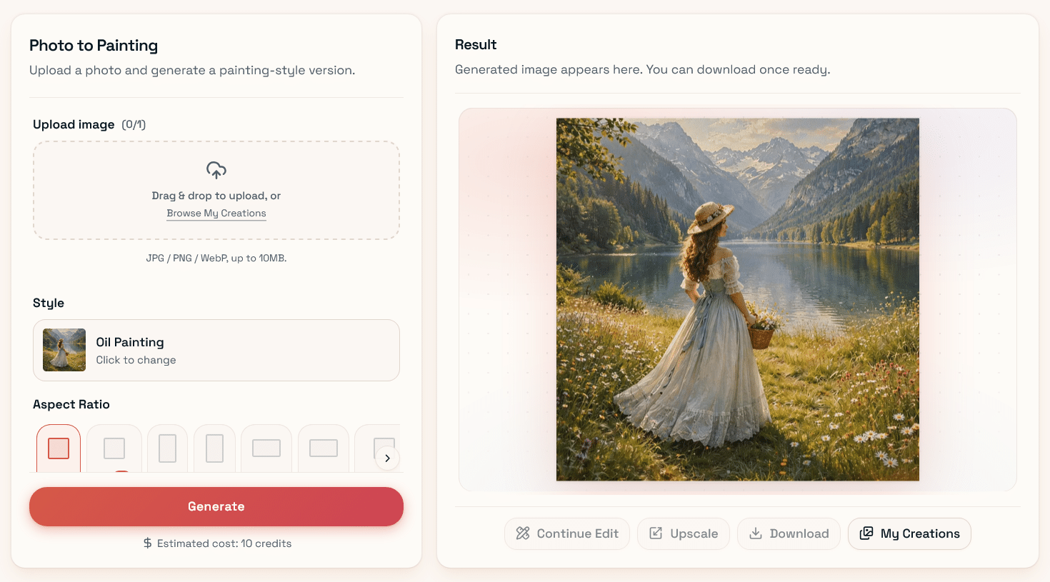
Pixlio’s intuitive interface makes it easy to turn a picture into a painting with customizable styles and aspect ratios.
That custom prompt can be useful in web design because the goal is rarely just “make this artistic.” You may want a quieter background so text remains readable, warmer tones to match the site’s palette, or less texture around a person’s face. Starting with an existing image gives the tool a clear structure to work from, so you are refining a composition rather than inventing one from nothing.
Watercolor works better when the page needs a lighter touch
Watercolor creates a different kind of effect. Soft edges, lighter textures, and less visual density can suit lifestyle blogs, wedding sites, hospitality pages, personal portfolios, and editorial layouts.
It also tends to work well in places where a heavier painting style might compete too much with the typography.
For that kind of treatment, Pixlio can convert a photo to watercolor painting while giving you control over how pronounced the effect should be. The available styles include Soft Wash, Detailed Illustration, Vibrant Watercolor, and Ink Wash, with Mild, Balanced, and Strong intensity levels.
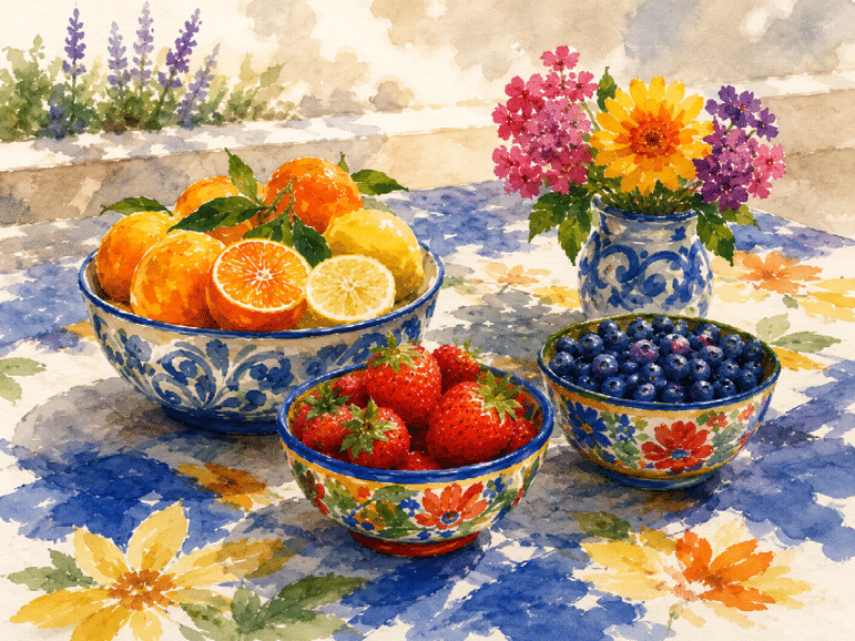
A simple still life turned into soft watercolor art with bright fruit, flowers, and a handmade Mediterranean feel.
That intensity setting matters more than it might seem. A strong watercolor effect may look impressive at full size but become distracting behind a heading or inside a compact content card. A milder version can preserve facial features, architecture, or product shapes while still giving the image enough texture to feel distinct from the original photograph.
Design the image around where it will appear
The strongest result is not always the most dramatic one. Before transforming a photo, it helps to know how the image will actually be used.
A hero image needs room for text, so composition is more important than fine painted detail. If a heading sits on the left side, begin with a photo that already has open space there.
Blog thumbnails have different requirements. They are usually displayed much smaller, so simple shapes and stronger contrast often survive resizing better than delicate texture.
Portraits need another approach. On an About or team page, recognizability matters. A subtle treatment is usually safer than a highly stylized result that changes facial details too much.
Aspect ratio is worth deciding early as well. Creating the artwork first and then forcing it into a very different crop can remove the part of the composition that made the image work in the first place.
Keep the original photo available
A stylized version should usually be an alternative, not a replacement.
There are plenty of situations where realism matters more than atmosphere. Product listings, property pages, team profiles, tutorials, and documentation often benefit from straightforward photography.
It is also worth checking the finished artwork at the size it will actually appear on the website. Fine brush texture that looks attractive in a large preview may disappear completely inside a small card. Faces, signs, buildings, and branded objects deserve a quick inspection before publishing.
One good photo can serve several purposes
The practical benefit of photo-to-art tools is not that every image should become a painting. It is that one useful photo can support more than one part of a site.
The original might stay on a service page. A softer watercolor version could work as a blog header. A richer painted treatment might suit a campaign graphic or featured article.
Used selectively, this approach fits comfortably into theme-based web design. The theme still does the important structural work through typography, spacing, layout, and responsiveness. The transformed images simply give a few key sections more character without requiring an entirely new visual system.
