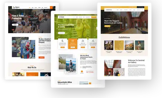
Human Psychology to Design an Engaging Website
Beautiful websites do not always do well, and many suffer from high bounce rates. Creating a functional website which loads fast and is easy to navigate are more important parameters to design a website.
Though I am not asking you to blindly beautify your website but learning a few psychology principles which may help in improving the user usability of the website so that the engagement rate improves is worth knowing.
After you find the perfect theme, it’s time to make the perfect logo. LogoMyWay has a free online logo maker that allows you to create your own logo design. It’s a simple process that only takes 5 to 10 minutes. Simply select the logo you like best and change the colors, fonts, text and anything else you want to customize.
We have complied a few such design principles for you to learn from.
Use Colors to Evoke Emotions:
It goes without saying that different colors have the power to evoke different emotions. Every large brand is associated with a color and they tend to use the same color for their logo so that it embeds in the customers’ mind.
The blue color is used for a soothing effect on the customers whereas red is associated with an energetic and bold brand image.
It has been noted that different gender prefers different colors. For example, feminine websites tend to stick to colors like pink, purple, brick red whereas businesses try to stick to gray-scale colors.
The important thing is to choose a color which resonates with your niche and matches the taste of your target audience
Standout with the Right Choice of Font:
Using the right font is an important design element but did you know that various font types represent different intent of the content? Using sharp font works better if it is a business website or a technical website and readers become attentive while reading articles using such fonts. Cursive and soft-edged fonts are usually used for non-formal content because it creates a sense of ease and leisure reading.
There are many sites out there using the same general font types, you can stand out by using a different, legible and more apt font for the niche of your site.
Use Asymmetry to Your Advantage:
Any design principle will encourage you to follow the symmetrical layout. We are not just talking about website design here but even architects tend to follow the principle of symmetry to design a building or a monument.
Symmetry is usually maintained because it is pleasing to the eyes and people find it easier to concentrate. If there is a sense of imbalance, people may start losing concentration.
Following the same principle in designing a website will make sure that the users are not distracted and can go through the site in an orderly manner.
The advantage here is that using asymmetry in your design to highlight an important element is a very clever way to draw the attention of the users to just that element like a call-to-action button, a subscription box, etc.
Use the principle of symmetry or rather I would say asymmetry to make sure that your readers are looking at what you intend them to concentrate on.
Extract the Power of Visceral Reaction:
Visceral reactions are the reactions triggered by emotions. You can use this to your advantage by designing a website that can subconsciously create such reactions which then makes the users feel that they cannot get enough of your website.
There are simple principles you can follow to create such reactions. For e.g. adding beautiful colorful images to a website can invoke such reactions consistently across different genders and various demographics.
Usually, the first impression of a website is important and if it could create that chemical reaction amongst individuals, they will tend to explore your site further.
Implement Hick’s Law to Design:
Hick’s law, or the Hick–Hyman law, named after British and American psychologists William Edmund Hick and Ray Hyman, describes the time it takes for a person to make a decision as a result of the possible choices he or she has: increasing the number of choices will increase the decision time logarithmically
This law applies to web design as well. If you overwhelm your users with 10 different options, your user will get confused and ultimately opt not to proceed with any.
The internet is filled with so much information and the user is bombarded with so many options that if you do the same, your site will not be any different.
Differentiate yourself from others by reducing the number of unnecessary options as it really does not help in improving your conversions. In fact, studies have been conducted where reducing extra elements from the site has improved conversions by 150%.
Lose a few unwanted fields from the contact form as people may withdraw from filling it if too much is asked from them. Use site analytics to figure out which social media share button is giving good conversions and the ones which is not being used much.
Remove the ones which do not contribute much as it only increases the website load time and confuses your users. Each page should have only one CTA and one goal.
This will make sure that your readers really focus on the intent of that page rather than getting confused with 10 different options.
Keeping the motive of designing the website in mind that it should reflect what your brand represents through its color, fonts and elements are important to convey your message across your users and create a lasting positive image of your brand.