How to use Web Design to Boost your Conversion Rate
Most smart marketers don’t just optimize their marketing campaigns to increase conversions but also their landing page.
Unless you have already tested your site for the UX design, it is imperative that you check your site for a flawless design. The site design is, after all, the first thing your visitor notices, along with your main content.
Whether your ultimate goal is higher CTR or higher conversions, you can easily use the design elements to drive your audience to convert better.
Here are some of the best ways to use web design to boost conversions –
Create an eye-catching value proposition
A value proposition is the promise of value delivered to the customer. A visitor usually decides whether or not to buy a product or service based on the value proposition.
There are two main pillars for a compelling value proposition – one is web design, and the other is copywriting.
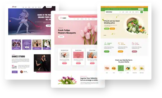
You don’t have to be a web design expert to create a beautiful design that converts. There are tons of website design tools that you can use to build your landing page from scratch.
Use web design principles – Z-rule and F-rule
One concept that nearly all designers use is visual hierarchy. Simply put, it is the design elements arranged to showcase their importance.
These principles are based on eye tracking, i.e., where the focus points are and how the user reads and locates them. The most common visual hierarchy principle is the Z pattern, which you find in nearly all landing pages.
Web designers know that users tend to move their eyes on the landing page in a Z pattern. This means he first reads the menu bar from left to right, focusing most on the rightmost part.
Then the user goes from the right top to the lower-left corner and then again reads from left to right. To see these principles in action, Design Shifu specializes in expert web design services that guide users naturally through the content using visual hierarchy techniques like the Z‑pattern and F‑pattern.
TO help you better understand, here’s a value proposition by Slack –
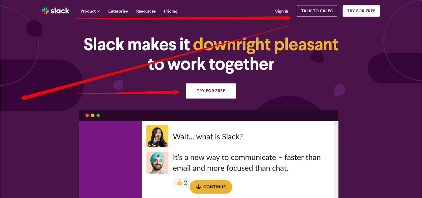
Slack’s landing page uses copy-written text that showcases the value they offer to their readers. The sentence “Slack makes it downright pleasant to work together” presents a clear picture that it is a productivity tool to help a team connect better.
Next to the design part, you will notice the Z pattern. They use CTA in the right-top corner and then in the center for a left to right view.
Similarly, when you are using content pages, the reader reads part of the content from left to right, then skips down again, reads from left to right, and then scrolls, focusing on the left section. The heatmap tool shows that this creates an F pattern.
Optimize your design for load time
It is also crucial that you make sure your site loads fast. Any page taking more than 3 seconds to load might lose some of its traffic. There are many ways to ensure that the page you are creating loads faster.
Image optimization – Make sure that you optimize the media you are using in your design. If you are using PNG images, convert them to JPG to decrease the load time. You can then use tools like Tiny JPG to compress the files without losing pixels.
Use CDN – Content Delivery Networks are data storing networks that you can use to increase delivery time.
Increase speed using cache – Top sites use cache memory to pre-load the site in the browser, so when a visitor re-opens your page, it loads faster than before.
There are many more things you can do to speed up your design. Once you finish, you can check your site speed and load time using tools like GtMetrix or Pingdom and your target location.
Use the right color combinations
Web designers use color combinations with a well-built layout and typography to create a positive impact on brands. It is important to understand the psychology of colors and use them accordingly on your site.
- White – Fresh and clean
- Black – Powerful and ominous
- Silver – Sense of innovation
- Red – Bold and confidence
- Blue – Stability
- Yellow – Happy
- Gray – Subtle
Based on the design type you want – minimalist, modern, classic, or other – you can also add white space to improve focus on your CTAs.
Over to you
So that was our take on some practical ways to boost your conversion rate and see the tangible effects. Of course, there are many other things you can do to improve your design.
There are a lot of website design tools available for free. You can use them to add improvements to your landing pages. If you are targeting a landing page, use Z-pattern along with brand-friendly color palettes.
For those who have a single product site, eye-catchy graphics are important. You can also add copywriting or cliff-hangers for improving your engagement rate.
If you are not sure which is the best way, you can read our guide on web design principles.