How to Use Visual Storytelling on a WordPress Site Without Sacrificing UX
A WordPress site can have the right theme, useful content and solid plugins and still feel forgettable.
In many cases, the issue is not functionality. It is communication.
Visitors land on a page and do not immediately understand what the business does, why it is credible or what they should do next. That gap often has less to do with missing features than with the way the message is presented. This is why visual storytelling deserves more attention from WordPress site owners.
Visual storytelling is not just about making a site look modern. It is about helping people understand faster.
Visuals Should Make the Page Easier to Understand
A short explainer video can communicate a service in seconds. A custom illustration can make an abstract process easier to grasp. A well-placed motion cue can direct attention toward the next action.
When those elements are used intentionally, they can improve the user experience rather than interrupt it.
That last point is important because visual content can easily go wrong.
Many sites add motion and video in ways that feel impressive during production but distracting during actual use. Autoplay backgrounds, oversized animations, generic stock visuals and cluttered hero areas often make the experience worse. Visitors do not need more visual noise. They need faster comprehension.
Start With the Page Goal
The easiest way to avoid that problem is to treat visual storytelling as part of the site strategy.
Start with the page goal. If the page exists to generate inquiries, the visuals should help explain the offer and reduce hesitation. If the page exists to educate, the visuals should simplify the information. If the page exists to build trust, the visuals should reinforce professionalism and consistency.
This connects with the broader idea behind professional web design and development. Good design is not decoration added at the end. It shapes how the brand is perceived from the first click.
A visitor should not have to work hard to understand the page. The visuals, copy, layout and calls to action should work together so the next step feels obvious.
Choose the Right Visual Format
A practical way to think about format choice is this:
- Use illustration when the concept is hard to explain with text alone.
- Use video when a human explanation, demonstration or before-and-after story adds clarity.
- Use motion when movement helps direct attention or explain sequence.
- Use static visuals when simplicity is the priority.
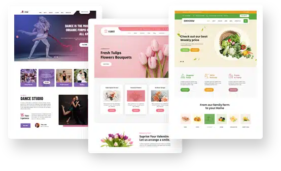
For example, a consultancy might use a custom illustrated framework to explain its methodology. A software company might use a short homepage video to show the product in use. A service business might add subtle motion to show users how a three-step process works.
None of those choices need to feel flashy. They just need to make the path clearer.
Keep Visual Storytelling Practical, Not Decorative
Visual storytelling works best when every element has a job.
A homepage video should help visitors understand the offer faster. An illustration should simplify a process, not fill empty space. A motion cue should guide attention, not distract from the main action.
This is where many WordPress sites lose balance. They add more design elements without asking whether those elements make the page easier to use.
A good test is simple: if the visual element disappeared, would the page become less clear? If the answer is no, the visual may be decorative rather than useful.
AI Can Speed Up Production, But It Cannot Replace Strategy
WordPress makes visual storytelling easier than it once was, especially as tools for visual layout and AI-assisted creation continue to improve.
The rise of AI-powered website builders also shows how quickly production expectations are changing. Site owners increasingly expect better content faster.
But speed alone is not enough. Someone still has to make sure the visuals support the message, fit the page goal and stay aligned with the brand.
AI can help create early concepts, resize assets, generate visual directions or support faster production. But it cannot decide what the business needs to communicate, what visitors are confused about or which visual choice best supports the user journey.
Growing Sites Need a Consistent Visual System
Visual storytelling becomes more difficult as sites grow.
A business may start with one polished homepage, then realize it needs campaign landing pages, feature pages, product explainer content, social cutdowns and email visuals that all feel connected.
At that point, the issue is no longer “How do I make this page look good?” It becomes “How do I keep the visual system consistent across everything?”
That consistency matters. If the homepage uses one visual style, the landing pages use another and the campaign videos feel unrelated, visitors may still understand each individual asset, but the overall brand experience becomes weaker.
A strong visual system helps a business repeat the same message across pages and channels without making everything look identical.
When Creative Support Can Help
Outside creative support can be useful when a team has moved beyond one-off visuals and needs a more consistent system.
When a team needs branded diagrams, website illustrations or clearer visual systems for complex content, Superside’s illustration design services are relevant. When the site or campaign needs animated explainers, feature reveals or movement-based storytelling, motion design services may be a better fit. And when a business wants stronger homepage storytelling, campaign videos or embedded product content, video production services can support the wider workflow.
The point is not that every WordPress site needs external production. Many site owners can create useful visuals on their own. But as the number of pages, campaigns and formats grows, it becomes harder to maintain quality and consistency without a clear creative process.
Superside’s AI-enhanced creative services also fit this larger workflow discussion. AI can help with speed and adaptation, but the useful output still depends on human direction, brand standards and a clear understanding of the user experience.
Measure What Actually Helps Users Act
Measurement matters too.
Not every homepage visual, explainer cut or campaign teaser will perform equally well. A site owner may discover that a founder-led clip drives more qualified inquiries than a polished montage. Another business may find that an illustrated framework outperforms a text-heavy section when reused in campaigns.
That is where a creative analytics platform like SuperAds can fit into the workflow. If a business is repurposing website visuals into paid campaigns, SuperAds.ai can help teams review which creative patterns, messages and formats are performing better, so future visual decisions are based on evidence rather than guesswork.
For WordPress site owners, the lesson is not to measure everything for the sake of it. The goal is to understand which visuals help people move forward and which ones simply take up space.
Do Not Sacrifice UX Basics
Of course, none of this works if the basics are ignored.
Accessibility, readability, mobile performance and security still matter. Richer visuals should not compromise page speed, create confusing navigation or undermine trust.
A beautiful video section is not helpful if it slows the page too much. A clever animation is not helpful if it distracts users from the call to action. A custom illustration is not helpful if the surrounding copy is unclear.
Even Grace Themes’ broader WordPress guidance around usability, design mistakes and site security connects to this larger idea: people trust sites that feel organized, professional and easy to use.
The best WordPress sites are not the ones with the most features or the loudest visuals. They are the ones that present information clearly enough for visitors to take action with confidence.
Final Thoughts
Visual storytelling helps when it removes uncertainty.
That is the real standard to design for.
A good WordPress site should not make visitors guess what the business does, why it matters or what they should do next. Illustration, motion and video can all support that goal when they are used with restraint and purpose.
The strongest visuals do not compete with UX. They make the experience easier to understand.