How to Make a Website That’s Visually Appealing
Many of us browse the internet in order to read up on information, or to find and use a service at our ease. That being said, we are far more likely to use and visit websites that visually appeal to us, rather than those that look outdated and difficult to use.
If you’re not a designer and you’re faced with the challenge of creating a website, then it can seem fairly daunting knowing where it is that you’re even going to start.
However, it’s not as complicated as it seems. Chances are other people are looking for something very similar to you, so use your intuition and follow these tips, and you’ll be making an aesthetically pleasing website in no time.
Think About Colour and Design
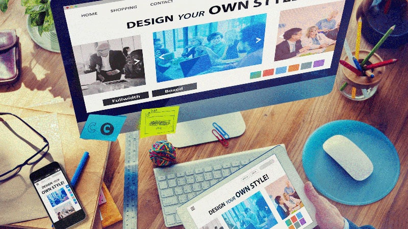
The obvious place to start when thinking about designing your webpage, is the colour and design of the homepage itself. Think about colour, and how important it is to you.
It’s what catches your eye when you’re scrolling through Facebook and you suddenly stop because you think you saw something interesting, and it can be the difference between a good jacket and a bad jacket when you’re out shopping.
Don’t bypass the colour scheme, because colour is everything. It could be the difference between someone clicking on your website, and someone not.
If you aren’t careful, and your colour scheme ends up cluttered and unmatching, it’s unlikely to fill potential website users with confidence about how the website itself is going to work and fulfil their needs.
If you lay your website out cleanly with colours that match and complement each other well, chances are people are going to find it not only more appealing to visit, but a lot easier to use also.
The colour of a website is likely to make us presume what sort of online experience we’re about to have before we even use it, so choose wisely. Basically if your website looks better, consumers will spend more time on it – it’s as simple as that.
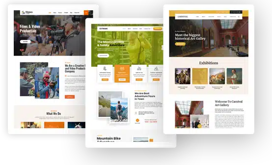
Pictures and Graphics
We’ve come a long way since clip-art, and everybody knows it. The quality and relevance of your images and graphics reflect not only the website itself, but the purpose behind your website.
It lets people know, without reading anything, immediately what your website is about and what it’s supposed to be used for.
First of all, make sure the images are relevant. For example, if your website is about interior design, and one of your main selling points at the present is that you have the perfect décor needed for a Christian home, then make sure your images reflect that.
Staying on the interior design analogy, make it so that your website could easily contribute towards somebody’s mood board when they’re trying to plan and create a design for the interior of their home.
High resolution images of beautiful sunsets and scenic waterfalls that you’ve found online might look great as your desktop background, but if they don’t contribute anything to your website, then there’s not a lot of point in using them.
Likewise, ensure that the images you are using are of the highest quality possible. We’re not all budding photographers, but there are so many photography tips that are readily available out there now that you might as well be. Using tools like an image extender can also help you adapt existing visuals to different layouts while preserving their quality.
As long as you’re using a good quality camera (whether this be on your smartphone or not) or your images are sourced from reliable, high quality resources, then you can’t go far wrong.
Usability
So you’ve got your colour scheme, your design is great, your pictures and graphics are relevant and high-quality, so what’s left? Making sure you can actually use the website would be good.
The usability of your website is crucial in ensuring that people visit and use the site you’re created. You can work as hard as you want on the visuals, but without a speedy and easy to use website, you’re not going to be doing so well.
Finally, before you get started, here is a checklist of what your website should include in order for it to work well:
- It should immediately communicate its purpose in a warm and inviting way. This can be conveyed through images and text.
- A simple and clear menu that organises all of the pages you have on your website.
- A “help” feature. People like to know that if they’re struggling to do something, the extra information is there ready for them to use.
- Enough information for the user to know WHY they’re using the website.
- A layout that’s primarily focused on ease, and is easy to read.
- Essential product information to enhance UX, such as a pricing table.
Use these tips and you’ll be up and running in no time!