
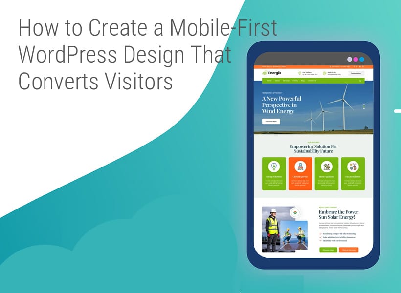
How to Create a Mobile-First WordPress Design That Converts Visitors
With over 60% of website traffic coming from mobile devices, optimizing your website for mobile is no longer optional; it’s mandatory. Besides, Google’s mobile-first indexing policy means they only crawl, index, and rank your site’s mobile version.
And since most people access websites via mobile, creating a mobile-friendly design makes attracting and converting traffic easy. This article will discuss actionable ways to create a mobile-first WordPress website that converts.
What’s Mobile-First Design?
Mobile-first design typically refers to a design that primarily suits smaller screens, such as smartphones. You need to build this design from the ground up.
This differs from a mobile-responsive design that modifies a site’s desktop structure to work well on a smaller screen.
The mobile-first design usually results in a cleaner interface, fast load time, and improved user experience.
Why a Mobile-First Design Drives Conversions
As mobile search continues to dominate, designing a website exclusively for mobile use can turn traffic into customers for these reasons:
-
Better User Experience
A design that fits smaller screens allows users to navigate different website sections easily, see and click on all buttons, read all the copy, understand, and much more. Ultimately, users have a satisfying experience while browsing different pages. They won’t leave to visit a competitor’s website.
-
Faster Load Times
Research shows that 53% of visitors will abandon a website if it takes over 3 seconds to load. Mobile-first designs improve load times, meaning most users will stay on your site, learn more about your services or products, and even purchase.
-
Trust and Accessibility
Since the design means painless navigation and quicker load times, people can sign up for email newsletters, book appointments, fill out contact forms, and purchase offers. This accessibility can make users trust your brand, return to it, and tell others about it. Just remember to match the seamless design with excellent fulfillment.
Planning a Mobile-First Website
Before starting the design, here’s what you need to do.
-
Understand the Behavior of Your Mobile Users
You can use Google Analytics, Hotjar, and other web analytics tools to understand your mobile traffic, user flow, session duration, and bounce rate. This information lets you know your audience’s pain points and the pages they find most important. That way, you’ll know which layout your users value most.
-
Define Conversion Goals
Decide what you’d like visitors to do. Here are some of the conversion goals to expect from users:
- Click-to-call button
- An email sign-up prompt
- A simple form to capture leads
- One-click checkout or purchase
Setting these goals upfront lets you design intentionally with accessible and visible CTAs, especially on tiny screens.
-
Start with a Wireframe
A wireframe is a basic layout that mirrors your site’s flow and structure. Starting with a mobile wifreframe lets you reduce clutter, prioritize content, and clarify navigation. You can use Adobe XD, Figma, or even a piece of paper to create a frame. After structuring the mobile layout, it’s time to expand it for desktop or tablet viewing.
Mobile-First WordPress Design Best Practices
When designing for mobile, you must go beyond resizing the layout and focus on what users want. Follow these best practices to ensure your website works and converts well on a mobile device.
-
Emphasize Speed and Performance
When browsing on mobile, users prefer fast-loading pages. So, you want to go for feather-weight, performance-based WordPress themes, such as Astra, Neve, and GeneratePress.
For instant-loading pages, use tools like FastPixel to optimize your website, CSS, and JS files, lazy-load images, convert them to WebP format, and deliver them via a content delivery network (CDN) with just a few clicks. Fast-loading pages boost both search rankings and user engagement. -
Simplify Navigation
Smaller screens require clean and user-friendly navigation. Save space with hamburger menus and use sticky call-to-action buttons for effortless accessibility. Besides, use a logical flow to guide people to your most important pages with minimal clicks.
-
Use Legible Fonts and Proper Spacing
Legibility is essential on mobile screens. Use readable fonts (of at least 16px) and reasonable line spacing. Additionally, create touch-friendly buttons that users can easily click without the need to zoom in. More importantly, break up the content with headings to enhance scannability.
-
Eliminate Clutter
Simplicity and focus are essential for mobile users. Remove all distractions and guide users to one, clear CTA per page. Use whitespace and visual hierarchy to guide users’ attention.
-
Optimize Forms for Mobile Use
Reduce the fields on long forms that won’t fit well on small screens. Instead, shorten the forms by keeping essential fields like name, email, and phone number. Also, create big buttons and easy-to-fill or autofill fields for better completion rates.
-
Use Mobile-Specific Functionalities
Leverage mobile device features like the tap-to-call button for quick contact, sticky chat widgets for fast support, and geolocation for local reach. These features improve conversions and user experience; you’ll find them on popular website builders like Elementor.
Testing and Iteration
Mobile-first websites require ongoing testing and iteration to facilitate high performance and boost conversions. Use these tips to assess and improve the design over time:
-
Check for Mobile Speed and Usability
You can use free tools like GTmetrix and PageSpeed Insights to establish whether your site loads fast, performs optimally, and works efficiently on mobile. Besides, cross-device testing platforms like BrowserStack can be used to see how your website behaves on various screen sizes and mobile devices.
-
Run A/B Tests to Optimize Conversions
Small changes can lead to significant wins. Use A/B testing tools like Unbounce or VWO to try form variations, varying button sizes, layout changes, and different CTAs to discover what mobile users prefer most.
-
Get User Feedback
A heatmap can help you visualize where mobile users scroll, tap, or get stuck. Analyzing this information provides valuable insight into user behavior. Additionally, you can survey users to collect direct feedback and discover friction points.
Summing Up
Mobile-first design goes beyond creating a WordPress website that looks beautiful on small screens. Instead, it’s about optimizing for a fast, navigational, and conversion-focused experience that addresses mobile users’ needs.
Take a moment to evaluate your current website’s mobile performance. Do pages load fast? Can people navigate hassle-free? Are CTAs accessible and legible?
To reach there, use website optimization tools like FastPixel to boost website speed, optimize images, and provide an unmatched experience across devices. An optimized mobile-first website will attract and convert traffic.