
How Fashion Stores Can Use AI Try-On Visuals Without Losing Product Clarity
A fashion product page has to do several jobs at once. It needs to show the item clearly, answer practical questions, and help a shopper picture how the piece might work in an outfit. A clean packshot can handle the first job. It does not always handle the last one.
That gap is why many stores add styling photography, lookbook blocks, customer photos, or short video. A generated try-on image can sit in the same family of supporting content, but it needs a clear editorial role. Drop one into the gallery without context and it may look more like a different product than an extra view of the same one.
The useful question for an online fashion store is not whether an AI image looks impressive in isolation. It is whether that image helps a shopper understand the product page without confusing the product facts.
Treat the Try-On Image as an Extra Product View
The main product image should still make the item easy to inspect. Keep the regular front, back, detail, and colour images where customers expect them. A try-on visual works better as a supplementary view: a way to show styling, proportion in an outfit, or a seasonal direction that the standard photos do not cover.
That framing has a practical benefit. It stops the store from asking a single image to answer questions it cannot answer. A visual preview is not a size chart, a fabric description, a stock update, or a promise about how an item will feel when it arrives.
For a store team, that usually means adding a small “styled view” section below the core gallery or using one labelled extra image in the product gallery. The page should make it obvious that the image adds context rather than replacing the essential product photography.
Build the Brief Before You Build the Gallery
The fastest way to make a product page look inconsistent is to start generating before deciding what the visual is supposed to show. Write a short brief first: which garment details must stay visible, what styling context is useful, and which parts of the original product photography should remain the reference point.
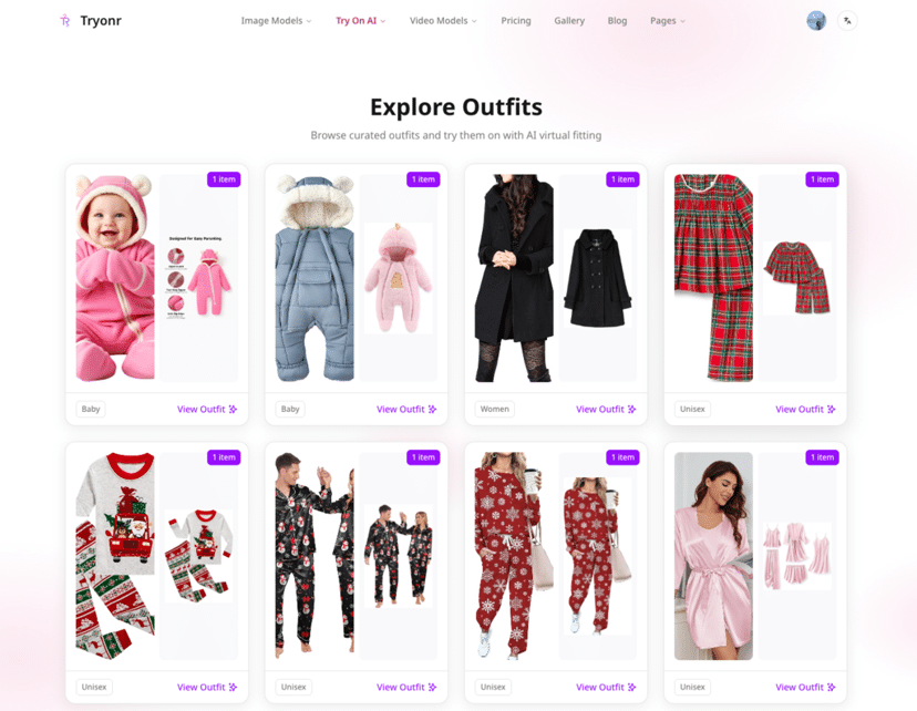
Tryonr presents a virtual try-on workflow that starts with a subject image and separate garment images, then lets the user add prompt constraints. That is a helpful reminder that the source material matters. A sharp garment image and a clear product brief give a reviewer something concrete to compare against later.
When choosing an AI clothes changer, the key consideration is not simply whether it can create a polished scene. It is whether the store can review the image against the actual garment: the neckline, closures, sleeve shape, pattern, colour, and any detail that a shopper would notice before adding the item to a cart.
This is also where the store should decide what not to ask of the image. Do not use it to imply exact fit, conceal a product feature, or stand in for a photograph that the team has not captured yet.
Design a Small, Useful Set of Views
More images do not automatically create a better product page. A gallery becomes harder to use when every asset repeats the same information. Start by mapping each image to one question a shopper might have: what does the full item look like, what is the key detail, and how might it be styled?
The Tryonr workflow also presents follow-up options for feature annotations and multiple viewing angles. For an online store, that can inform a sensible image plan: keep the original product views as the factual base, then add only the supplementary views that make the page easier to scan.
A knit could need one styled view and one close detail. A coat may benefit from a front styling view plus an open-front detail that shows the lapel. A dress already photographed from several angles may need nothing more than a single lookbook-style image below the product summary. The page architecture should decide the asset count, not the novelty of the tool.
Keep Product Facts Close to the Visual
If a try-on image appears near the product summary, the factual content needs to stay just as visible. Keep the product name, available options, size guide, material information, care instructions, and delivery or return details in their normal places. Those are the details a shopper uses to make a purchase decision.
This matters particularly when the styled image looks more editorial than the standard product photography. The stronger the styling direction, the more useful it is to distinguish the exact item for sale from accessories, lighting, model pose, or background atmosphere. A short nearby label such as “styling preview” can be enough, provided it matches the store’s established voice.
The same principle applies to the page layout. Do not hide specifications below a large visual block simply because the new image looks good on desktop. Check the mobile product page as well. The core information should remain easy to reach before and after the new section is added.
Start With One Representative Product
There is no need to refresh an entire catalogue to learn whether this content belongs on the site. Pick one representative product: something with enough visible detail to review, a familiar photography style, and a product page that already has solid factual content.
A limited virtual try on clothes online free experiment can give the store a contained way to test the publishing workflow. Create one supplemental visual, place it on a test version of the product page, and ask the person responsible for merchandising to compare it with the item photos and copy before it goes live.
The review should be specific. Is the garment recognisable? Are the design details intact? Does the image make the page easier to understand? Is its placement clear on a phone? If any answer is uncertain, the simplest response may be to hold the visual back rather than try to explain it away.
A Product-Page Checklist for Store Owners
Before publishing a try-on visual, check that it has a defined job on the page and that the original product photography still leads. Make sure the garment details have been reviewed against the item for sale. Keep size, material, colour, and availability information easy to find. Finally, look at the page on mobile, where a large visual can quickly push important information out of view.
Used this way, AI try-on is not a replacement for product information or careful photography. It is one more editorial asset an online fashion store can use when it adds context without taking clarity away.
