Enhancing User Experience Through Effective Website Design: Key Strategies

When user experience (UX) is dissected, it’s possible to get bogged down in a multitude of talking points. Sometimes this is not an issue, but if you are looking for simplicity and clarity in this context, it’s normal to feel bamboozled.
To get you back on the road to comprehension, here is a look at some strategies that will let you kick your site’s UX up a gear without tearing your hair out in the process.
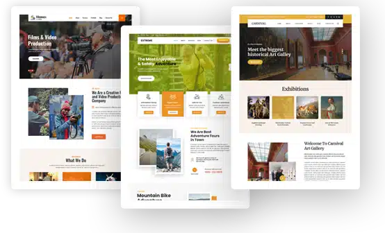
Strategic Theme Selection Tailored to Industry Needs
It’s helpful to think of selecting the right theme for your website as if you’re choosing a suit for a special occasion. That’s because the wrong choice can make or break the impression you leave on your visitors.
Understanding Your Audience
First, know who will visit your site. For instance, an e-commerce platform needs a sleek, functional design with clear calls to action (CTAs), while a blog might benefit from clean readability and easy navigation.
Industry-Specific Considerations
As well as keeping your audience in mind, your theme has to be appropriate for your industry niche in other ways.
For instance:
- E-Commerce: Opt for themes with integrated shopping carts, product display options, and secure payment gateways.
- Blogging: Take a look at minimalistic themes that highlight content without distractions.
- Corporate Sites: Aim for professional layouts with ample space for detailed information and high-quality visuals.
Performance and Compatibility
Themes must perform well across different devices. A slow-loading site frustrates users quickly, and since you want to ensure bounce rates are below 40%, speed must trump other considerations.
Moreover, mobile responsiveness is mandatory in 2024 as traffic from portable devices continues to outpace desktop use.
Key considerations for choices here include:
- Load speed optimization
- Cross-browser compatibility
- Responsive design ensuring seamless user experience on all devices
Aesthetic Cohesion
Choose themes that match your brand’s visual identity. Using Google Web Fonts allows you to create aesthetic cohesion effortlessly by providing a wide array of font styles tailored to various industries:
- Modern sans-serif fonts convey professionalism.
- Elegant serif fonts are ideal for editorial sites or brands looking to establish trustworthiness.
- Playful display fonts suit creative industries targeting younger demographics.
In short, strategically selecting themes that align with these aspects will leave your site set up for success from the get-go. And if you’re overwhelmed by choice here or you need something even more specialized, working with a WordPress agency like Freshy will let you get a truly custom site that takes a good theme as a foundation and runs with it.
Content Arrangement Techniques for Enhanced Readability
Effective content arrangement is like organizing a library. The better the structure, the easier it is to find what you’re looking for. As such, a website that wants to offer exceptional UX design must prioritize this aspect.
Logical Layout
Start with a clear hierarchy. Users should intuitively understand where to find information. Place essential content above the fold; users often decide within seconds if they’ll stay or leave. And while average time spent on-site sits at around 52 seconds, you really want to push beyond that by impressing newcomers rather than leaving them keen to browse elsewhere.
Breaking Down Information
Avoid overwhelming your visitors with walls of text. Break down information using:
- Headings and Subheadings: These guide users through sections effortlessly.
- Bullet Points and Lists: This will make complex data digestible quickly. You’re reading one right now, for example!
- Short Paragraphs: Keep paragraphs concise for easy scanning.
Visual Aids
Integrate visuals like images, infographics, and videos strategically to complement text-based content.
These can be used for different purposes:
- Images: Use high-quality images relevant to your text that support understanding without distracting.
- Infographics: With these you can simplify complicated processes or data points visually.
- Videos: Well-produced clips let you offer deeper insights into topics while keeping engagement high. In fact they’re capable of upping conversion rates by 80% as well.
On top of this, visual aids break the monotony of browsing your site and cater to varied learning preferences among users. Not all people want to read walls of text, and the advent of social media makes visuals even more of a keystone UI/UX design agency choice where UX is concerned.
Internal Linking Structure
Internal links serve as a map guiding visitors through related topics on your site. With them you can:
- Create pathways between related articles or product pages.
- Enhance SEO by spreading link equity throughout your website.
- Encourage longer visit durations by promoting deeper exploration of your site’s offerings.
The basic idea is that by carefully arranging content in these ways, you conjure up an environment where users feel engaged rather than overwhelmed. It’s quite a balancing act, but pull it off and you’ll see your site traffic skyrocket sustainably.
Monitoring Performance for Continuous Improvement
In website design, continuous performance monitoring acts like a regular health check-up. It helps you diagnose issues early and keep your site running smoothly. That’s not to say it will not be without its hiccups, so having a consistent plan of action is your best bet.
Setting Up Analytics
First, integrate tools like Google Analytics or more advanced platforms such as Hotjar. If you don’t know which one to use, you can compare the more popular ones like Google Analytics vs Hotjar or Hotjar vs Fullstory
These provide detailed insights into user behavior and site performance metrics. :
- Traffic Sources: Understand where your visitors come from.
- User Behavior: Analyze which pages attract the most attention.
- Conversion Rates: Track how effectively your CTAs are converting visitors.
Key Metrics to Monitor
Monitoring specific metrics allows you to pinpoint areas needing improvement:
- Bounce Rate: High bounce rates can indicate poor user experience or irrelevant content.
- Load Time: Slow load times deter users; aim for under three seconds. Averages at the moment sit at 2.5 seconds on desktop machines, while mobiles are closer to 8.6 sections.
- Session Duration and Pages Per Session: Longer sessions usually signal engaging content and intuitive navigation.
Performance Optimization
Identify lagging areas through analytics and address them promptly:
- Optimize images to reduce loading time without compromising quality.
- Minimize HTTP requests by combining files when possible (CSS, JavaScript).
- Implement caching strategies to improve repeat visit load speeds.
A/B Testing
Conducting A/B tests provides concrete data on what works best for your audience. In turn you can choose what changes to make, and whether you’re taking the right path.
To do this:
- Create variations of web pages with different designs or content elements.
- Direct traffic equally between versions using tools like Optimizely or VWO.
- Analyze results to determine which version performs better based on defined KPIs (Key Performance Indicators).
Continuously monitoring these aspects creates a scenario in which your website evolves alongside changing user expectations.
The Last Word
Success with a website is not about luck, and while it’s a little cliché to paraphrase a 35 year old Kevin Costner movie, if you build it well, visitors will come in their droves.
Picking an appropriate theme, arranging content in a coherent and cohesive way, and keeping tabs on performance will all go towards enhancing the user experience your site has to offer. You just have to be willing to put in the work.

