
AI-powered image generation, creativity, design tools
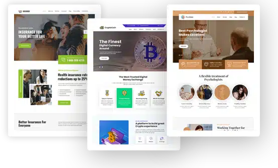
Over the past couple of years, AI-powered image generation has become for web development what CSS frameworks once were: it has dramatically accelerated the process from concept to finished interface. Teams that previously spent weeks building a visual system can now assemble a stylish set of screens, illustrations, and promotional materials in a day, and then calmly polish the details for production. And in this new reality, it’s especially interesting that demand is growing not only for “pretty images” but also for practical visual components — for example, 3D icons — that help interfaces look modern, user-friendly, and still remain understandable.
AI and Creativity: Why It’s Not a “Designer Replacement”
Web development has long been in a constant state of optimization: build faster, test faster, release faster, measure impact faster. AI image generation fits perfectly into this process, but it’s important to understand its role correctly. It doesn’t “solve the design,” but rather removes routine work and expands the range of options.
Interface creativity is frequently constrained by time and resource constraints rather than a lack of ideas: a lot can be created, but systematizing and visualizing it is costly. AI pushes the envelope by proposing twelve style guidelines, generating metaphors for a landing page, recommending visual accents for onboarding, and producing fast variations for A/B testing. After that, the designer and developer choose, streamline, and harmonize the design to create a product that will work flawlessly on various screens and not conflict with the brand.
As AI-generated visuals become more common, another layer is quietly joining the workflow: AI image detectors. They don’t restrict creativity, but help teams understand where and how AI-generated assets are being used. This is especially relevant for companies working with strict brand guidelines, licensed content, or regulated industries. Detection tools make it easier to audit visuals, avoid accidental misuse, and maintain transparency—without slowing down the creative process.
Next-Generation Design Tools: A Library as the Foundation of Speed
Consistency, not “pictures,” is one of the most underappreciated aspects of design. Everything starts to work when a project has a common language and a set of repeatable components: development is easier to maintain, functionality is easier to explain, and the interface is easier to read. That’s why asset libraries (icons, illustrations, 3D objects, patterns) have become more than just “decoration” but a true productivity tool.
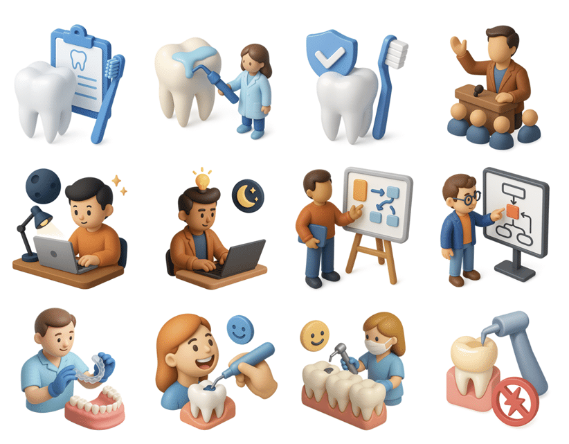
Frankly, most product teams fail not because of poor design, but because of visual chaos. Flat icons here, photorealistic there, and random stock illustrations there. The user can’t form a “brand sense,” and the interface looks like a collection of disjointed fragments. 3D icon libraries solve this problem: they provide a consistent style, a consistent feel, and a repeatable composition.
Why does a website and app need 3D icons if there are regular ones?
Because they are neutral, compact, and readily scalable, flat icons effectively fulfill their purpose. However, 3D icons have a clear benefit: they give the interface a “sense of objectivity” and emotion. This means the user doesn’t just see the icon; they perceive it as an object—friendly, understandable, and “alive.” This is especially important when a product needs to appear accessible and modern: in fintech, delivery services, educational apps, and B2B dashboards, where you want to reduce the “dryness” of data.
3D icons often act as a bridge between functionality and marketing:
- In marketing blocks they replace complex illustrations and make the benefits of the product more tangible;
- In onboarding and prompts they help retain attention and better explain steps;
- In empty states they relieve irritation and maintain the tone of communication;
- In the settings and personal account sections, the interface is made more visually friendly without overloading it with text.
Crucially, photorealistic 3D icons are not necessary. Conversely, stylized “basic 3D” with delicate shapes, faint shadows, and a somewhat toy-like look frequently works best. It’s safe for a variety of themes and fits well with familiar interface grids.
When 3D Icons Really Enhance a Product
There’s a simple criterion: 3D icons should help the user quickly understand the meaning of a block or action. If they’re just “for show,” there’s a risk they’ll compete with the content.
The most successful scenarios:
-
Homepage and landing pages
Here, 3D icons act as visual markers of benefits. The icons—security, speed, analytics, integrations, and support—assist the user’s brain in rapidly understanding the content as they browse the page. This increases the page’s coherence and readability.
-
Onboarding and training
When a product is complex, people often get lost on the first screen. 3D icons make the explanation more fluid: instead of a dry diagram, they create a clear image. This isn’t just aesthetics, but a psychological comfort: “They’re speaking to me in normal, human language.”
-
Empty states and errors
Empty states, “nothing found,” “no data”—these are where user motivation drops. A little 3D flair can transform a dry message into a friendly moment and keep users from leaving.
-
Dashboards and B2B
B2B environments often contain numerous tables and numbers. Visual markers help reduce clutter: sections become more noticeable and the interface becomes less monotonous. The key is to avoid overdoing the size and detail.
AI Generation and 3D Icons: A Perfect Combination for Iteration
AI is particularly helpful when you need to locate a visual metaphor quickly. For instance, you are writing a page about abstract concepts like “automation,” “security,” or “integrations.” It is possible to create a full-fledged illustration, but it may be too heavy, complicated, stylistically dubious, and not repeatable between blocks.
3D icons are a compromise that often wins. They can be:
- Quickly select from collections to match the meaning of blocks;
- Adjust to brand colors and tone;
- Scale according to a single rule;
- Reuse in different places of the product: landing page → app → presentation → documentation.
AI here acts as a customization accelerator. Instead of manually redrawing, you can quickly “adapt” a set to a brand palette, change the background, create variations for dark mode, and prepare multiple images for different sections. And all this without turning the design task into a lengthy production process.
Web Development Best Practices: How to Implement 3D Icons Without Chaos
To ensure that 3D assets actually contribute to your project, rather than turning it into a patchwork of graphics, it’s helpful to think like a developer: you need rules.
-
Single level of detail
If some icons are “almost cartoonish” and others “almost realistic,” the style falls apart. Choose a single line: either a soft, basic 3D or a more detailed, but consistent look.
-
Same perspective and light
Even if the user can’t articulate it, the brain notices the discrepancy. The beauty of library sets is that perspective and lighting are often already aligned.
-
Restriction on places of application
Icons should support the user’s meaning, not replace text in critical areas. Typically, the following are sufficient: landing pages, onboarding, empty states, and sections/categories. It’s best to keep them simple within forms and tables.
-
Balance of weight and performance
3D images can be heavier than regular SVG icons. For the web, this is crucial: optimization, lazy loading, correct formats and sizes, and thoughtful loading. Beauty shouldn’t compromise Core Web Vitals.
-
Token and theme system
If you have a light/dark theme, check the readability and contrast. Sometimes 3D icons get lost on a dark background due to shadows. This can be resolved either with separate versions or a neat overlay.
Where 3D icons are especially good for product and business
More broadly, 3D icons provide more than just visual freshness. They help businesses in three important ways:
- Speed and consistency:
A single style allows the team to assemble new pages, screens, banners, and presentations faster. Fewer approvals, less hand-crafted graphics, less “everyone comes up with their own.” - Clear Communication:
Images work faster than text. This is critical for a landing page: users make decisions in seconds. - The emotional tone of the
Soft 3D brand makes a technological product more human. This is noticeable in niches where people are afraid of making mistakes: finance, security, automation, and documentation.
The Future of Visual Content: From “Images” to Components
AI is gradually turning visual design into a construction kit. We’re moving toward a world where images aren’t one-off “illustrations,” but reusable components, like buttons and cards. In this sense, 3D icons are the ideal format: they’re expressive enough to create a mood and systematic enough to be part of a library.
While web developers once treated graphics as “material to be brought in by designers,” graphics are now increasingly becoming part of the product—and they can be planned just like UI components. Select a set, customize the style, define usage rules, optimize formats—and then easily scale the product without incurring visual debt.
Bottom Line: Why You Should Keep 3D Icons in Your Arsenal
AI-powered image generation has opened the door to new speeds and new levels of variability. But in practice, the winners aren’t those who create the “most unusual images,” but those who build a clear visual language and don’t break the product with chaotic solutions. 3D icons are one of the most convenient tools on this path: they combine creativity and consistency, marketing and interface, emotion and functionality.
If a web development blog is looking for a topic that’s both design- and product-focused, 3D assets are the perfect bridge where developers have a lot to talk about: from optimization and formats to UI logic and experience integrity. And the sooner the team starts treating visual assets as system components, the easier it will be to develop the product in 2026 and beyond.