8 Visual Elements to Improve Your Web Design
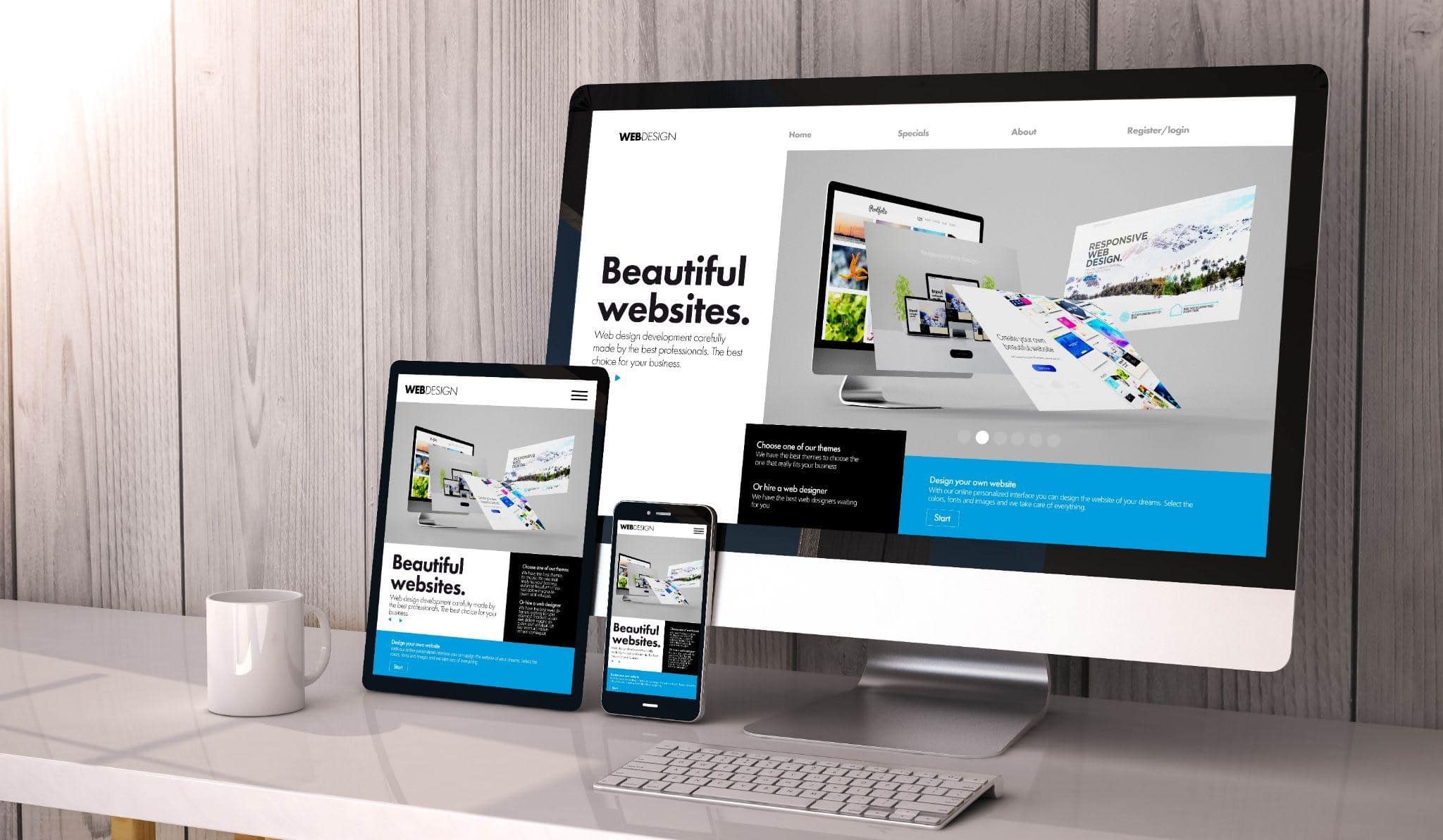
Websites are a highly visual medium for most users. Not only does the overall aesthetic of a site impact the user experience (UX) but you can guide users to the next step in the buyer’s journey, confirm they’ve clicked on something actionable or share videos to teach them about a product or service.
When choosing images, you must ensure you look at how easily they respond to smaller screens. Research shows more than 50% of web searches now occur via a mobile device. If you wish to capture the attention of all your site visitors and turn them into leads, you need to improve your web design through visual elements, excellent colors and the right background images.
What Are Visual Elements in Web Design?
The images should set the tone for the website and speak to your target audience. You want to make sure any images/stock photos/photography you add to your site match the overall graphic design personality.
There are millions of sites where you can download various images, videos and vectors. You have to consider web security vulnerabilities when downloading and using different visual elements. Never download from a site that seems iffy. If your virus protection throws up a warning, then it’s probably a website you should stay away from.
However, most will give you both premium and free templates and images you can use. Sprinkle in a few unique ones as well and you’ll have a site that is unlike any competitors.
Add personality to your site with texture, amazing typography and stock photos. Even your logo helps set the personality you present to the outside world and make a first impression on your users. Here are some of the visual elements you can use to improve your web design.
-
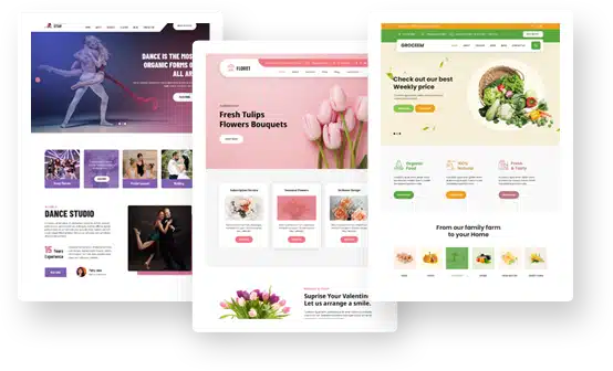
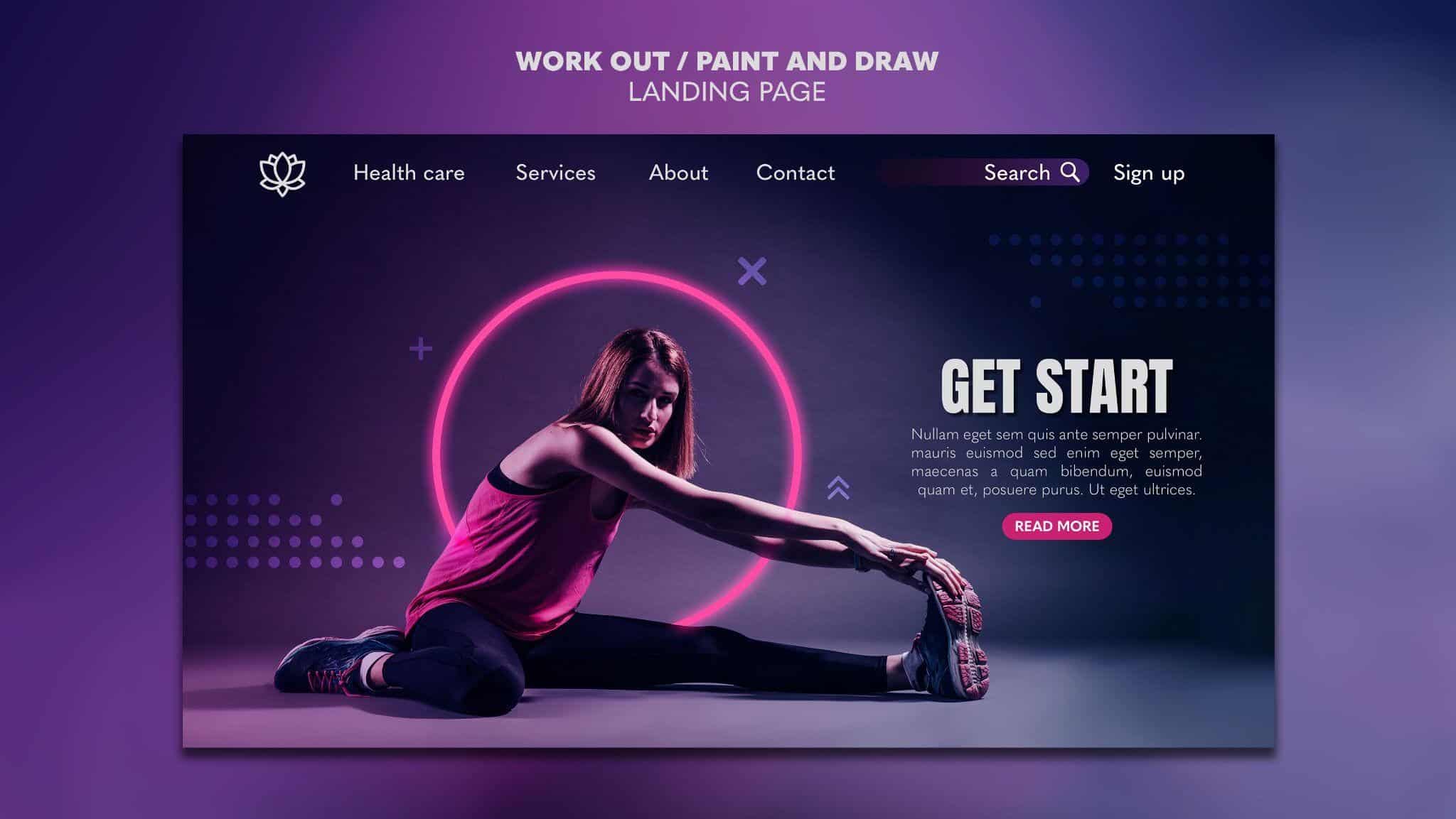
High-Quality Photos
Don’t just add images to your site, but seek out relevant high-quality photos that enhance the words on your page. For example, if you want to show potential customers that your product beats the competition, you’d use photos showing the problem your customers face and how you can solve it.
You can grab stock photos, but you should also intersperse your own unique photos that are personalized to your brand. Find top-notch, professional pictures that make your site look more established.
You can tell the difference between photos an amateur snaps and photos a professional does. Strive to present an experience, authoritative appearance at all times.
-
Unique Fonts
Stick to headlines and logos when you use display fonts or something really unique. However, you certainly have some creative leeway when choosing which typography works best for your particular brand personality.
An original font looks great and can make logo templates look different than others. Just make sure it’s readable. You don’t want to insert something consumers can’t really figure out.
Take a step back from the computer screen and see how the headline looks from a distance. Is it still readable? Pull the site up on a mobile device and see if it scales down and the letters are still easy to read. Consider all the ways you’ll use various fonts and choose the ones that make the most sense for your brand.
-
Icons
You can enhance some sections of your site by adding icons to guide the user through the buyer’s journey. Icons can enhance information. For example, you might add a small image of a telephone to indicate your toll-free phone number.
Another place you can add icons is in your mega menus. You can break up sections with a few well placed images.
Icons don’t take up a lot of space like a photo does. However, they can guide the user and add personality and style.
-
Stock Video
Videos have become increasingly popular because they’re a good way to absorb information quickly. People can watch a short clip between meetings or while waiting for a doctor’s appointment.
However, smaller brands may not have the funds to shoot their own footage. Fortunately, you can utilize stock video footage to add the effect of video content without spending as much to produce something unique.
-
No Visuals
How much negative space is on your website? The use of no visual at all can be a powerful statement. People have a much easier time honing in on the thing you want them to focus on when you limit the number of elements on the page.
If you have one truly powerful photograph and you want people to spend some time looking at it, you should surround it with some white space.
Want your CTA button to be the thing that stands out? Contrast it with the background or set it off by itself.
-
Vector Graphics/Vectors
Are you new to using vector graphics? They are similar to other images but made up of lines and curves and much more scalable than some visuals.
If you’re familiar with math terms, you probably remember that vectors are lines that sit on an axis or some type of geometrical shape. Similar to the way they appear in math, vector graphics in web design turn to geometric shapes and present a crisp style that has a unique and modern look.
Vector graphics are made up of lines and curves. They work well to create a unique website that doesn’t look too square or make one think of a bunch of boxes. You can add vectors anywhere on your page or within your background.
The great thing about vectors is how easily they scale. Designers can scale a curve to a small screen or blow it up into a full-size illustration for a desktop computer.
-
Headshots
What is your brand’s story? If you utilize images to tell a story, people will feel instantly more connected with your business. The faces of those who started the company and the workers who built it into what it is today can showcase what your company culture is like.
Brands have a number of options in how they share portraits on their sites. You can use bubbles and names. You could offer a timeline with square photos of each person. Video statements and testimonials also tell a tale.
People want to feel they are buying from a brand that stands for something. When you share personal stories and put a face and images to them, you capture the imagination of your customers and turn them into loyal fans who refer your brand to others.
-
Color Palette

Choosing the perfect color palette to represent your brand isn’t easy. You have to figure out what colors work best in which elements on your page. Your brand colors might be red and white, but red isn’t going to work as well for the background images as white would. Red works much better as an accent color.At the same time, you must consider how different hues impact people’s emotions and buying behavior. Red can be seen as excitement, passion or murder. You have to consider the culture of your typical audience and how they might view different shades.
Today’s backgrounds tend to be less flat than those of the past. Web designers use gradients, photos with a layer of color on top or other designs to set the tone.

Take a Step Back
Improving your web design takes time and trial and error. Add some new visual cues and then take a step back and see how it looks from different angles. Does anything not match the rest of the page? Is a jarring visual intentional to grab attention or should you change it?
Ask for feedback and conduct some split testing to see what your users respond to best. Take the time to really hone in on the best elements of your design and then make the changes needed for your site to be better than any other in your industry.