6 Secrets To Make An Engaging And Attractive Website
When the internet became a global phenomenon, multitudes began surfing. They discovered an ever-increasing number of websites that featured everything from sports to shopping.
Thanks to modern innovations, it has become easier and easier to create your own website. Whether you’re a holiday blogger or a business owner, the opportunity is there.
You might be about to create a website on your own or with professional help. Alternatively, you may already have one, and be wishing to improve it.
This article has been written to help you ensure it is as engaging and attractive as possible. Thanks to six helpful tips, you will better understand how to get your website noticed.

-
Seek Professional Help
An IT consultant or third-party company could apply their experience and knowledge to your individual needs. They could make sure the site functions correctly and is optimized for SEO (Search Engine Optimisation).
People scroll through social media and the internet very quickly, so first impressions are very important. You may have just a few seconds in order to gain a potential customer’s interest before they move on.
This is an area where graphic designers can apply their technical and artistic skills to your project.
Australia’s Gold Coast is a center for start-up businesses. It’s no surprise either because the city’s Gross Regional Product adds up to around $38.11 billion. When it comes to graphics design on the Gold Coast it’s possible to receive help with both your website and social media design.
Things like branding (logos and taglines) can help define you in the marketplace, so it’s essential that you get it right.
-
Focus On Your Page Layout
Whilst you don’t want each web page to look robotically identical, there should be enough similarity for it to appear professional.
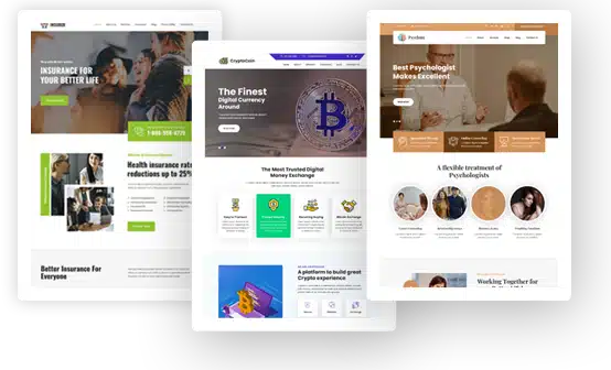
No matter how good the content is, you will fall at first base if the site looks random and untidy. Many website builders, such as Venturz and WordPress, can be really helpful because they provide templates that you can use.
It’s also worth checking your rivals’ web pages to see what you can learn. Whilst you may want to pack your website with written information, people actually want clarity and simplicity.
Rather than displaying mountains of text, use hyperlinks that direct people elsewhere on your site for more information.
Whilst fonts that resemble handwriting may look stylish and personal, you should avoid using any that are not easy for people to read.
-
Use Images And Multimedia
When it comes to adding pictures it’s a question of balance. They can help break up the text (although you should be using small paragraphs) but shouldn’t be used excessively as people won’t want to keep scrolling.
If you have lots to display you could consider creating a slide show or providing the option for people to scroll sideways for more.
Whilst pictures are more engaging than text, videos trump them all. This is why they are being used in email marketing campaigns more and more. For this reason, you should consider having a video on your homepage that explains what your site is all about.
If you appear on it, it will make your mission seem more personal. These days people want to learn about more than just products and services – they desire to discover the mission behind them (e.g. environmental or charitable).

-
Maximize The Power Of Colour
We mentioned graphics design earlier and for good reason. When people have clearly recognizable brands it’s easier for them to become more widely known.
When folk can quickly identify a product from the colors and design they will assume this is a leading brand and one to do business with.
Even if your page layout is great, it will still look amateur if there are clashing colors. If they are too bright people may be put off too.
If you look at some of the social media giants such as Twitter and Facebook you will see they have used the restful color blue. It’s worth researching the use of colors online to make sure you have chosen the most suitable shades.
-
Always Have Social Media In Mind
People need to have the same visual experience whether they are reading your content on social media or your website. Whether they are using a laptop or pc, smartphone or tablet the quality and accessibility needs to be the same.
Whilst you can include social media links (plugins) on your website, the reverse is the most important. This is because you can use platforms like Facebook or Twitter to redirect people to your online sales pages.
When people can freely move from your website to your social media and vice versa it’s easier to increase online traffic and generate brand awareness. The more people visit your web pages and enjoy them, the higher your ranking will be on Google.
This means greater visibility when people are searching for the products or services that you provide. Just as your social media followers may buy from your website, your website visitors may become your social media followers.
-
Provide Simplicity Of Access
We discussed earlier that you only have a short time span in order to secure a person’s interest. If your page takes too long to load, this could cost you business.
The same thing applies if the website is not user-friendly and intuitive. By this, we mean the action buttons should be clearly identifiable and easy to use.
People should be able to quickly understand the purpose of your website and receive a call to action (CTA).
It should be simple to navigate from one section to another and your contact details must be quickly accessible. If you have loads of textual information available (eg product specifications) you should consider using drop-down menus. They are especially effective with online catalogs.
As you can see, there are many ways to improve a website. If you put some of these strategies in place, you will ultimately reap the benefits. People will enjoy reading your web pages, and revenue may be generated for many years to come.


