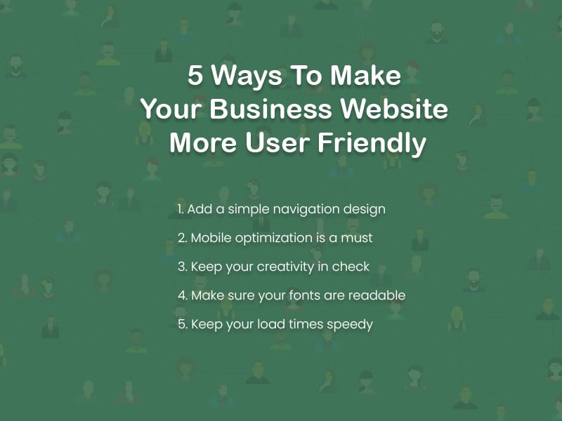
5 Ways To Make Your Business Website More User Friendly

Having a website is typically a tool for building interest and visibility for your business. Even if you are selling business online, a user-friendly website will be the simplest and most effective way to connect and attract new customer. If your website isn’t very user friendly, you won’t achieve that goal. The design of your pages have to do more than just look good.
If you’re looking for ways to boost user engagement on your website, try investigating ways you can tweak your design to make it more user friendly. Here is a quick run down of a few simple ways to give your website a little user-friendly face lift.
-
Add a simple navigation design
People will find your website more inviting if it is easy to see how you’re supposed to move around the pages. Navigation should be simple, so passing users don’t get frustrated and leave.
A stationary navigation bar, like this data analytics business website shows, will set up a clear path for visitors to dive into the content on your website. When it’s easy to explore, people will explore.
-
Mobile optimization is a must
Mobile access to the internet is something that happens a whole lot in this tech-driven era. Building a business website that makes an impact on the digital world means that mobile optimization is essential.
Take the time to research the variables involved in building a more mobile compatible website. Then take a look at where your site’s design may or may not be falling short. A simple upgrade to your design could do a lot to drive more traffic your way.
-
Keep your creativity in check
Creativity is great for building your brand and keeping your marketing approach fresh. However, getting too creative within your business website design can work against your effectiveness.
A website that’s too busy with creativity could be overstimulating. Overstimulation is good for shutting users down. Keep it simple when you can, and always remember balance.
-
Make sure your fonts are readable
A cool font might seem like a neat way to jazz up your website’s style, but it’s not really preferred by web users. People need to easily be able to read what your business page has to say, and some fonts can be very difficult to read.
Choose an easily identifiable style for the text on your pages, and make reading what your business has to say a non-issue for visitors.
-
Keep your load times speedy
Finally, keep it fast. Everything in the world of commerce is speed related in some way, and your business website is definitely one of those things.
When your pages load quickly, your site is much nicer for users. Web users will only wait a few seconds for your site to load before they choose to move on to another search result.


