

10 Effective SEO Techniques to Optimize Your WordPress Site for Mobile
An increasing number of individuals are presently accessing the Internet via their mobile gadgets, which emphasizes the necessity for companies to construct a strong online presence tailored for mobiles to connect with a wider audience.
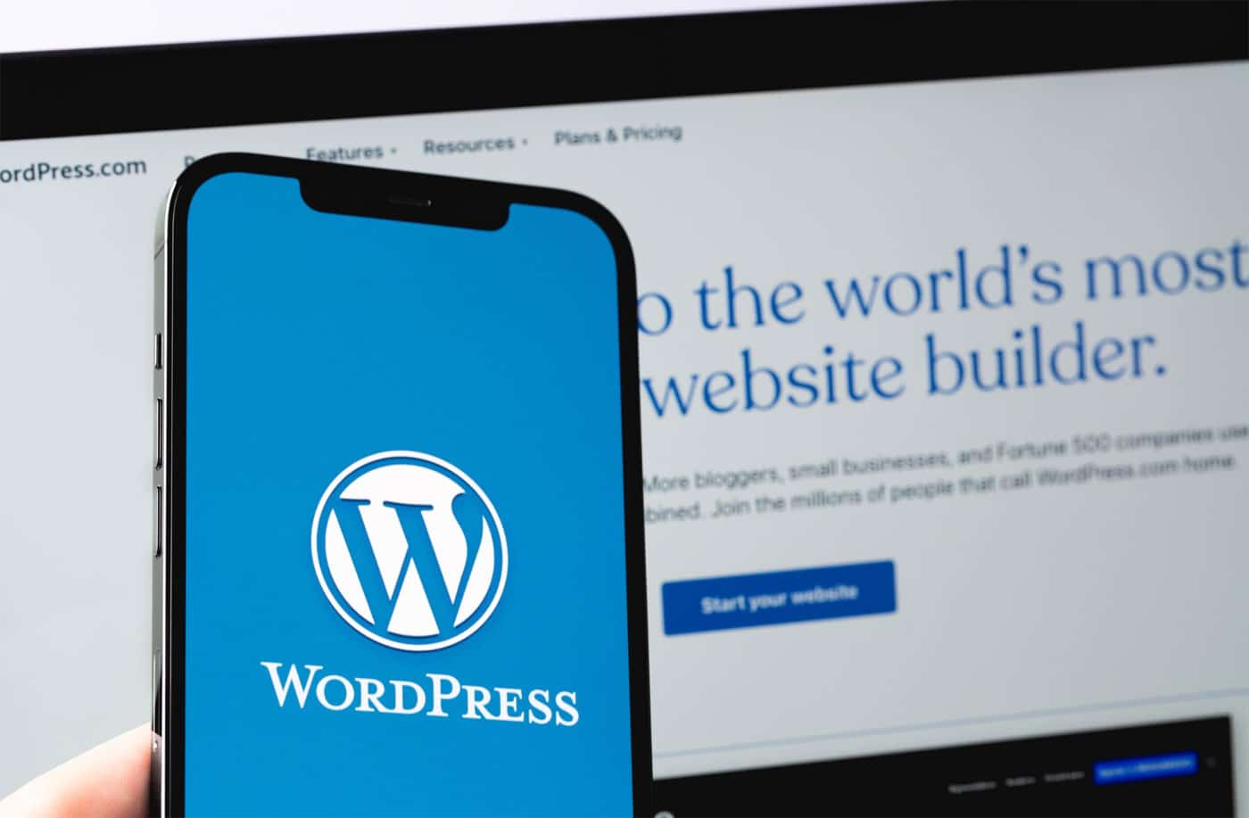
43.2% of all live websites are powered by WordPress. However, using this leading content management system does not guarantee success in the tight competition of the online landscape.
It’s time to implement SEO strategies into your WordPress website. I’ll share with you 10 mobile optimization strategies you can implement into your WordPress site to rank high in search results.
Importance of Mobile Optimization for WordPress Websites
For WordPress websites, mobile optimization improves search engine ranking, boosts conversion rate, grows traffic, and enhances user experience, performance, and brand reputation.
- Enhanced User Experience: When your website is optimized for mobiles, users using mobile devices can access the website without a problem when it comes to navigation, readability and interface. This will provide better engagement, enhancing their experience.
- Improved Search Engine Rankings: Google’s mobile-first indexing predominantly uses the website’s mobile version. By optimizing your WordPress website for mobiles, chances are high that you will rank in search engines.
- Increased Visibility: When you rank high in search engines, more people will be able to find your website.
- Enhanced Performance: Optimizing your WordPress website for mobiles increases loading times, smoother navigation, and functionality for its performance.
- Boost Conversion Rates: When users find it easy to navigate your WordPress website for whatever it is they are looking for, they are likely to action – increasing conversion.
- Growing Mobile Traffic: During the first quarter of 2024, 61.21% of all traffic came from mobile devices. This will continue to grow for years – tapping you into a larger and growing market with mobile optimization.
- Enhanced Brand Reputation: A good experience for users in an optimized WordPress website will give them a positive view of your brand. This will increase not only your loyalty but also your word-of-mouth recommendations.
How to Optimize WordPress Site for Mobile in 10 Ways
Now, to optimize your WordPress website for mobile, the following strategies will provide insight into its importance and implementation.
-
Implement a Responsive, Mobile-Friendly WordPress Theme

Regardless of the device, a responsive and mobile-friendly website is easy to interact with and navigate.Choose a WordPress theme that aligns with your business goal and aesthetics, ensuring it can support any essential plugins you need. Also, opt for those with regular updates and responsive support from developers, and seek those with positive and high ratings from other users.
Some of these themes include Astra, Divi, GeneratePress, and OceanWP.
-
Streamline Your Content for Mobile Users
When a website is viewed on a mobile, the tendency is that the content will become smaller and harder to read. This is frustrating and would lead users to leave your website. To avoid this, you need to have concise and clear writing due to the limited space and also for the readability of users on a device.
Break up your content into smaller sections, as large blocks of text on a smaller screen can be overwhelming. Use enough spacing between lines and paragraphs, and make fonts readable.
Simplify your vocabulary so that users can easily understand your content, and use numbered lists or bullet points to highlight the important information.
-
Optimize Images and Videos for Mobile Viewing

Uncompressed images and videos can lead to slow loading times on a mobile device, frustrating users.Compress images and videos into a smaller file size without compromising their quality. You may use tools like TinyPNG, JPEG optimizer for PNG and JPEG files, and Handbrake and Clipchamp for videos.
Always use the proper formats for mobile viewing: JPEG for photographs and images to balance quality and PNG for text-based graphics and images with transparent backgrounds.
Optimizing these media for mobile viewing will enable a smoother experience for mobile users.
-
Enable Mobile Caching
Caching reduces the time needed to fetch data from the server by storing the most accessed data in memory. This optimizes performance, improves conversions and enhances user experience (especially for mobile users).
Some of the best caching plugins for WordPress are WP Rocket, W3 Total Cache, and WP Super Cache. They feature page caching, browser caching, object caching, and database caching, each aimed at reducing load times and server load.
When you’ve chosen a caching plugin, install and activate it from the WordPress admin dashboard and enable caching for mobile devices.
-
Utilize Accelerated Mobile Pages (AMP) in WordPress
Accelerated Mobile Pages (AMP) uses a streamlined version of HTML with an optimized CSS for a quick rendering of content and reducing the load times that have the potential to annoy mobile users.
On WordPress, AMP automatically produces AMP-compatible versions of your pages and post that adhere to the guidelines. It also provides customization choices to tailor the AMP pages to suit your website’s requirements.
However, the simplified essence of AMP limits the availability of custom styles and scripts, which may impact the overall appearance of your website. Moreover, certain features and interactive elements may not function seamlessly on AMP pages, prompting the need for a delicate balance between website performance and user interaction.
-
Enhance User Experience (UX) with Responsive Design

A seamless user experience guarantees that visitors can effortlessly navigate your website, discover the necessary information, and interact with your content.A responsive design that contributes to an enhanced and favorable mobile user experience involves the following:
- Ensuring that layouts adjust to varying screen sizes and orientations.
- Utilizing flexible images and media.
- Incorporating touch-friendly navigation.
As an example, it is essential that navigation menus are easily accessible, buttons are sufficiently sizable for effortless tapping, and text is easily readable without requiring zooming in.
Ensure to test your design across a variety of devices and screen sizes to uphold a uniform and pleasant user experience irrespective of the device in use.
-
Speed Up Your Mobile Site for Better Performance
Slow-loading pages frustrate users and boost bounce rates. Google started using page speed to rank mobile searches in 2018. Your mobile site’s faster load time ups your chances for better search rankings.
You can speed up your website for mobile users with the strategies we talked about above. These include compressing images and videos smaller and using caching.
To check your website’s speed, use Google PageSpeed Insights or Pingdom.
-
Implement Mobile-Friendly Navigation and Menus
Mobile-friendly navigation should be easy to use. Key designs include collapsible menus, hamburger icons, and sticky navigation bars that enhance user-friendliness.
Designing easy-to-use navigation involves several key tips. Firstly, simplicity is crucial; avoid cluttering the navigation menu with too many options and prioritize essential links. Secondly, clear labels should be used to ensure menu items are easily understood and avoid user confusion.
Additionally, optimize touch targets by ensuring buttons and links are adequately sized and spaced for easy tapping. Prioritizing speed is also important; make sure navigation elements load quickly to prevent user frustration. Finally, the navigation on various mobile devices should be regularly tested to verify its effectiveness and usability.
-
Use Mobile-Friendly WordPress Plugins
Mobile-friendly plugins are specifically designed to improve functionality and performance when viewed on mobile devices. There are several categories of mobile-friendly WordPress plugins available:
- Mobile Menus: Plugins like WP Mobile Menu and Max Mega Menu offer customisable mobile navigation solutions that make it easier for users to browse your site on their smartphones or tablets.
- Image Optimization: Plugins such as Smush and ShortPixel help optimize images to reduce loading times, ensuring your site runs smoothly on mobile devices without compromising image quality.
- AMP Implementation: Accelerated Mobile Pages (AMP) plugins, like AMP for WP, convert your website’s pages into a faster, more streamlined version, improving load times and performance on mobile devices.
- Lazy Loading: Plugins such as Lazy Load by WP Rocket help defer the loading of images and other non-essential elements until they are needed, speeding up the initial load time for mobile users.
Evaluate the features each plugin offers, check compatibility with your theme and other plugins, and read reviews and ratings to ensure you’re selecting the best options to enhance your site’s mobile performance.
-
Test and Monitor Your Mobile Optimization Efforts
Businesses must test and watch their mobile efforts to give users the best experience on phones.
Tools like Google Mobile-Friendly Test check if sites work well on phones. Google PageSpeed Insights looks at how fast pages load. GTmetrix examines overall site performance.
When keeping an eye on mobile efforts, key numbers matter. These include how many phone users leave, how fast pages load, how many phone users buy things, and Core Web Vitals.
Always testing, watching, and improving mobile strategies keeps WordPress sites easy to use. This way, all phone users can access and enjoy the site without trouble.


Conclusion
Optimizing your WordPress site for mobile users in today’s digital era is very important. With the strategies in this article, you can greatly improve how well your website performs and looks on mobile devices. From making AMP pages to responsive themes to constructing a mobile-friendly plugin to developing a smooth navigational experience, these approaches maintain your site’s eliteness even when people are walking.
Take time and make these changes to WordPress so that you can see the difference it makes. Today, begin implementing such shifts to boost the performance of your website on handheld devices by making it more engaging and appealing to customers, thus increasing its visibility in search engines.