

There’s never been a better time to be in e-commerce than now.
Consumers can easily purchase anything from fashion to groceries with just a few clicks, making e-commerce websites an integral part of our daily lives.
But to successfully make sales online, you must have a strategy — a crucial part of that strategy is an attractive website.
But how exactly do you stand out and offer a seamless shopping experience to your visitors?
Ideally, your e-commerce website design should have everything that convinces customers to buy from you. From high-quality images and social proof to providing clear navigation and convenient checkouts, a lot goes into converting potential customers.
Let’s explore eight proven tips for making your website more appealing to customers and examples of e-commerce brands that have successfully applied them.
-
Keep website design simple and scannable
Keeping it simple is a key rule to follow in e-commerce website design.
When customers visit your site, they should immediately know what you’re selling and find the products they seek. A good tip is to keep your design clear and clean with healthy white space to avoid overwhelming visitors.
Here are a few more guidelines to keep in mind:
- Shorten sentences and paragraphs, so they’re easier to read.
- Use bold text to highlight important information.
- Use a sharp, clear image. Try Object Remover to delete unwanted objects from pictures.
- Break up lengthy paragraphs using bulleted lists.
- Create scannable chunks of text for product descriptions, blog posts, and “About Us” pages.
Implementing all these tips can be time-consuming, but thankfully, plenty of resources are available to help improve the quality of your e-commerce web pages. For example, an AI writing tool can help you create compelling content faster than a human writer, while the Hemingway App can make your writing bold and clear. For example, an AI writing tool can help you create compelling content faster than a human writer, while the Hemingway App can make your writing bold and clear. You can also use AI detection tools to help ensure your content is not AI-generated and sounds unique and compelling to readers.
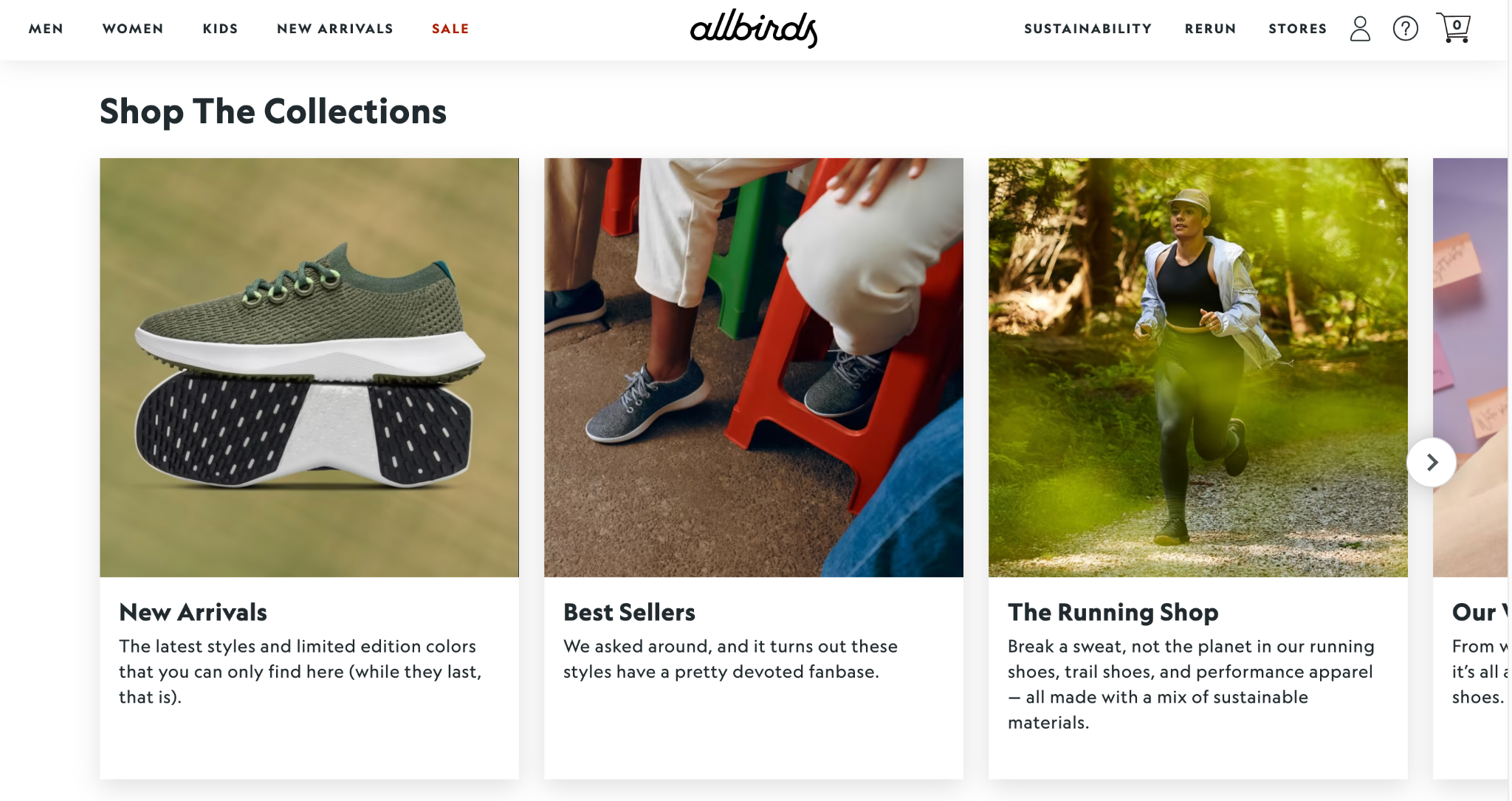
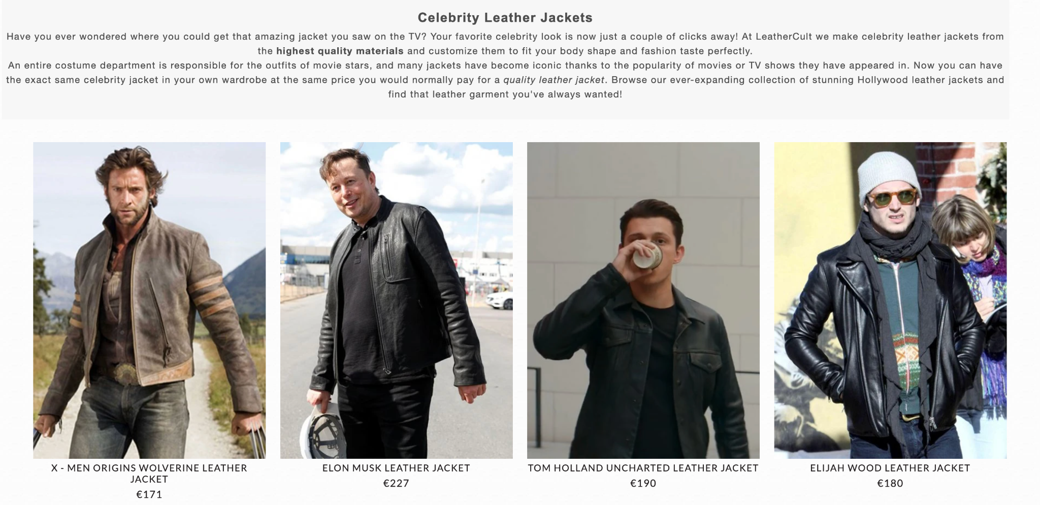
Allbirds is a great example of an e-commerce website that keeps it simple. It uses short sentences, bold formatting, and breaks down the text to make the content snappy.Also, avoid cluttering your category or product pages with unnecessary ads, CTAs, or pop-ups, as these can distract customers and negatively impact their buying decision. And don’t forget that your best product should always appear on the front page. For example, LeatherCult, known for its unique leather jackets, never misses this chance.
-
Think like a website visitor
If you want to win over customers and build strong relationships with customers, you need to understand their needs and desires — and the key to achieving this is to think like them.
Generally speaking, website visitors have certain expectations when shopping online: a website that’s easy to navigate, with a seamless shopping experience that helps them make purchases faster. To succeed in e-commerce, you must meet these expectations and create a website that delivers on these fronts.
Put yourself in their shoes and think of a suitable website design they’ll like. What’s the best way to list product categories so customers can find what they need faster? How can you simplify the checkout process? What kind of information should you show to ensure faster purchases?
This YUPLAY web page is an excellent example of making essential information available to customers.
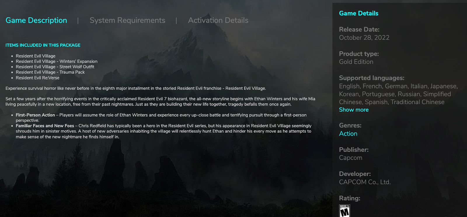
Suppose a customer wishes to purchase Resident Evil games. They can quickly check if their computer meets the requirements and the activation details, step-by-step, to assess if the purchase is worth their time.Here are some tips you can apply when designing product pages for your e-commerce store:
- Add an epic product description. Make sure all the required information is clearly mentioned, including the product features and technical details.
- Make the website layout intuitive and appealing.
- Include recommended products to help customers make better purchase decisions.
- Feature customer reviews.
- Use high-quality images.
We’ll discuss these best practices in more detail later in the blog post.
-
Provide seamless navigation
Nothing kills a sale faster than clumsy product pages. If your customers have to click around ten menus before finding what they want, they’ll bounce right off your website and go straight to your competitor.
Make it easy for customers to navigate your e-commerce website with a clear and concise layout. They should be able to find what they’re looking for quickly without getting lost in a maze of confusing categories and menus.
Categorize your products logically, with the most popular products listed on top. Divide it into clear parts and filter your products as needed. For example, if you sell clothing, consider organizing by gender, size, or type of clothing (e.g., tops, pants, dresses). If your store has a lot of pages, add them to sub-navigation menus.
The idea is to make the purchase process seamless to increase conversions.
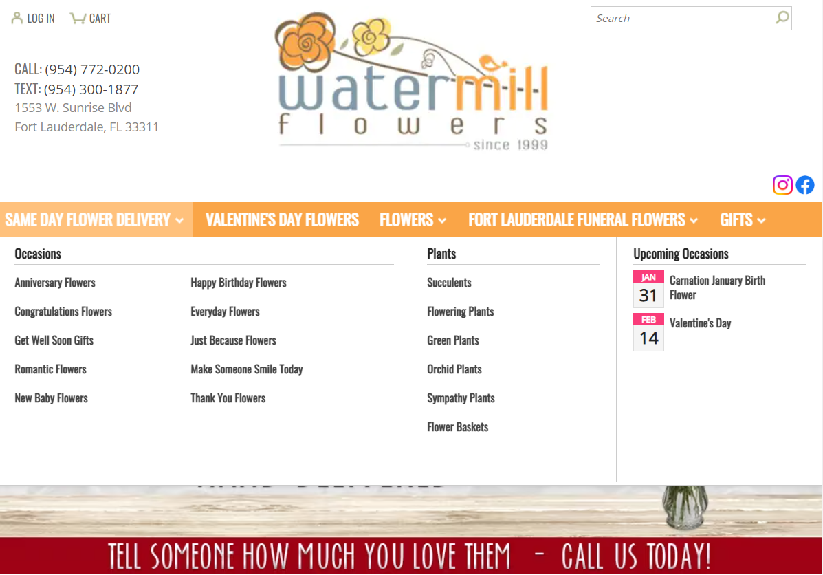
This Fort Lauderdale florist website does a great job of organizing products. Flowers are a highly demanded product, so if customers can quickly find what they’re looking for and book deliveries, they’ll be more likely to purchase again.
Another example is Penn Tool Co, a business that sells power tools online.Divided by product categories, with clearly presented information regarding the price, description, features, and customer reviews of every product, the website is user-friendly and easy to navigate. This helps their customers make decisions fast and increases their time on site.
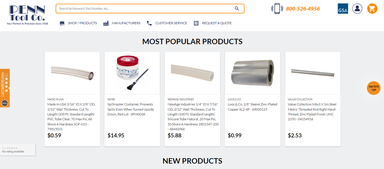
Apart from helping customers find products, simple navigation also improves SEO on your site, improving organic visibility in search results to drive sales. -
Use high-quality images
In e-commerce, product images can move visitors from consideration to conversion. High-quality images with multiple angles, zoom-in functionality, and clear descriptions can help customers make informed purchase decisions.
Think about it: your customers can’t taste, try, or feel your product online, so they rely heavily on images to decide if the product is right for them.
Get professional-quality photos of all your products from different angles to allow customers to examine the products carefully. This goes a long way in building confidence and trust.
More importantly, remove the image background from your product pictures. A plain background focuses more on your product, helping to capture and hold the visitor’s attention.

-
Have an easy checkout process
Customers will hightail it out of your store if your checkout process is overly long and complicated. So, if you want people to buy from you, the process has to be as pain-free as possible.
Many factors contribute to a smooth checkout experience. These include:
- Short and streamlined checkouts, ideally no more than 3–4 steps. Ask for only the necessary information and remove any unnecessary fields to reduce the time and effort required to complete the purchase.
- Multiple payment options cater to a variety of customer preferences, such as credit/debit cards, PayPal, or digital wallets like Apple Pay and Google Pay.
- A progress bar so that customers understand where they are in the checkout process and how much more they need to complete.
- Properly labeled steps of the entire checkout process, providing concise instructions to help customers navigate the process.
- Prominent and easy-to-spot calls-to-action (CTAs) such as ‘Add to Cart’ and ‘Checkout Now’ to guide customers through the checkout process.
- Guest checkout option to allow visitors to purchase without creating an account.
Bellroy is a great example of one-step checkouts that seamlessly incorporate the above elements.
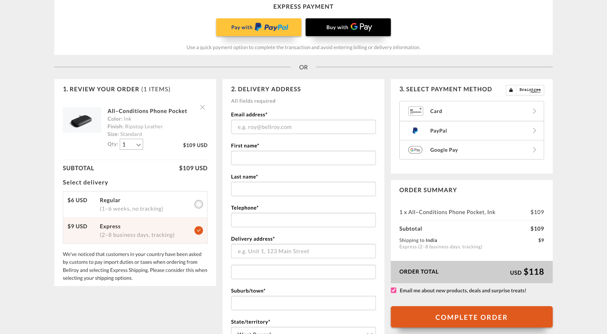
Its robust UI design eliminates any potential distractions that may discourage customers from completing their purchases. Strategically placed, prominent CTAs stand out against a crisp white background, helping customers navigate the checkout process.Bellroy also offers multiple payment options and a clear order summary, allowing customers to enter all relevant details on a single page. This helps streamline the process and removes the need for multiple checkout web pages.
-
Add social proof
When potential customers visit your store for the first time, they may not know anything about your brand or the quality of your products, making them reluctant to buy from your brand. Adding social proof to your e-commerce website can help you overcome this issue and build trust.
How?
When shopping online, the customer doesn’t relate face-to-face like in a physical shop. Instead, they rely on reviews and recommendations from others who have purchased from you.
Look for ways to get feedback from existing customers. Consider adding a rating section to allow customers to rate your store, and try to get many 5-star ratings while you’re at it. Create a built-in testimonial section on your homepage featuring customer photos with a quote or two about their experience purchasing from you.
Manuka Doctor, a skincare shop, is a perfect example of how to use social proof.
The company became well-known for its honey products after celebrity Kourtney Kardashian used it on her reality show. Its website places customer reviews on the homepage to build trust and encourage shoppers to purchase from them.
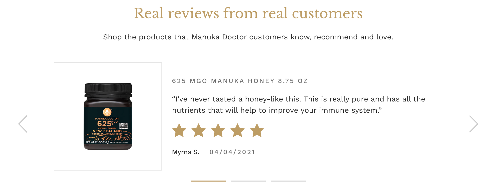
Alternatively, you can have a separate ‘Testimonials’ web page dedicated to spotlighting positive reviews and feedback from past customers.Consider adding an image of the customer and other information like where they live or work and their age. This will allow customers to put a face to the words, making them more likely to trust your brand and make a purchase.
While good ratings and positive reviews lead to successful sales, you should actively monitor and respond to customer reviews with the help of sales automation tools, addressing any concerns or issues that arise to ensure success in the long run. Be as proactive in handling negative reviews as you would, highlighting positive ones.
-
Makes it mobile-responsive
An e-commerce website that doesn’t work on smaller screens will likely lose a lot of customers. In fact, 59% of shoppers say that being able to shop on mobile is important when deciding which brand to buy from. So, you must optimize your store to respond to all the devices.
Your website should look and work just as well on a mobile device as on a desktop computer or laptop. For instance, a computer’s perfectly legible text and images shouldn’t be too small for users to read if they’re checking out your store on their phones.
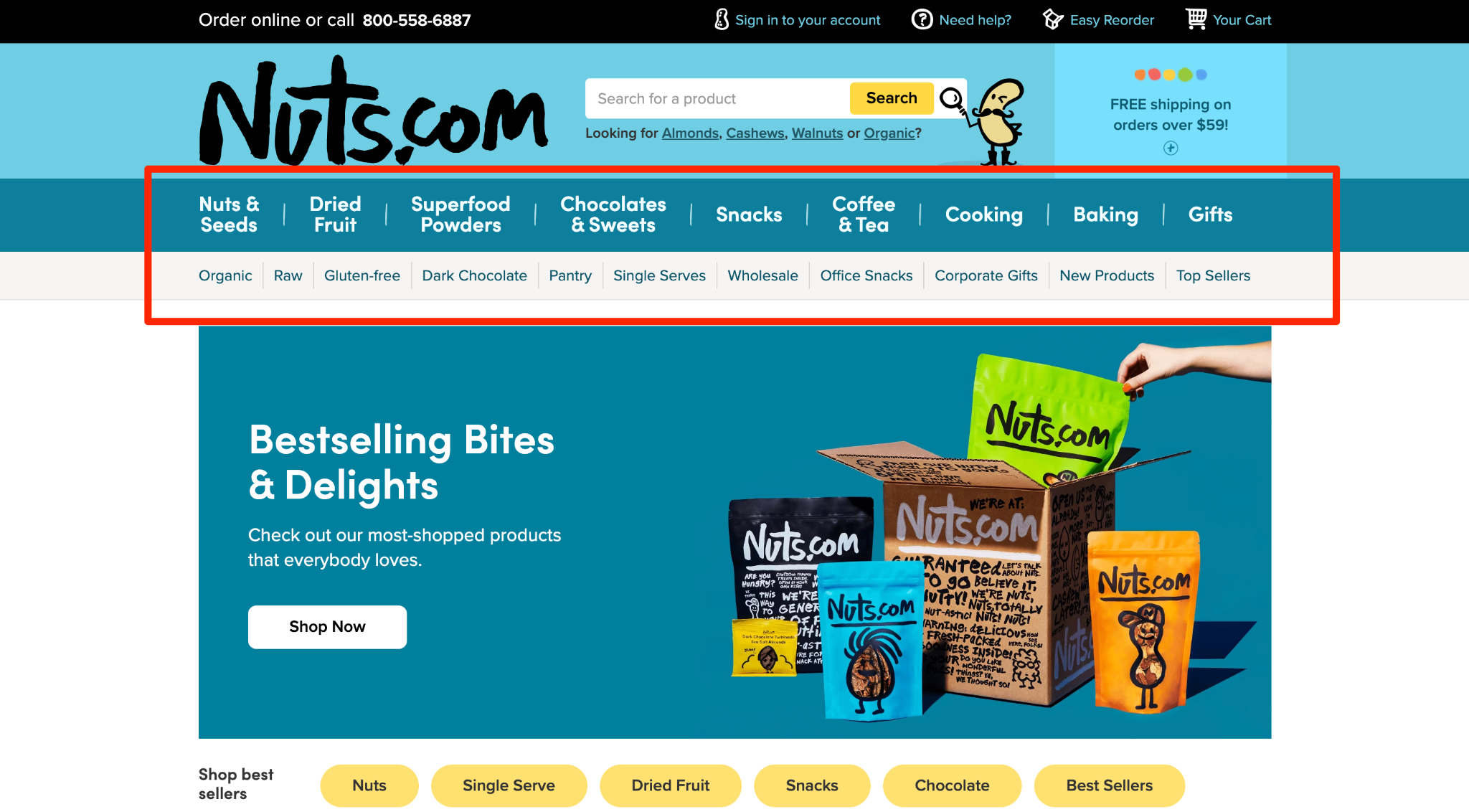
Nuts.com is one retail brand that’s nailed responsiveness across devices. Their navigation system is easy to follow, making shopping on smaller devices simple and painless.
Here’s what its menu looks like on a computer device:
And here’s what the menu looks like on a smartphone: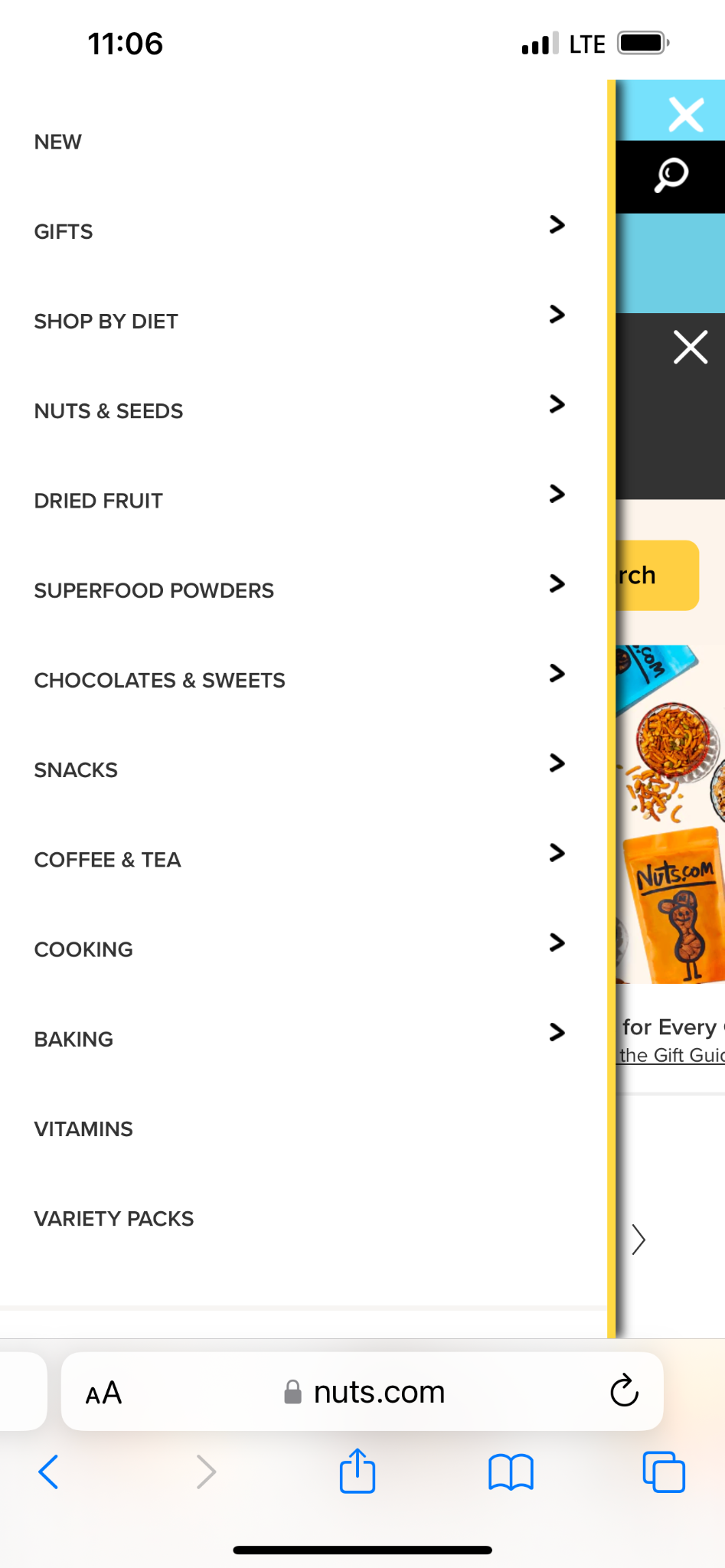
That’s what having a responsive site is about: providing visitors with a streamlined shopping experience across devices.Notice how each element is easy to read and tap on despite viewing the Nuts.com website on a relatively smaller screen. You should aim to emulate a similar experience for visitors shopping for your products from their smartphones.
-
Ensure a professional look
In e-commerce, trust is everything. Customers have to share sensitive information, such as payment details and shipping addresses, and they won’t feel comfortable if your website looks unprofessional.
Think about it: would you willingly enter your credit card information on a website with typos and broken links? Probably not.
That’s why giving your e-commerce website a professional look should be a priority.
Make sure your website is error-free. Go through each web page with a fine-tooth comb and fix typos or misspellings. Your branding should also be consistent on all pages. That means using the same colors, fonts, and images throughout your website for a neat look.
Look at how aesthetically pleasing Dockyard Social’s website looks by simply focusing on the color scheme. Not only does this give it an on-brand appeal, but it also works wonders to attract and hold the visitor’s attention.

Another important aspect of a professional website is making sure all product links and buttons work properly. There’s nothing more frustrating than clicking on a button that doesn’t do anything, giving you instant brickbats from customers.The bottom line is your customers will take you seriously if you show them you take your business seriously. A professional website design can help you do that.


Wrapping up
A good e-commerce website must check all the boxes to ensure a good customer experience.
It should be user-friendly, have high-quality product images and descriptions, offer an easy checkout, and incorporate customer reviews and ratings.
And while this takes effort, the rewards make it well worth it.
Now that you know the top website design elements, go ahead and build a fantastic e-commerce website that’s appealing to your customers and delivers a positive shopping experience for them, and converts like crazy.
You’ve got it.