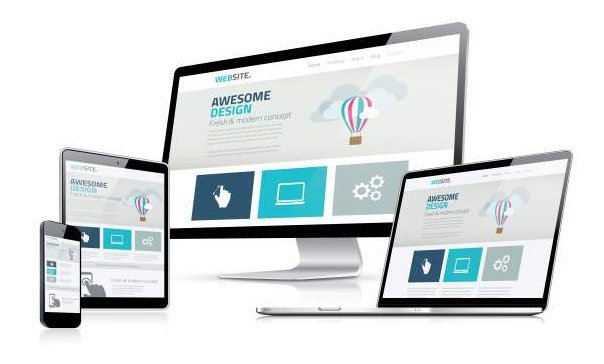
Every business is becoming website-centric. If created tastefully, websites can be a great tool to upscale trust, catch attention and enhance the bottom line of your business. Put, it is the identification of brands in the modern-day.
Is your website not living up to your expectations? It is about time you should be fixing the following five things which are the hallmark of every successful:
Responsive design
Though the importance of laptops and desktops is still intact, the world is taking giant steps and shifting towards smartphones. Even if you audit your website traffic right now, the odds are that a fair proportion of that would be coming through smartphones.
It is pertinent to mention here that mobile users have a shorter attention span. If a webpage consumes more time to load, in all likelihood, you might lose a considerable number of viewers. A responsive design means your website is optimized for every user, regardless of his medium of usage.
What’s more, Google has also realized this fact. Since Google is hell-bent on giving the best user experience to its users, its algorithm is more supportive of responsive designs.
Quality content
Content is king. Bill Gates discovered that way back in 1996. Your content has to come from the top drawer. Period. Superior content is a great source to build up your credibility not only among your audience but also with Google. Quality content helps readers to stay longer on your website, and Google takes this gesture as a sign of authority.
Along with the quality, also address the readability issues as well. Unlike Austin SEO companies,most website owners fail to understand that blogs are not novels. Most people tend rather scanning through your content instead of reading it word by word. So make sure that your write-ups are secure on the eyes.
Here is what you can do to improve the format of your blogs:
- Write short paragraphs. People abandon reading at the mere sight of exhaustive paragraphs
- Divide every article into sub-headings. Typically, readers look for a particular piece of information and sub-headings are of great value in this regard
- Use bullet points. Bullet points directly lead the readers towards the crux of information which saves energy and time for them
Add pictures and videos
Not to take anything away from content writing, but a large segment of the audience has been drawn towards visuals. To be more precise, the power of videos and photos have revolutionized the online world.
The most significant benefit that goes with visual content is that it quickly delivers the message. Our mind processes visual information 60,000 times better than text.
Here is what the visuals are can do:
- Visuals are easily remembered. The audience will not have to go through much wear tear to memorize the content
- Visuals work best when it comes to creating bonding. Trust-deficit has been an issue with the online audience and visuals, videos, in particular, can look after that problem
- Drives more organic traffic. Google has evolved with time. It just keeps resonating with the audience. Today, the audience is hungry for visual information. Therefore, Google also gives preference to the websites containing impressive visuals
Easy navigation
It is good to overload your website with useful information but without making things too complicated for the users. What’s the point of all your well-crafted information if it’s not easily accessible to users in the first place?
Point being, keep your navigation simple. By all means,the purpose ofa navigation bar should be to compliment the user instead of making things further complicated for him.
If it is impossible for you to reduce the information, divide it into two separate navigation bars. That way, you can significantly improve the user experience, which will be a welcome addition in terms of elevating your SEO rankings.
Social media icons
As of now, about 2.82 billion people are actively using social media. On top of that, the graph is likely to see upward growth in the coming years. These statistics are sufficient to convey the worth of social media in the modern era.
There is no reason why your website should be without social media icons. Irrespective of your niche, social media has a unique appeal for every kind of audience. In simple terms, social media icons allow you to connect with a bigger world. There is more to it.
For example, if your blog is shared 200 times on social media. The visitors would be able to see that number on your website, and it will do a world of good to transfer trust among the audience.
Final Thoughts
The list can go on and on, but the idea is to keep it simple and avoid overdoing. You can make changes to your website with the time. But these are the essential things you should fix right from the word goes.