7 Great Ways to Improve Your Checkout Page
It might seem like checkout pages with websites are all basically the same, but there are definitely some that are better than others, and those better pages will be more successful in convincing customers to complete their purchases. These are some ideas for making your checkout page a great one, and enticing customers to complete those purchases.
-
Use Visual Cues
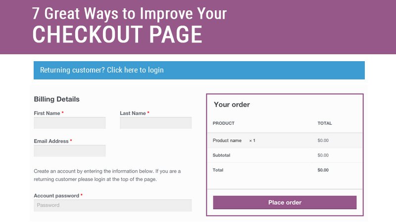
Particularly if you can’t squeeze your entire checkout process into a single page, give your customers visual cues for checking out. Use larger buttons that are “tappable,” and make sure you distinguish different buttons from each other. For example, you don’t want your “Proceed to checkout” button to look the same as your “Continue shopping” button.
Placing these buttons at both the top and the bottom of the page makes it easy for customers to find them, no matter where they are on the page. Using a progress bar, so that website customers know exactly where they are in the checkout process, is also a good idea. That leaves no confusion about whether they’re selecting shipping options or making a payment. Don’t fret; the Magento e-commerce platform will serve you well. By using One Step Checkout extension, you can complete your purchase in a single, streamlined process.
-
Don’t Force Buyers to Create Accounts
Buyers don’t want to be forced to give their information to you, so let creating an account be optional, rather than a mandatory requirement for purchases. If customers feel like they have a choice in the matter, most will probably choose to create their own accounts, rather than checking out as guests.
When they do create an account, don’t ask for more information than you actually need. For example, do you really need to know a person’s birthday, or whether he or she is married? You need an email address, you need a shipping address, you may even need a phone number. You don’t need other information.
-
Give Buyers Shopping Cart and Wishlist Options
Yes, there is the risk of cart abandonment, but buyers appreciate the ability to save their shopping carts. Maybe they want to think about it before they make the actual purchase.
Buyers also appreciate the option to update the quantity of an item or remove it from their shopping carts while still on the checkout page. Don’t send them somewhere else to do it, as that’s unnecessarily complicating the process.
Many buyers also like to create wishlists, so give them that option. Whether they consult their wishlists at another time, or share their wishlists with others, buyers like being able to compile a list of wanted items.
-
Show the Actual Costs
This is a big one. Customers want to know what they’ll be paying, and that includes the price of the item, tax, and shipping costs. Make sure you always display the entire final cost, including tax and shipping, before the final checkout. No one likes to be surprised when they hit the Submit button. Give your customers multiple shipping options and payment options, if at all possible. Some buyers are willing to pay a premium in order to have something shipped quickly, why others may prefer a cheaper shipping method. In the same way, some customers prefer to pay with a particular credit card, while others may want to use PayPal. Give them options.
It’s also a good idea, at least occasionally, to offer free shipping to customers. It doesn’t have to be completely free shipping, but give free shipping to the customers who purchase $50 or more. Or offer free shipping for a limited time. It’s a great way to attract new customers, and those new customers will return if they’re happy with your service.
-
Rely on a Mobile-First Design
It goes without saying that your entire website should be designed with mobile devices in mind, but particularly, your checkout page should be created with a mobile-first design. According to Websitesthatsell SEO Brisbane, one of the biggest reasons that mobile users abandon their shopping carts is because the checkout page is too difficult to navigate on a mobile device. You should use larger buttons that look like they can be tapped, and make sure the form fields align vertically, so that the page is easy to navigate. Remove menus that aren’t needed for checkout, and get rid of complicated, multi-step checkouts. Make it easy for your customers. Also, reduce the number of images on the checkout page, so the page will load quickly.
-
Include Shipping Dates, Message Options, and Gift Wrap
These are perks that customers really appreciate, and they’re not hard to offer. When displaying multiple shipping options, show the approximate shipping and delivery dates, to allow the customer to make the best choice. Give customers the option of creating a message if the purchase is a gift, along with the option of having the item gift-wrapped, for a small fee. Gift givers look for those special touches.
-
Provide the Customer Service and Return Policies
Website visitors want to know that they have some form of recourse if they’re unhappy with their purchase. Make sure your website clearly states your customer service policies and return policies. Customers should know how long they have to return an item, how it must be returned (mail or in person), and whom to contact if they’re unhappy with their purchases. That information will make them feel secure in doing business with you.
Conclusion
Your checkout page is the one last chance to convince a customer to make a purchase. Design your checkout page in a way that promotes your business and trustworthy and gives customers the information they want to know. These guidelines will definitely improve your business and website.