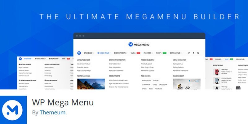
Full-screen drop-down menus and mega navigations can be seen on many popular and reputed business websites. They are highly popular and are quite useful for sites which have plenty of additional links.
However, finding the right design for your mega navigations can be quite a headache. There are not any fixed or strict rules or guidelines for designing these menus.
As a result, you have to do the research yourself and study what other websites are using and doing and then attempt to salvage something from there which will be appropriate for your site.
In this article, you shall learn about the top trends in mega navigation designs which can help you to create a design for your business website.
Deep level categories – what are they?
The basic design style for mega navigation is that of the column structure. Column structures allow you to create separate categories for your links and also create deeper level links without requiring the use of various flyout menus.
Mega navigation drop-down menus can even span the whole page in its entirety so you will be able to put around five columns in a single dropdown. You can check some reputed brands’ websites to see how they use drop-down menus for mega navigations.
Some websites have links to a broad category, under which you can find various subcategories. This type ensures that your customer is not lost for choices when he or she is browsing your website.
You can break the categories down and organize them based on demographics, prices or items, and then provide the mega navigation menu where you can put all the various products which come under the broad categories.
The columns must have their own separate headers so that each of them is easily separable and distinguished from the other links.
It generates a real column structure as you will be able to glance through the column headers in the beginning and then browse your sub-links from that point only.
You can always start organizing the deeper level categories first and then move on to the bigger and broader mega navigation dropdown design.
Dropdown menus that are full width
Full-width drop-down menus span throughout the width of a page but still be used in such a way to generate more space for desktop users. People who access the website from their cell phones will have hidden menus and thus never get to see the complete effects.
Full-screen menu designs can of various types. You can put the content to stay fixed at a constant width with the page while keeping the menu from preventing throughout the screen.
It will create a visual illusion of there being room than it is in reality. You can try combining the column structure design with this full-screen drop down effect to create a single design. You can visit eterpro.com to get the best professional web design layouts for your business requirements.
Mix your images with your texts
Add more pictures on your business website wherever and whenever you see fit. Visuals help break the monotony of full-length texts which we see daily. Mega navigation menus are supposed to work at their best on big screens.
Thus there will be additional room to fill with images. You can break the mega nav menu in such a way as to design a network of various categories and subcategories adding to them both pictures and the product links.
You can also put a row of images along with a row of textual links in your navigation design. You can mix images with texts which serve as labels for various individual pages.
You can also think about designing a few custom icons for your business website, put these icons beside the crucial links which you set, this will juxtapose visuals with your texts for navigation.
Concept behind incorporating navigation menus
Incorporating mega navigation menus is a design technique which will both free up space on your business website and will also be helpful and convenient for the customers.
These menus will allow your customers to pinpoint and find the exact products they want and see if it is on your website or not. It saves the time of your customers.
Customers always value sites which are easy to navigate and comprehend. So mega navigation menus are essential for your business website. However, you must also ensure that the design of the mega nav is appropriate.
Hopefully, from the tips and methods shared in this post, you will be able to find and choose the best designs for your mega navigation menus for your business website.