5 Top Tips to Optimize Your Website for Search Engines
Throughout 2022, Google has increasingly placed importance on how well your website is optimised from a usability standpoint. It has become so important; it is impossible not to incorporate this into your SEO marketing strategy.
With over 65 million websites globally now using WordPress (40% market share) as their choice of CMS, there are plenty of resources and plugins to ensure your website is as optimised as possible to give you the very best chance to perform well on the search results.
Below are our quick steps to getting you started to not only provide a better user-experience for your site visitors, but to generate more leads and sales by optimising your website’s SEO.
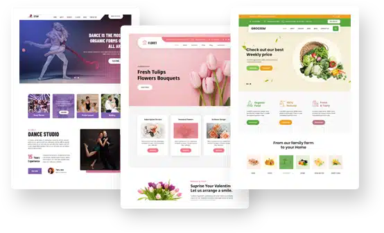
Choosing the Right Theme
The first step to optimising your website for Google is to ensure you’ve chosen the right WordPress theme. This step is often overlooked as people are not aware that the wrong theme can be extremely detrimental to your website’s performance.
Your theme should be lightweight, quick to load and have clear call-to-actions to help your customers convert.
When choosing a Grace Theme template, you can be sure your website has a higher chance of loading swiftly, that it’s well optimised for Google, and displays clear call to actions to help convert your visitors into paying customers.
Site Speed Optimisation
Since the Core Web Vitals launch earlier this year, your site’s speed load time plays a significant role in your website’s exposure on search engines. It’s important that your website loads quickly on both desktop and mobile devices.
A tool that you may find useful is the GTMetrix site speed auditor. We recommend aiming for a 5 second or less load time, as every additional second your website takes to load, can increase your bounce rate by 8%.
Mobile Responsiveness
Since the launch of Google’s Mobile First Indexing algorithm, it has become critical to ensure your website is optimised for mobile devices. Google now looks at how your site displays on a mobile device (content and all), to now sort its rankings in the search results. This makes perfect sense since Google knows over 60% of users are now searching on Mobile devices.
Below are our quick tips to check your websites mobile responsiveness:
- Check your website on a mobile device or install the Chrome extension Responsive Viewer
- Is your website displaying all the content that your desktop version shows?
- Are buttons easily clickable or too close together?
- Are phone numbers clickable?
- Is your website loading quickly on mobile devices? We recommend trying Google Page Insights for mobile testing is it provides much more data.
Interlinking Content
Having great content on your website is one thing, but does it allow your customers to browse around your website naturally? Too often we see blog posts with no internal links which can greatly assist your site visitors browse your pages.
By allowing your site visitors click around your website, it reduces your bounce rate and increase your time on site, which are all fantastic signals that Google wants to see.
Schema Markup
Schema markup is a great tool to gain extra exposure on the search results. The Google Schema markup options have expanded over the years and is no longer just for reviews or recipes.
Below is a complete list of the options you can utilise for your personalised search results:
- Article
- Book
- Breadcrumb
- Carousel
- Course
- Dataset
- Employer Aggregate Rating
- Event
- Fact check
- FAQ
- Home Activities
- How-to
- Image license
- Job posting
- Learning video
- Math Solvers
- Movie
- Education Q&A
- Estimated salary
- Podcast
- Practice problems
- Q&A
- Recipe
- Software app (Beta)
- Speakbable
- Subscription and paywalled content
- Video
This list isn’t for everyone, but we recommend utilising as many as possible which will not only enhance your search results, but gives your search listings a much needed boost.
Conclusion
SEO is ever changing, but one thing that will always stick around is how well optimised is your website for an improved user-experience. Following the above tips will help boost your rankings, but if you do require further help, contact the SEO experts at Launch North.